Post-Production

Processing HDR Images for Urban Night Photography

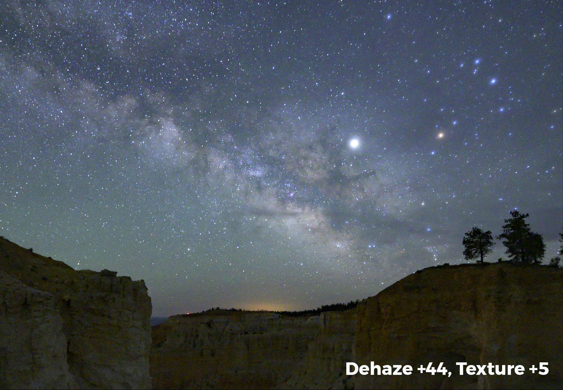
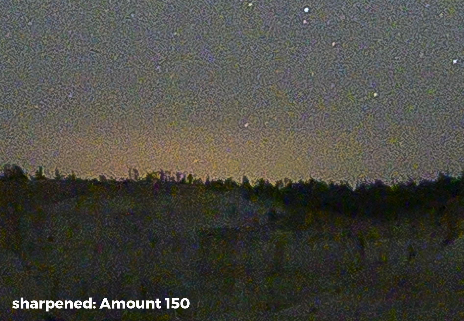
While HDR is commonly associated with landscape photography, it can also be indispensable for low-light and night photography. From urban nightscapes to dimly lit interiors, opportunities abound for using this technique to overcome the limitations of cameras and create better photographs. As such, HDR extends the shooting hours and subject choices for the night photographer.

A few years ago I wrote a blog post titled “Casting Out Shadows: When HDR is the Right Choice for a Night Scene.” In it I described what HDR is, and I showed some examples of night photography problems that the technique can help you solve.

Now, in this video, I show how to process HDR night images by walking through two examples: an exterior photo at Bruges in Belgium and a low-light interior photo of Sagrada Família in Barcelona (which we will visit on our night photography tour this coming November).

Bruges, Belgium. Canon EOS 5D Mark II. Three images combined into an HDR in Adobe Lightroom.

Sagrada Família, Barcelona. Fujifulm X-T2. Three images combined into an HDR in Lightroom.

While walking through these two examples in the video, I reveal my secrets on editing images using Adobe Lightroom’s Merge to HDR feature. I discuss:

  • the definition of HDR

  • when you should use HDR at night

  • how to shoot for HDR at night

  • using Lightroom to process night HDR images

  • maximizing highlights and shadows without making the photo look false

  • and more!

You can see the video below or on the National Parks at Night YouTube channel. (Don’t forget to subscribe!)

Share Your Night HDR

Have you shot urban HDR at night, or are you now inspired to do so? We’d love to see your results! Feel free to share in the comments below or on our Facebook page.

Tim Cooper is a partner and workshop leader with National Parks at Night. Learn more techniques from his book The Magic of Light Painting, available from Peachpit.

UPCOMING WORKSHOPS FROM NATIONAL PARKS AT NIGHT

Cleaning the Clutter: How to Get Your Lightroom Catalog in Tiptop Shape

Clean and organized. Some people are and some people are, well, less so. When it comes to Adobe Lightroom however, we all benefit from a clean, well-organized catalog. In fact, cleaning up Lightroom is one of the most common topics we’re asked about on our workshops and in our one-on-one Tutoring sessions.

In this post, I will share three tips on decluttering this very important part of our digital lives.

Tip 1: Use Reject Flags to Remove Unwanted Images

Get rid of those files you’ll never use and do it quickly with Reject flags. Lightroom has the capacity to keep track of thousands and thousands of images. In fact, I’ve not heard of an upper usable limit, but I have noticed that when my catalog neared 50,000 images it started to slow down a bit. Cleaning out the dead weight couldn’t hurt, right?

Here’s a method that will help you sail through your images and quickly mark them for deletion:

  1. Open Lightroom and enter the Library Module.

  2. From the menu choose Photo > Auto Advance (Auto Advance is engaged when there is a check mark next to it). You can also do this by engaging your Caps Lock key.

  3. Find a folder that contains images you would like to cull. Click on the first image and then press your space bar to magnify the image to fill the screen (this puts you into Loupe view).

  4. Now, if you want to keep this image, simply hit the right arrow on the keyboard to advance to the next image. To mark the image as rejected, you can go up to the Menu and choose Photo >  Set Flag > Rejected (Figure 1), or press X. This will set the flag on the image as rejected, and because you have Auto Advance enabled, Lightroom will automatically advance to the next image!

Figure 1. Rejecting an image.

Once you are finished working through that folder, it’s time to actually delete the images:

  1. Return to the Grid mode by pressing G.

  2. The keyboard combination to Delete Rejected Photos on a Mac is Command + Delete, and on a PC is Control + Backspace. Click whichever is pertinent.

  3. Lightroom will ask you to confirm (Figure 2). Click Delete from Disc to permanently delete the images from your computer as well to remove them from your Lightroom Catalog.

Figure 2. Deleting flagged images from the catalog and disk.

Deleting images one at a time takes a lot of time. By using Reject flags and then the Delete Rejected Photos feature, you’ll save a ton of time, thus freeing up more time for you to sift through more images.

Further Tips

  • You can do this whole process of adding Reject flags to the images while working in the Grid view as well.

  • If you accidentally flag an image as rejected, simply click on the image again and press U to unflag it.

  • Conversely, pressing P will flag an image as simply “flagged.” Many of us think of this as a Pick flag. This can be an additional marker on your image along with stars and color labels.

Tip 2: Optimize Your Catalog

Your Lightroom catalog is a database. Databases, like your teeth, need maintenance and occasional care. If uncared for, like your teeth, they will no longer perform the job we ask of them without being painful to use.

Begin by backing up your catalog on a regular basis. This could be once per week or once every two weeks or so. Remember this backs up only your Lightroom Catalog (the database of the location of your images and all the metadata and edits you’ve performed on them). This does not back up your actual photographs. To ensure your images are backed up, you must take the separate step of backing up the drive(s) where your images are stored.

Here are the steps to determine when your catalog will be automatically backed up:

  1. From the menu on a Mac, choose Lightroom Classic > Catalog Settings, or on a PC choose Edit > Catalog Settings.

  2. Click on the General tab.

  3. In the Backup section, choose your frequency preference in the dropdown menu (Figure 3). I choose “Every time Lightroom exits.” This setting gives me the option to back up or skip each time I close the program.

Figure 3. Setting backup preferences.

When I quit Lightroom, I see the dialog in Figure 4, which tells me the backup preference that I set earlier. Then it’s time to make some additional choices. Notice that I check both boxes outlined in red. Test Integrity will ensure my catalog is healthy, and Optimize Catalog will keep my catalog lean. This way, by taking the time to back up my catalog, I’m simultaneously repairing it and making it run more efficiently.

Figure 4. Backup options.

Further Tips

  • Both the Test Integrity and the Optimize options are sticky, which means once you check the boxes they will still be checked every time you back up, until you uncheck them. (And vice versa.) So if you check the boxes today and then back up, next week when you go to back up again, the boxes will already be checked for you. Awesome, right?

  • There is no need to have a zillion backups of your catalog. I recommend periodically going to the Backups folder and deleting older backups. I typically keep one or two. The Backups folder can be found by navigating to the General tab of Catalog Settings (directions above) and clicking the Show button (Figure 5). This will take you to the folder on your hard drive where your backups are stored. Enter the folder and delete any subfolders for older backups that you no longer want to keep.

Figure 5. Navigating to the location of your backups.

Tip 3: Organize by Using Smart Collections

I know, I know, the topic of organizing your Lightroom catalog could easily fill a small book. (Or it could even fill a 5.5-hour video dedicated to the Library and Develop modules 😎). For now, I’d like to show you just one of the myriad tools you can use to ensure that your images are always easy to find. That tool is Smart Collections.

The more information you put into an image, the easier it is to find. For example, all imported image files already contain EXIF data from your camera that lists aperture, shutter speed, focal length, ISO, lens model, etc. This embedded information makes it easy to search for, say, all images shot with a Nikon Z 6 set at ISO 6400. You could further narrow the results by searching for all images shot with a Nikon Z 6 set at ISO 6400 using a focal length of 14mm.

That is incredibly powerful. But EXIF is only one part of an image’s metadata. The color labels, stars and flags we add to help us organize our catalogs are also metadata. Develop settings we apply—such as Exposure, White Balance and Dehaze—are also recorded as metadata. The keywords we apply to images? Metadata.

So we start off with searchable metadata in the form of EXIF data from our camera. But we can also apply metadata after the images have been imported.

Again: The more information (data) we apply to an image, the easier it is to find. How so? Smart collections.

Think of a smart collection as a really smart, saved search. In the above example we wanted to search for all images shot with a Nikon Z 6 set at ISO 6400 using a focal length of 14mm. Great. We could do that with Library Filter. But if you did this through a smart collection, Lightroom would immediately find those images and gather them up in one location for you to view at any time. It doesn’t move your images. It just creates another “location” to view the images that meet those criteria, no matter how many different folders the images live in.

The smart collection doesn’t stop there, though. It continually monitors your whole catalog and updates the collection whenever a new image meets those same criteria (Nikon Z 6, ISO 6400, 14mm focal length). You don’t need to anything. The next time you import an image you shot with a Z 6 at ISO 6400 and 14mm, that image will automatically appear in that smart collection.

Creating a Smart Collection

The Collections panel sits just below your Folders panel in Lightroom’s Library module (Figure 6).

Figure 6. Creating a smart collection.

Here’s how to create a smart collection:

  1. Click on the plus sign in the upper right corner of the Smart Collection panel to reveal the actions shown in Figure 7.

  2. Choose Create Smart Collection. You will see the dialog that allows you to set the criteria the smart collection will search for (Figure 8).

  3. Start at the top by giving your new smart collection a name. (Ignore the Inside a Collection Set option for now.)

  4. Keep Match set to “all.”

  5. The large area on the bottom of the dialog contains the rules you will set up for the smart collection. Notice that by default the first rule is sets Rating as “is greater than or equal to.” Clicking on one of the dots to the right sets the star rating it will search for. So if you click the fourth dot, this smart collection will collect all of the images in your Library that are marked 4 stars or above.

  6. Click Create and you’ve just made your first smart collection!

Figure 7. Collection panel actions.

Figure 8. Creating a smart collection.

Putting Smart Collections to Practical Use

Now let’s make a smart collection that will help keep your catalog organized.

  1. Click the plus sign to create a new smart collection.

  2. Name this collection “Without Keywords.”

  3. Click the arrows next to Rating and instead choose Other Metadata > Keywords (Figure 9).

  4. Click the arrows next to “is greater or equal” and instead choose “are empty” (Figure 10).

  5. Click create.

Figure 9. Choosing a criterion for a smart collection.

Figure 10. Refining the options for a criterion.

Now you have a smart collection that shows every image that needs to have keywords applied. Click on any image, apply a keyword, and that image will automatically disappear from the smart collection. Why? Because now that the image has a keyword, it no longer fits the criterion.

Creating this particular smart collection is a great way to begin organizing your entire Library, because it can be very difficult to find images that lack keywords!

Smart collections are extremely powerful. As you can see from the screenshot in Figure 9 above, there are an enormous amount of criteria you can use to build your smart collections. And you are not limited to just one choice. By clicking on the plus sign to the right of your first rule, you can continue to add additional rules. As long Match is set to “all,” an image would need to meet all of the criteria to show up in the smart collection. Figure 11 shows a screenshot of the smart collection we talked about earlier (Nikon Z 6, ISO 6400, 14mm focal length).

Figure 11. A smart collection that collates all images shot with a Nikon Z 6 at ISO 6400 with a focal length of 14mm.

Spend some time thinking about how you want to find and organize your Library. Poke around in the choices for ideas for new collections. Before you know it you’ll be creating smart collections that will keep your Library perfectly organized!

Some Sample Smart Collections

Here are a few ideas to get you started:

Make a collection of your favorite photos that are marked with 5 stars.

Make a collection of your favorite photos that are marked with 5 stars.

Make a collection that shows all of your images that don’t have stars.

How about one to show your favorite family photos?

Or your favorite vacation photos?

Further Tips

  • Organize your smart collections by creating collection sets. Think of these as folders to store your individual collections in.

  • In the Collections panel, collections appear in alphanumeric order from top to bottom with the collection sets coming first. If you want to have something appear at the top, use a space or underscore before the title to force Lightroom to move it up there.

  • You can edit a smart collection anytime by double-clicking on the gear icon that appears on your smart collection icon.

Wrapping Up

There you go, three tips to help you clean your Lightroom catalog! It might take some time and dedication to get this done, but the investment will pay off later when you’ll be running a lean, efficient database of images.

Do you have any of your own tips for how you like to clean up your Lightroom catalog? Share them in the comments below or on our Facebook page!

Want some help getting your Lightroom catalog organized? National Parks at Night offers one-on-one tutoring, so we can work with you remotely! See our Tutoring page for more information.

Tim Cooper is a partner and workshop leader with National Parks at Night. Learn more techniques from his book The Magic of Light Painting, available from Peachpit.

UPCOMING WORKSHOPS FROM NATIONAL PARKS AT NIGHT

Five Ways That Lightroom’s New Update Eases the Processing of Night Photos

As has been true since the beginning of photography, field work is equally important as what comes after: post-production. Consequently, we always monitor the advancement of both in-field and on-desk tools, and this week there was some good news in the latter category.

On Tuesday, Adobe released an update to Lightroom that contained several interesting changes, including five that will make life easier for night photographers. So below we explore each new feature and setting, looking specifically at how it applies to working with night images.

(Note that these points pertain to Lightroom Classic, which is the version we use—and recommend using—for serious photo editing.)

1. Large-File Support

If you’re into blending exposures, stitching complex panoramas or stacking images—whether for stars, lighthouse beams, light painting or whatever else—then you’ve probably had to deal with the 2 GB size limitation for a PSD, Photoshop’s default file format (Figure 1).

Figure 1. Until now, Photoshop files over 2 GB posed a problem for Lightroom users.

If your image exceeded that limit, you were faced with five primary options, all of which had downsides:

  1. Downsize the resolution (which meant throwing away pixels).

  2. Flatten the layers (thereby limiting the ability to edit the image in the future).

  3. Save as a TIFF (which has a 4 GB limit).

  4. Save as a large-format PSB file (which Lightroom couldn’t see, edit or catalog).

  5. Convert the layers to a Smart Object and save them as a new linked file, then save the whole thing as a TIFF (which is an inelegant, unintuitive process).

Now, with this update, these options are obsolete and the downsides are no longer obstacles. Lightroom now recognizes PSBs, allowing you to import, catalog and edit these files of theoretically unlimited size. (“Theoretically” because there are limitations, but ones that most photographers will never encounter—i.e., 65,000 pixels wide or tall, or 512 total megapixels.)

2. Simpler Visual Matching

Last winter Tim Cooper wrote a blog post titled “How to Make Your Lightroom Rendering Look Like Your Camera Preview.” One of the key points was ensuring that the profile you use in Lightroom’s Develop module matches the profile you use in your camera (i.e., the “Picture Controls” setting for Nikon, “Picture Styles” for Canon, “Picture Profile” for Sony, “Film Simulation” for Fuji, etc.)

For example, I always set my Nikon D5 (or any other Nikon camera I might be using) to “Standard,” so I want to use “Camera Standard” as my Lightroom profile. That used to be a manual step (or semi-manual, depending on how presets were used), but now Lightroom can do it for me by default.

To automate that process, select Edit > Preferences on a PC or Lightroom Classic > Preferences on a Mac, then select the Presets tab, and you’ll find the option at the top under Raw Defaults. Click on the Master drop down to reveal its options (Figure 2):

  1. “Adobe Default,” which is the behavior you’re accustomed to—Lightroom just applying its own Adobe Color profile to the RAW conversion

  2. “Camera Settings,” which uses the same profile/style you indicated in-camera

  3. “Preset,” which uses any Adobe- or user-created Develop preset, which you select in the fly-out menu

Figure 2. Lightroom’s new Raw Defaults let you specify which demosaicing profile is automatically applied when importing images.

For the purpose mentioned above, you want the second option, “Camera Settings” (and be sure to check “Use defaults specific to camera model” for the most precise results). You don’t even need to tell Lightroom which profile to use—it reads the camera setting from the metadata and chooses the appropriate profile for you.

Consistent Black and White Workflow

This feature also comes into play when shooting in black and white with a digital camera, which is an effective strategy for dealing with night scenes that contain too many variations of color temperatures to reign them all in to one exposure (e.g, LED and sodium vapor lights in the same scene)—or for if you just like to work in monochrome.

When using a digital camera to shoot black and white images, we always recommend changing your camera’s picture style to a monochrome setting. This provides an LCD preview in black and white, which helps you visualize how the final image will look more effectively than if you were looking at a color preview.

The problem with this strategy was that Lightroom would still import the RAW file as a color image. You would then need to remember which files you intended to be black-and-white photographs and then change the settings accordingly.

However, now with this new Raw Defaults management, if you set the preference to “Camera Settings,” then images you shoot with an in-camera monochrome picture style will appear as monochrome in Lightroom (Figure 3).

Figure 3. By setting the new Raw Defaults option to “Camera Settings,” images shot in-camera as black and white will now automatically have the corresponding monochrome profile applied on import.

3. Overriding Manufacturer Adjustments

This isn’t new functionality so much as a new interface. It’s also really the second part of the previous feature, but we have a completely separate use for it, so it gets its own heading.

In that same Presets tab in Preferences, below the Master setting, you’ll find the option to apply a specific profile based on which camera you’re importing image files from. Most photographers who use this feature do so because they have specific adjustments they like to make to files from specific types of cameras—for instance, always applying a little extra Vibrance to images from an old backup digital body.

But there’s another, similar use: Overriding the built-in processing adjustments that some manufacturers apply to files from some cameras.

For example: We love the Nikon Z 6, but one challenge is that the files come packaged with baked-in noise reduction settings for Lightroom that we find to be way too aggressive. (Figure 4. You can read more about this in our blog post “The Z 6 is the Best Camera for Night Photography.”)

Figure 4. The aggressive default noise reduction settings packaged in the metadata of Nikon Z 6 files..

The good news is that Lightroom now allows you to more easily take control of this on import, by indicating a specific profile or preset from the same Preferences tab (Figure 5). Simply select the camera model, then select from the same options listed above. Now that profile/preset will be applied to any imported files originating from that type of camera. (You can also apply this setting to specific cameras by serial number, if you need to. For the record, most photographers don’t need to.)

Figure 5. By applying a custom preset in this new interface, we can fix perceived problems with baked-in adjustments from camera manufacturers.

So, using this feature, we can tell Lightroom not to use Nikon’s baked-in noise reduction settings for Z 6 files, but rather to apply a custom preset with the noise reduction approach we deem more appropriate. Gabe likes his Z 6 noise reduction set between 10 and 30 for luminance and color noise, so he could perhaps create a preset for 10 each, apply that to all Z 6 images on import, then tweak each of those settings manually in the Detail panel of the Develop module.

4. Camera Support

Nearly every Lightroom update includes support for new cameras and lenses, and this month’s is no different. One notable addition has us pretty excited.

Figure 6. The Nikon D780.

A few weeks ago we got our hands on a brand new Nikon D780 so we could test it for night photography. (Thank you to B&H Photo! See our review in the coming weeks.) Lance was working with the camera before and during our workshop in Death Valley National Park, but he couldn’t open the files in Lightroom. That was a big obstacle to testing, not to mention that it was an unfortunate fact for any early adopter of the camera.

Now? No problem. The new version of Lightroom (as well as Camera Raw) will open D780 files. (For the record, other companies make cameras too, and Lightroom does support them. Also new to Lightroom are the Canon EOS-1Dx Mark III and the Olympus OM-D E-M1 Mark III, among others.)

5. Auto Sync is Less Dangerous

The Auto Sync feature is very powerful, as it was the easiest way to sync adjustments to multiple photos—such as when applying Dehaze to a few dozen starry-sky images before stacking them. But Auto Sync is also dangerous, because it’s easy to create havoc with. Why? Because it was easy to leave on by accident, leaving you unaware that you could be applying a series of changes to dozens, hundreds or thousands of images—or even, as I did once, to the whole catalog. The danger of this was so palpable that I’ve always hesitated to teach the feature on workshops.

Now Adobe has mitigated the risk with three simple tweaks to Lightroom’s interface:

  1. When you activateAuto Sync, the button now changes appearance to a bright light gray that’s easy to see at the bottom of the Develop module.

  2. When you hover the pointer over the Auto Sync button, a tool tip warns what will happen if you click it.

  3. When you make an auto-synced adjustment, Lightroom now advises that you did so with a message such as “Contrast updated for 190,817 images.” (That’s not a joke. See Figure 7.)

Figure 7. Auto Sync can be dangerous, but powerful. New features mitigate the former.

The software also gives you the ability to disable these new warnings in Preferences. Don’t disable them. Ever.

Wrapping Up

There you have it—five ways to work easier when post-processing night photos, courtesy of Adobe.

Which of these features are you most happy to see implemented? And what features and improvements do you hope to see next? Tell us what you think in the comments section below or on our Facebook page.

Note: Do you want to learn more about post-processing? Sign up for the waitlist for our Post-Processing Intensive workshop in San Francisco, or check out our tutoring services!

Chris Nicholson is a partner and workshop leader with National Parks at Night, and author of Photographing National Parks (Sidelight Books, 2015). Learn more about national parks as photography destinations, subscribe to Chris' free e-newsletter, and more at www.PhotographingNationalParks.com.

UPCOMING WORKSHOPS FROM NATIONAL PARKS AT NIGHT

How to Plan, Shoot and Edit a Milky Way Arch Panorama (Part II)

Note: This is the second in a two-part series about creating a Milky Way panorama. Part I covered planning and shooting. Below we go over how to put it all together in post.


In last week’s blog post, Matt demonstrated how to create the raw materials for a Milky Way panorama arch. I really enjoyed the post and was glad that he asked me to follow up with a tutorial on processing the frames he captured to stitch the final image.

Computer Software

To create a panorama from multiple images, you’ll need some type of software for your computer. When it comes to software, I like to keep it simple—until I can’t. For me, keeping it simple means working with software I already own and understand. In this case, that means working with Adobe Lightroom Classic and Photoshop. While there are other stitching programs out there, I have always been satisfied with the Adobe products. I already own them, so again, I keep it simple.

In general, both Lightroom and Photoshop are seriously robust and each have their own advantages and disadvantages. When it comes to processing panoramas, both programs work well. Lightroom is the more convenient of the two, and Photoshop offers more options and tends to create more realistic results when you have less-than-perfect captures.

What are less-than-perfect captures? In short, images that the software finds difficult to stitch together. This could be frames taken without a nodal rail or frames that don’t overlap enough, etc. In last week’s article, Matt showed how to create perfect captures that will be easy enough for either program to stitch.

Pre-Stitch Processing

Once you download your images, it’s time to start processing them. If you are planning to stitch (or “merge”) the images together using Lightroom, there’s very little processing that’s necessary beforehand. The reason is that the result of Lightroom’s Merge function is a panorama that is still a RAW file. This means you can do all your processing to the final pano after it’s created, rather than to each individual file before stiching.

Figure 1.

However, there is one exception to that, and that exception is Lens Correction. Why? Because correcting lens quirks will help the rest of the process go better, particularly in regard to vignetting. Removing vignettes will help the exposure look consistent across the whole panorama.

The Lens Correction panel (Figure 1) lives in the Develop module, and it’s the one place you must visit before merging your images into a panorama. Here you can see I’ve checked the Remove Chromatic Aberration box as well as the Enable Profile Corrections box.

Checking both of these boxes tells Lightroom to correct any aberrations associated with that particular lens. At this point Lightroom will typically recognize which lens you’re using and apply the correct profile corrections automatically. However, if you are using a very old lens, or if you’re using a lens brand that’s different than your camera brand, you may need to manually input the type of lens you used. In the example in Figure 1, I had to choose Zeiss from the Make drop-down menu for before Lightroom recognized the lens as the Zeiss Milvus 2.8/15 ZE.

Once you have set the Lens Correction panel on one image, it’s time to sync that change across all the images of that set. From the thumbnails at the bottom of the page, first click on the image with the Lens Corrections. Next, hold down the shift key and click on the last image in that set. This will highlight (select) all of the images in the series. Notice in Figure 2, the cell for the first image I clicked on (the one with the changes) is white, while the remainder of the selected cells are light gray. This means that all the images are selected, but the white image is the “active” image. When we sync, the active image is the one that shares all of its settings with the others.

(If the image with the Lens Corrections is not white, simply click on the correct image. All images will remain selected—you will have just changed the active image.)

Figure 2.

With all of the images selected, click the Sync button (circled in red in Figure 3). (If the Sync button is not available, that means you have only one image selected. Return to the Filmstrip at the bottom and reselect the images.)

Figure 3.

Now, click the Sync button to open the Synchronize Settings dialog (Figure 4).

Figure 4.

Click the Check All button and then finish by clicking the Synchronize button. This will close the box and copy all of the settings from the active image to the selected images.

Figure 5.

Merging Using Lightroom

With all of your images selected and synchronized, it’s time to merge them into a panorama. From the Lightroom menu, choose Photo > Photo Merge > Panorama (Figure 5).

The next thing you’ll see is the Panorama Merge Preview box (Figure 6). The choices here are quite minimal. Projection (Spherical, Cylindrical and Perspective) is what determines the overall shape and look of your image. Simply choose the one that best represents your original vision. Because Matt used a nodal rail when shooting, the difference between Spherical and Cylindrical is nearly impossible to discern. This may not always be the case. Again, just choose the setting that produces a result you like.

Figure 6.

With this image, when I choose Perspective, I get the error “Unable to merge the photos(Figure 7). If you get this error, simply choose another projection. It may or may not work. As I mentioned earlier, while Lightroom’s Merge to Panorama is convenient, it may not work in all circumstances.

Figure 7.

The remaining options are really just that—options. My preferred settings (which appear in Figure 6) are:

  • I keep the Boundary Warp at 0 and I check the Auto Crop box. This keeps Lightroom from stretching the image to fill in blank spaces around the edges, and instead crops out those stray spaces.

  • I keep the Auto Settings box unchecked. This keeps Lightroom from auto-tuning the basic adjustments in the final pano. I prefer to make my own adjustments.

  • I check Create Stack so that the panorama file is stacked with all of its source images in the Library module. This just helps keep things organized.

Click the Merge button at the bottom right of the Panorama Merge Preview dialog to create your panorama. Lightroom will begin merging your images, and you can track its progress in the taskbar in the upper left portion of your screen (Figure 8).

Figure 8.

Once finished, your image will appear back in Lightroom (as a RAW file), all ready for you to apply your favorite Milky Way edits!

Comparing Lenses

As you may remember from last week, Matt shot the raw materials with three lenses—the Zeiss 15mm Distagon f/2.8, Viltrox 20mm f/1.8 and Sigma 35mm f/1.4 Art. Here are those three panos created with Projection set to Spherical.

Figure 9. Nikon Z 6 with a Sigma 35mm f/1.4 Art lens. Multiple stitched frames shot at 8 seconds, f/2.8, ISO 6400.

Figure 10. Nikon Z 6 with a Viltrox 20mm f/1.8 lens. Multiple stitched frames shot at 14 seconds, f/2.8, ISO 6400.

Figure 11. Nikon Z 6 with a Zeiss 15mm Distagon f/2.8 lens. Multiple stitched frames shot at 16 seconds, f/2.8, ISO 6400.

The first thing you might notice is that the panos shot with longer lenses are darker, with fewer stars appearing in the sky. That’s because Matt needed shorter exposure times for the longer lenses, in order keep the stars sharp.

The next thing you’ll notice is that the images from the widest-angle lens—the 15mm (Figure 11)—do not merge well. The sky on the left side of the image appears uneven. Lightroom may sometimes have problems merging panoramas made with superwide-angle lenses.

Merging Using Photoshop

When using a very wide lens, or if you didn’t use a nodal rail—or if Lightroom is having trouble with the pano for any reason, discernible or not—you may have to take your images into Photoshop to do the stitch. The steps are very similar to merging in Lightroom. In fact, the first three steps are exactly the same:

  1. Select first image in the series and go to the Develop module.

  2. Go to the Lens Corrections panel and check Remove Chromatic Aberration and Enable Profile Corrections.

  3. From the thumbnails at the bottom of the page, click on the image with the Lens Corrections (this should already be selected if you were just working on it), hold the shift key and click on the last image in the pano series. With all of the images selected, click the Sync button.

Now we start to detour from the Lightroom pano workflow. Before exporting to Photoshop, you can edit your images before merging. Stick with the big overall changes in the Basic panel, such as White Balance, Color Profile and the fundamental tonal adjustments. Remember you’ll be syncing these changes across all of your images in the set, so don’t make a change that might adversely affect one of the other images.

Once that first frame is suitably adjusted, sync the settings across the whole set in the same way as described above. Then look at each image to ensure that the settings work well with each frame. If they don’t, return to the settings and adjust as needed. Then synchronize them again.

Once all the frames in the set look right, select the whole series by clicking the first and shift-clicking the last. Then, from Lightroom’s menu, choose Photo > Edit In > Merge to Panorama in Photoshop (Figure 12).

Figure 12.

Next you’ll see the Photomerge dialog in Photoshop. Choose Auto from the Layout panel on the left and check Blend Images Together (Figure 13). You don’t need to check Vignette Removal or Geometric Distortion Correction, because you already fixed those issues in Lightroom; you don’t need to check Content Aware Fill Transparent Areas because we’ll tackle that manually later.

Figure 13.

Click OK. Photoshop will now start to create the panorama. This could take a minute or so. For our example, Figure 14 shows the final image that Photoshop creates.

Figure 14.

Next, from the Photoshop menu, choose Layer > Flatten Image.

For the simplest way to wrap up, choose File > Save and then File > Close and your image will return to Lightroom ready for your magic touch in the Develop module. However, if you are even somewhat Photoshop literate, there are some advantages to keeping the file open and continuing to work on it before sending it back to Lightroom. Read on. …

More Photoshop Edits

One of Photoshop’s more powerful features is Content Aware Fill, which is perfect for filling in gaps at pano edges that you would otherwise need to chop off with the Crop tool. In this example I wanted to keep a bit of sky over the Milky Way arch, so I left the blank corners, as seen in Figure 15. Content Aware Fill will help us quickly and intelligently fill in those blanks.

Figure 15.

After I crop the image (as seen above), I choose Layer > Duplicate Layer from the Photoshop menu. This keeps all of my edits on a separate layer and protects my original pano as a background layer.

Next I select the Lasso tool and draw a circle around the area that I want to fill (Figure 16). I don’t want to include too much excess area, but I also don’t want to cut it too close.

Figure 16.

After making the selection, I select Edit > Content Aware Fill, which is where a lot of magic can happen. In the Content Aware Fill dialog, everything masked with green is where Photoshop will look to sample data to fill in the blank area (Figure 17).

Figure 17.

By default, the Subtract paint brush is selected. Simply paint away any areas of green that you feel don’t need to be included in the sample; likewise, you can add to the sample by holding Alt (Windows) or Option (Mac) and painting to add green. Figure 18 shows how I painted away areas not similar to the area I want to fill. For example, I don’t want Photoshop to sample a starry sky when trying to fill foreground rocks. The Preview box on the right foretells the final effect.

Figure 18.

When finished, click OK, which will apply the fill and close the dialog. Figure 19 shows the result. Photoshop has literally made up information (based on the green-masked sample) and filled the blank area.

To continue filling in the corners, I return to the pano copy layer by clicking on it (Figure 19). Again I make a selection and proceed as above until all of the corners are filled. (Remember to return to the Layer 0 Copy layer between edits.)

Figure 19.

Once you are finished, you can flatten the image (Layer > Flatten Image), choose File > Save and then File > Close, and your panorama will return to Lightroom ready for final edits.

In Summary

Both Lightroom and Photoshop can create seamless panoramas of the night sky. Lightroom excels at being simple and convenient when using source images that are easy to merge. Photoshop can be used when images are less than perfect. This includes images made from superwide-angle lenses or frames that don’t overlap as much.

Regardless of which tools you use, making the time investment to learn how to create Milky Way panoramas will open up a whole new area for creativity in night photography.

Whether you’ve been making Milky Way panos for years or will start after reading this post, we’d love to see your images! Please share in the Comments section below or on our Facebook page.

Tim Cooper is a partner and workshop leader with National Parks at Night. Learn more techniques from his book The Magic of Light Painting, available from Peachpit.

UPCOMING WORKSHOPS FROM NATIONAL PARKS AT NIGHT

Sliding Into Sharper Skies: Lightroom Brings Texture to Night Photography

Lightroom’s new Texture slider.

Back in May, Adobe introduced a new slider to the Presence area within the Basic panel in Lightroom’s Develop module. This new tool was originally intended to be a “smoothing” slider that would soften skin texture somewhat more naturally than the Clarity slider does. But during development, the engineers found that while it was great at smoothing skin tones, it could also be used to add texture to our photographs.

Thus, the new Texture slider is aptly named. It really does enhance texture in our images! But as with all new photography tools, we wanted to push its limits and see what else it can do, particularly for night photography. As it turns out, when paired with the Dehaze slider, Texture can really enhance the look of our night photographs.

For those of you looking for a quick read, that about sums it up. By adding in a fair amount of Dehaze and a little Texture, your night skies will come alive! In the example below, Dehaze was set to +44 and Texture to +5. These are by no means default settings, as each camera produces different files and each scene requires its own approach. This does, however, give you starting point.

For those of you looking for a deeper understanding, read on.

A Deeper Understanding

The general effect of the Texture slider is somewhere between Clarity and Sharpening. To fully understand how this slider works, let’s take a look at all the sliders that enhance detail and contrast in our images: Sharpening, Texture, Clarity and Dehaze. We’ll begin with Sharpening.

Understanding Sharpening

Each of the aforementioned sliders, in essence, increases contrast. It’s the areas they increase contrast in that separates them from one another. Sharpening, on one end of the scale, adds contrast at the pixel level. Dehaze, at the other end, is much broader in its application of contrast. Let me show you what I mean.

Sharpening increases apparent sharpness by finding an edge, and then darkening one side and lightening the other. This increases contrast around that edge, making it appear sharper. The images below show an unsharpened enlargement (11:1) of a night sky, and the same section after adding Sharpening. Notice how the stars appear to have a dark ring around them? This is the contrast being added by the sharpening slider.

Also notice that even the pixels in the sky without stars have been sharpened. This look is what makes an over-sharpened image look “false.” Lowering the value of the Detail slider can correct this negative effect. The images below show the sky sharpened with Amount at 150 and Detail at 25, and the same image with the Detail slider lowered to 2.

Finally, let’s look at the real comparison. The images below are completely unsharpened and then sharpened with Amount at 150 and Detail at 3.

As you can see, the adjusted image has an increased apparent sharpness in the stars without appearing to be over-sharpened in the surrounding sky.

Of course, you would never want to sharpen your images at a magnification of 11:1. And the slider settings presented are not what I would necessarily suggest. These magnifications and settings were used to better help you understand the concept of sharpening. Sharpening should be done at magnifications of 1:1 or 1:2. Experiment with each magnification to suit your taste. Likewise, experiment with your sharpening sliders, keeping your Amount higher and Detail lower.

Note: The other sliders in the Sharpening box are Radius and Masking. The Radius slider controls how large the “halo” around the edge becomes. A higher Radius equals a thicker halo ring; a lower Radius setting creates a more natural look (a setting of 1.0 could be your benchmark). Adobe defines Masking as: “Controls an edge mask. With a setting of zero (0), everything in the image receives the same amount of sharpening. With a setting of 100, sharpening is mostly restricted to those areas near the strongest edges.” So increasing your Masking slider relegates the sharpening to only the areas with well-defined edges—which is typically the place we want the sharpening to effect.

Congratulations! You’ve made it through it a quick primer on Sharpening. The reason I dove a little deep here is that a basic understanding of Sharpening helps create a better understanding of the other contrast controls—Texture, Clarity and Dehaze.

Understanding Dehaze

Now, let’s jump to the other end of the spectrum with Dehaze. While Sharpening adds contrast on the pixel level, Dehaze increases contrast across your image on a much broader scale. The following images are at a 4:1 magnification. We see a comparison of no contrast controls applied, versus the Amount slider in Sharpening increased to the maximum of 150, versus Dehaze set to +100. (Again, these adjustments are not recommendations, but rather exaggerations to show the effect.)

Contrast added with Sharpening.

Contrast added with Dehaze.

Below, let’s look at those two contrast adjustments side by side—Sharpening at 150 and Dehaze increased to the maximum of +100.

The Dehaze slider is actually increasing contrast between the sky glow and foreground. Compared to Sharpening, notice how Dehaze makes the foreground darker and the sky glow brighter. This makes the foreground and sky more separate from one another (i.e., there’s more contrast between them).

You can also see how Sharpening actually brightens the foreground and adds texture throughout. It does not, however, significantly separate the sky glow from the foreground.

Below is another example, comparing the image straight from the camera with a version with Dehaze set to +60.

This really shows how Dehaze darkens the sky around the Milky Way. Again, this is a broader application of contrast as opposed to Sharpening’s more localized approach to separating individual stars from their surroundings. For our night skies, the Dehaze slider can be simply magic. (See more on this in my 2018 blog post “Dehaze: The Night Photographer's Secret Weapon.”)

Note: Along with an increase in contrast, the Dehaze slider also significantly increases contrast and somewhat darkens the whole image. After pumping up Dehaze, it’s not uncommon for me to decrease the blue saturation and increase Exposure.

So What About the Texture Slider?

The Texture and Clarity sliders fall between Sharpening and Dehaze. The breakdown of the different sliders looks like this:

  • Sharpening. Pixel-level addition to contrast around the edges. No real increase in saturation. Can increase grain and noise in the image.

  • Texture. Edge contrast added on a broader scale than Sharpening. Increases the apparent texture without the amplification of grain or noise that is sometimes accompanied with Sharpening. No noticeable saturation increase. The net effect is one of increased sharpness.

  • Clarity. Contrast added throughout the image on a broader scale than Texture. Looks more like an increase using the Dehaze slider but with slight sharping of the edges and no noticeable increase in saturation. The net effect is one of increased local contrast.

  • Dehaze. Adds contrast and saturation across a broader area of the image. Virtually no sharpening effect added. Separates especially well in brighter, low-contrast areas. This is why it works so well on our night skies.

  • Contrast. The broadest application of contrast. Also adds saturation. It does not take into account bright areas or dark areas, nor does it control edges. It’s the bludgeon of contrast controls with a very heavy-handed effect. Consider this to be an image-wide increase in contrast.

So the Texture slider is really like a less focused Sharpening slider. It creates edge sharpness without increasing noise and grain. You can see the effect here:

Used in combination with the Dehaze slider, Texture can produce night skies that are both crisp and colorful. However, like with the Sharpening slider, you should adjust with a soft hand. Kid gloves. A little goes a long way.

Putting it All Together

The following is a workflow that I used to process a recent image from our Bryce Canyon National Park workshop. Figure 1 shows the image captured with a Luxli Viola at camera left to illuminate the foreground. The Luxli output was balanced to complement the Milky Way in the background. The exposure was 15 seconds, f/2.8, ISO 6400.

Figure 1. Bryce Canyon National Park. Nikon Z 6, Nikon 14-24mm f/2.8 lens at 14mm, light painted with a Luxli Viola. 15 seconds, f/2.8, ISO 6400. Unprocessed.

Figure 2 shows the image after basic Lightroom adjustments—I decreased Blacks to -32 and increased Whites to +4.

Figure 2. Blacks -32, Whites +4.

Then, as we see in Figure 3, I added a local adjustment on the foreground using the Adjustment brush and increased the Texture to +45. This increased the sharpness and texture of the hoodoos in the foreground. (This is the type of application that Texture is actually designed for—adjusting actual texture in a surface.)

Figure 3. Local Adjustment of the foreground, Texture +45.

The last adjustment was to the sky only, increasing Dehaze to +30, Exposure to +35 and Texture to +3. Figure 4 shows the final image.

Figure 4. The final image with another local adjustment of the sky: Dehaze +30, Exposure +35,Texture +3.

Everyone will develop their own special recipe of slider settings for their night skies. And indeed these may even change from one scene to the next. The important thing to keep in mind is the effect of these settings. A better understanding of what each slider produces will arm you with the knowledge to craft a truly fine photograph.

Tim Cooper is a partner and workshop leader with National Parks at Night. Learn more techniques from his book The Magic of Light Painting, available from Peachpit.

UPCOMING WORKSHOPS FROM NATIONAL PARKS AT NIGHT