Post-Production

How Lightroom's New Selection and Mask Tools Help the Night Photographer

Post-processing is an important aspect of the night photographer’s skill set, and now Adobe has made it even easier for us to quickly create very powerful adjustments.

Adobe’s latest Lightroom release (version 11.0, October 2021) is surely something you’ve seen in the photography news, and for good reason: It’s chock-full of both major upgrades and minor quality-of-life tweaks, all of which will help photographers create art better, easier and faster. Which means you can level up your photography!

Some of the smaller tweaks include greasing the bearings of working with keywords and metadata, making some filter choices sticky, and resetting local-adjustment sliders between edits so you don’t inadvertently apply unwanted changes later.

But the biggest news of all is that Adobe has has completely revamped the local adjustment tools in the Develop module. This set of tools is now called Masks, and it includes our beloved Brush, as well as the Linear and Radial Gradient tools.

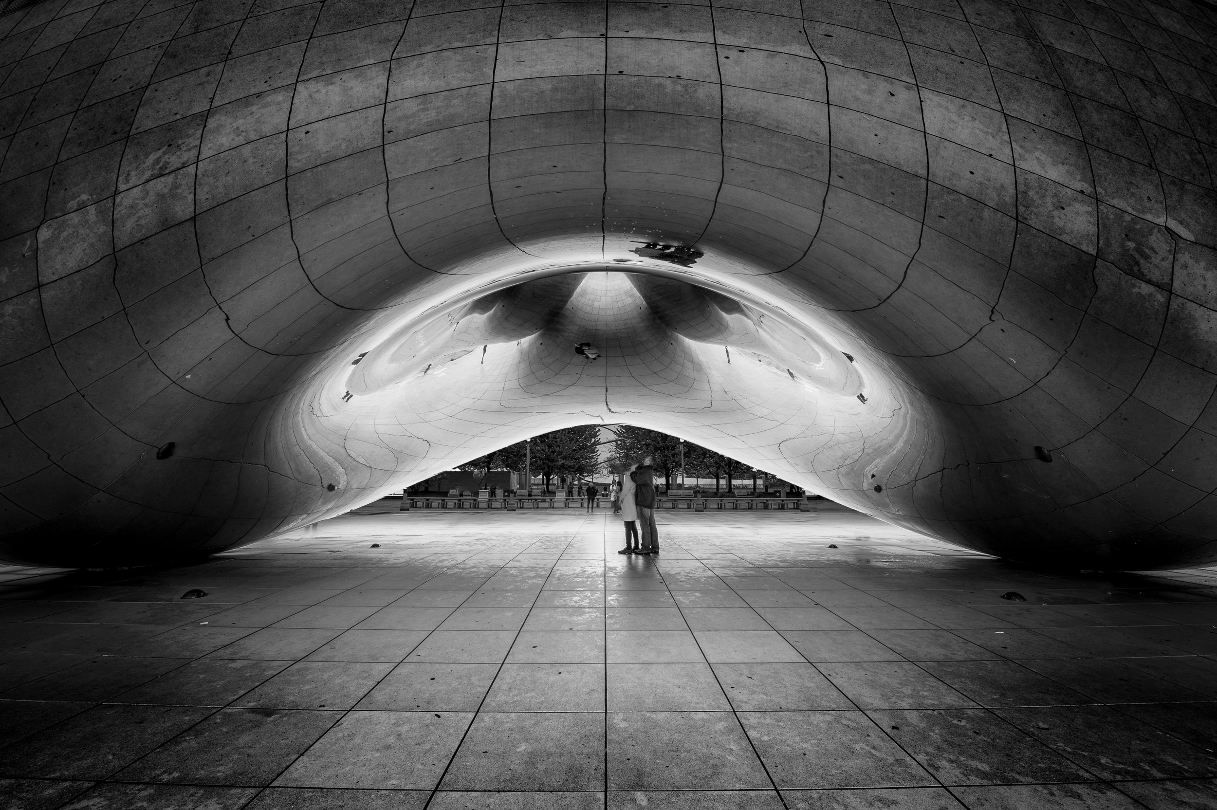
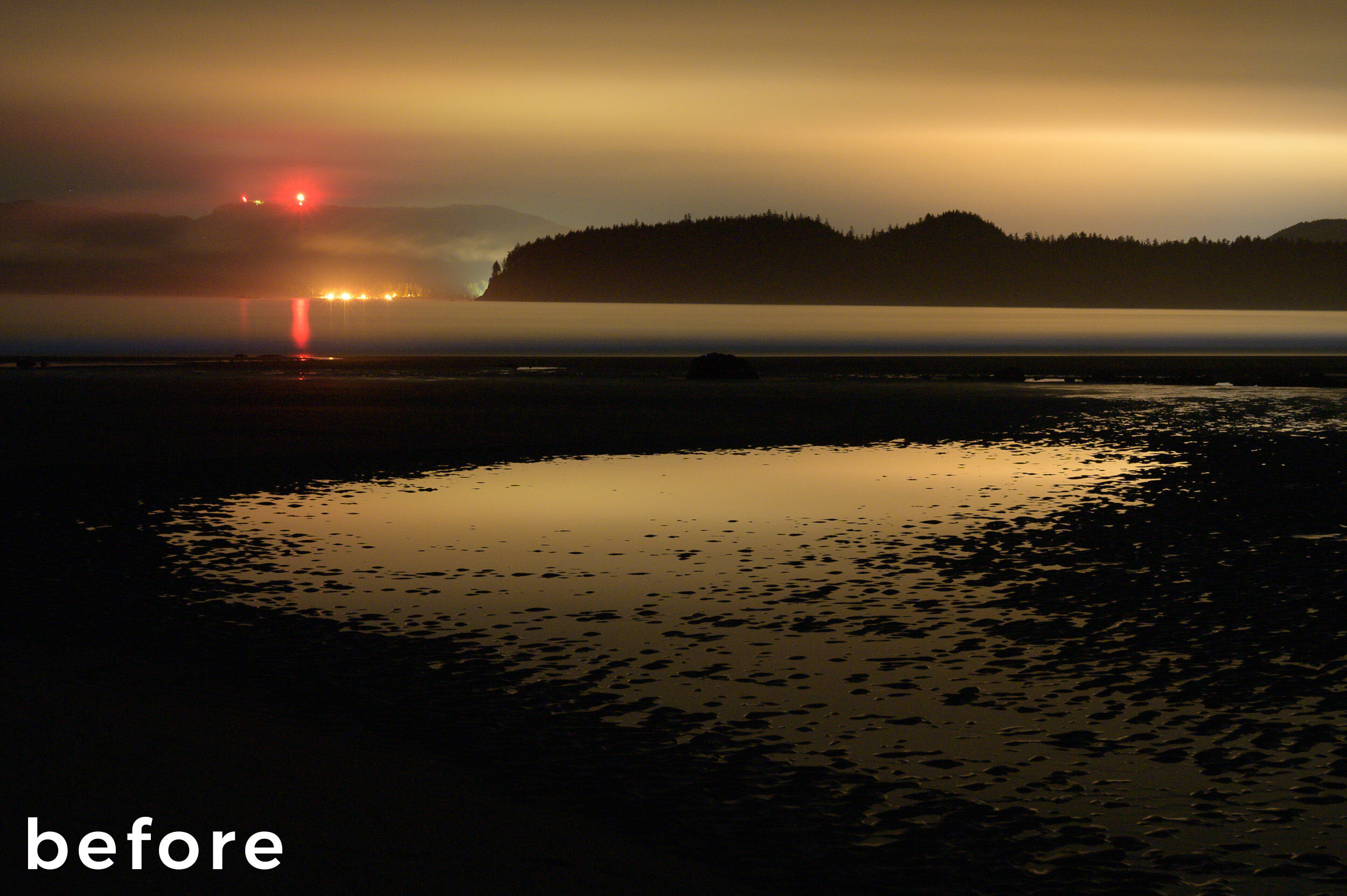
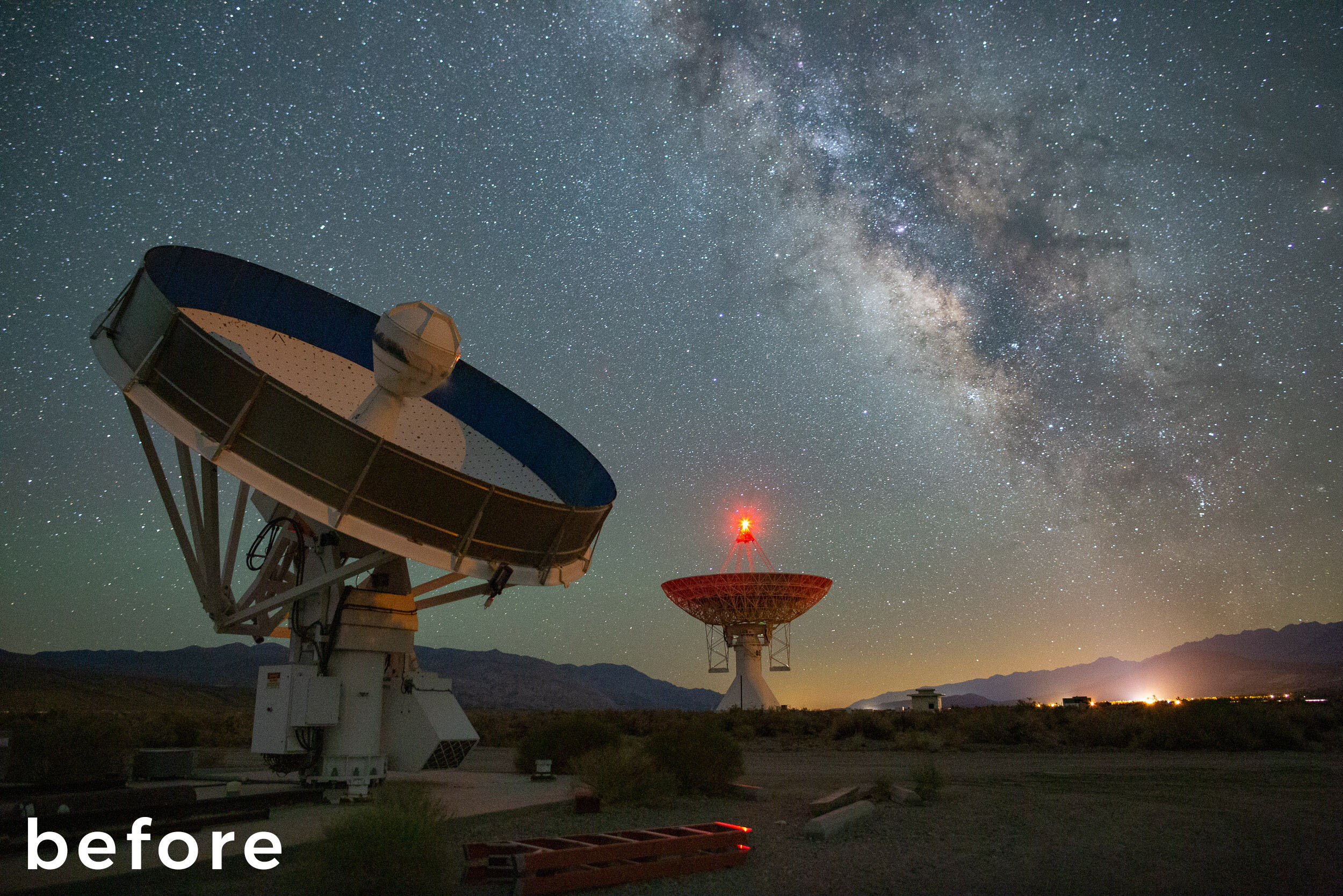
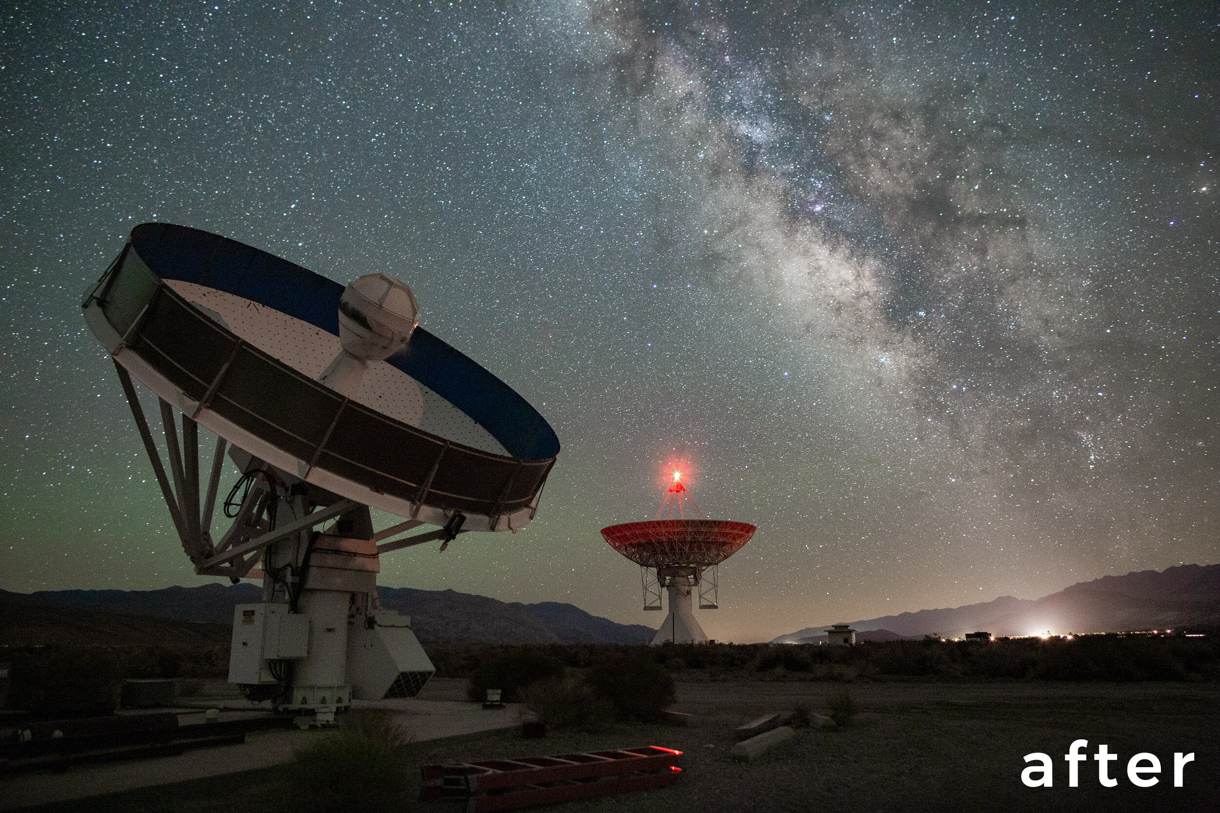
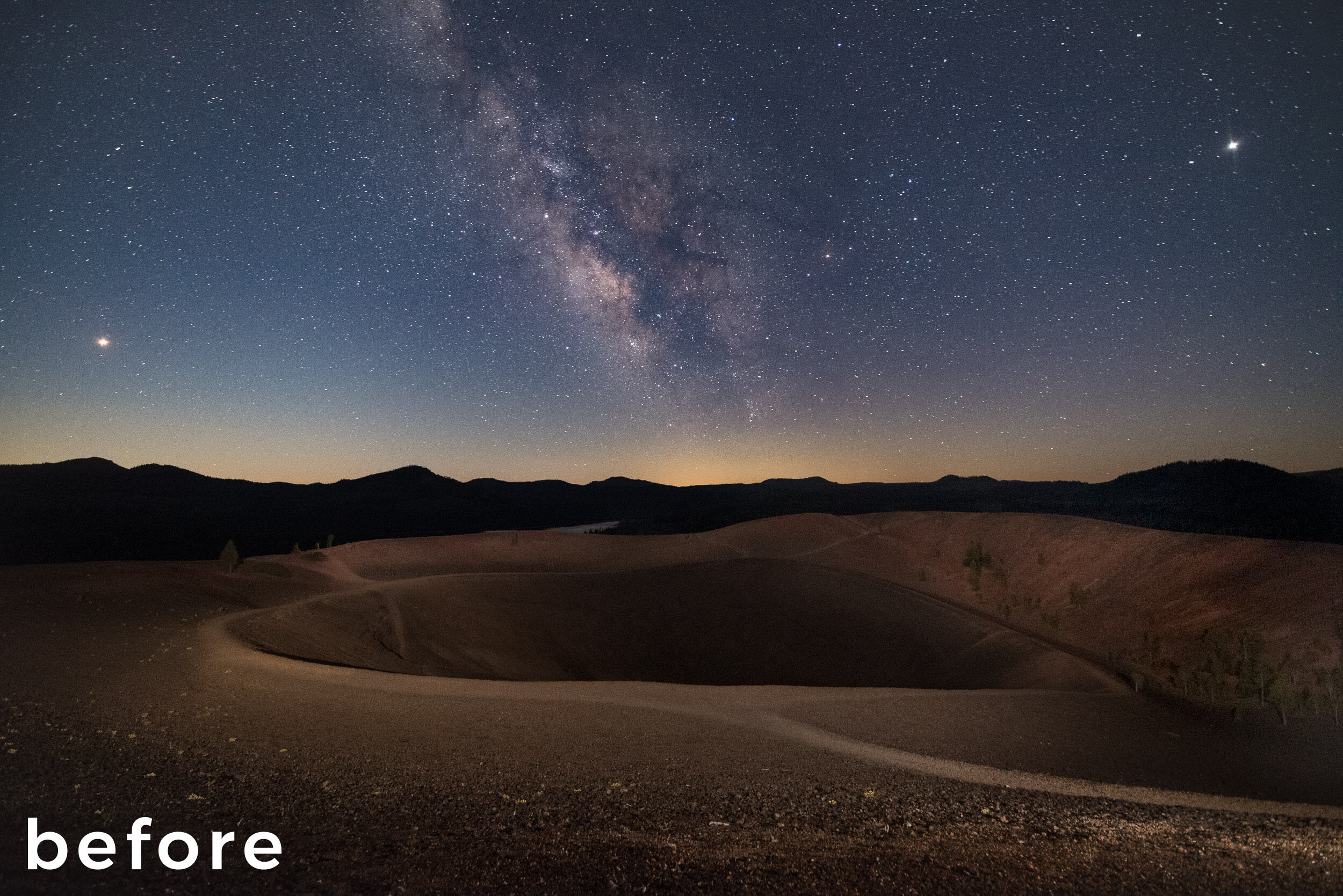
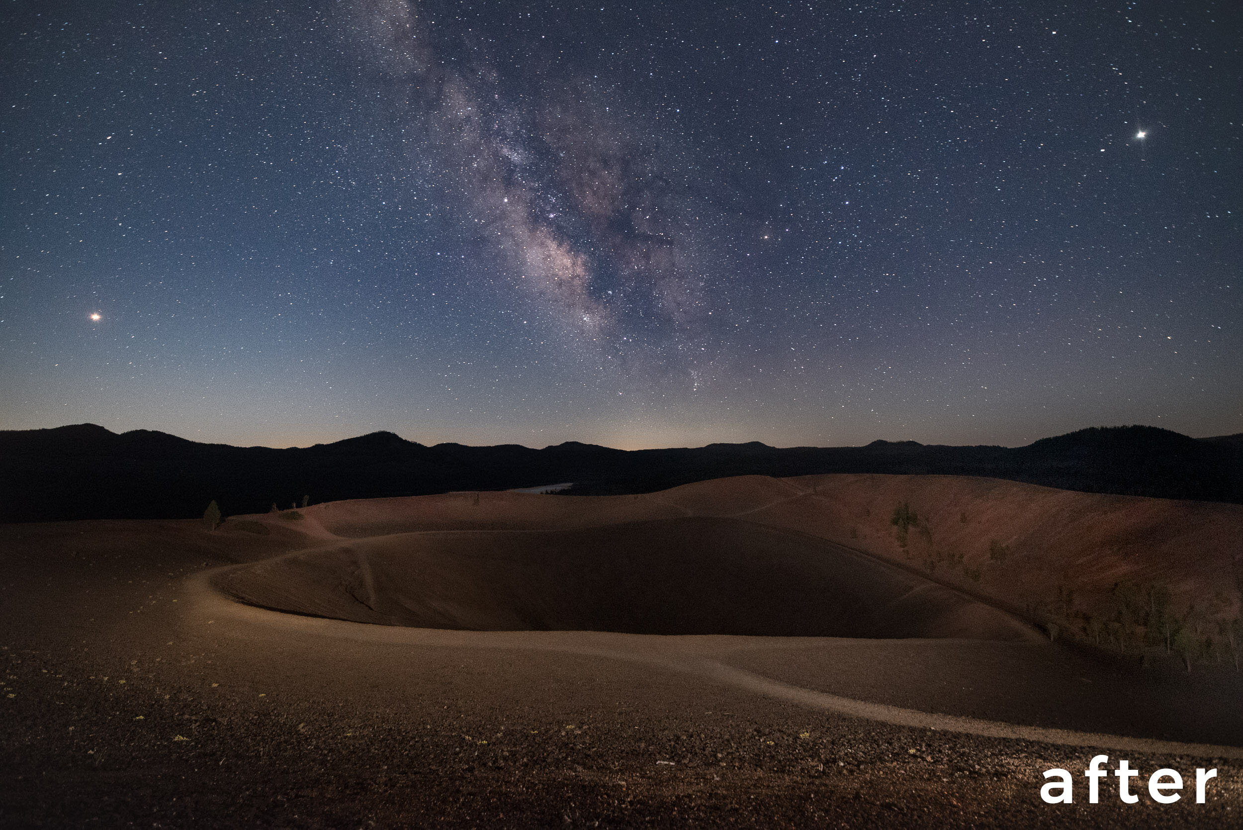
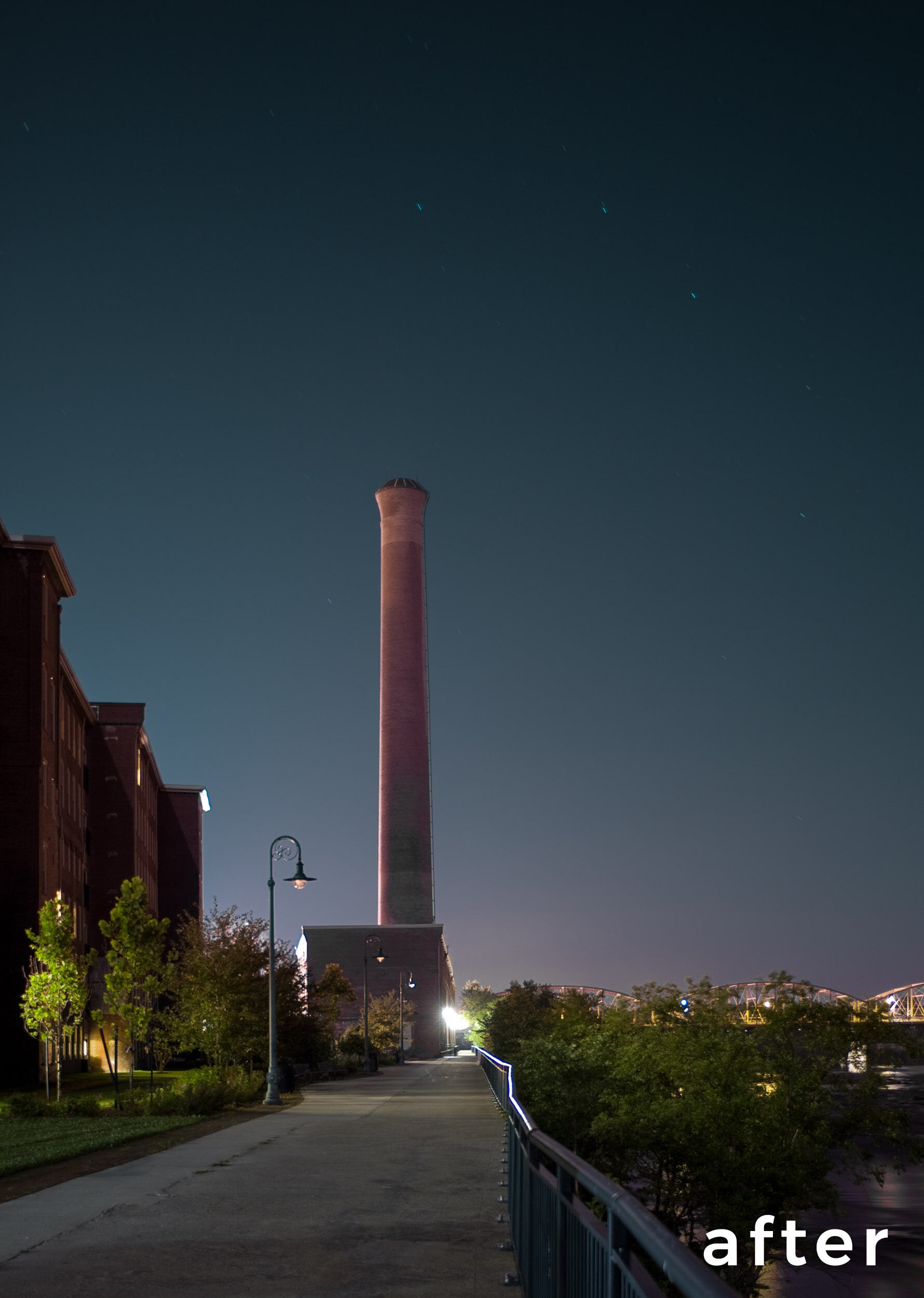
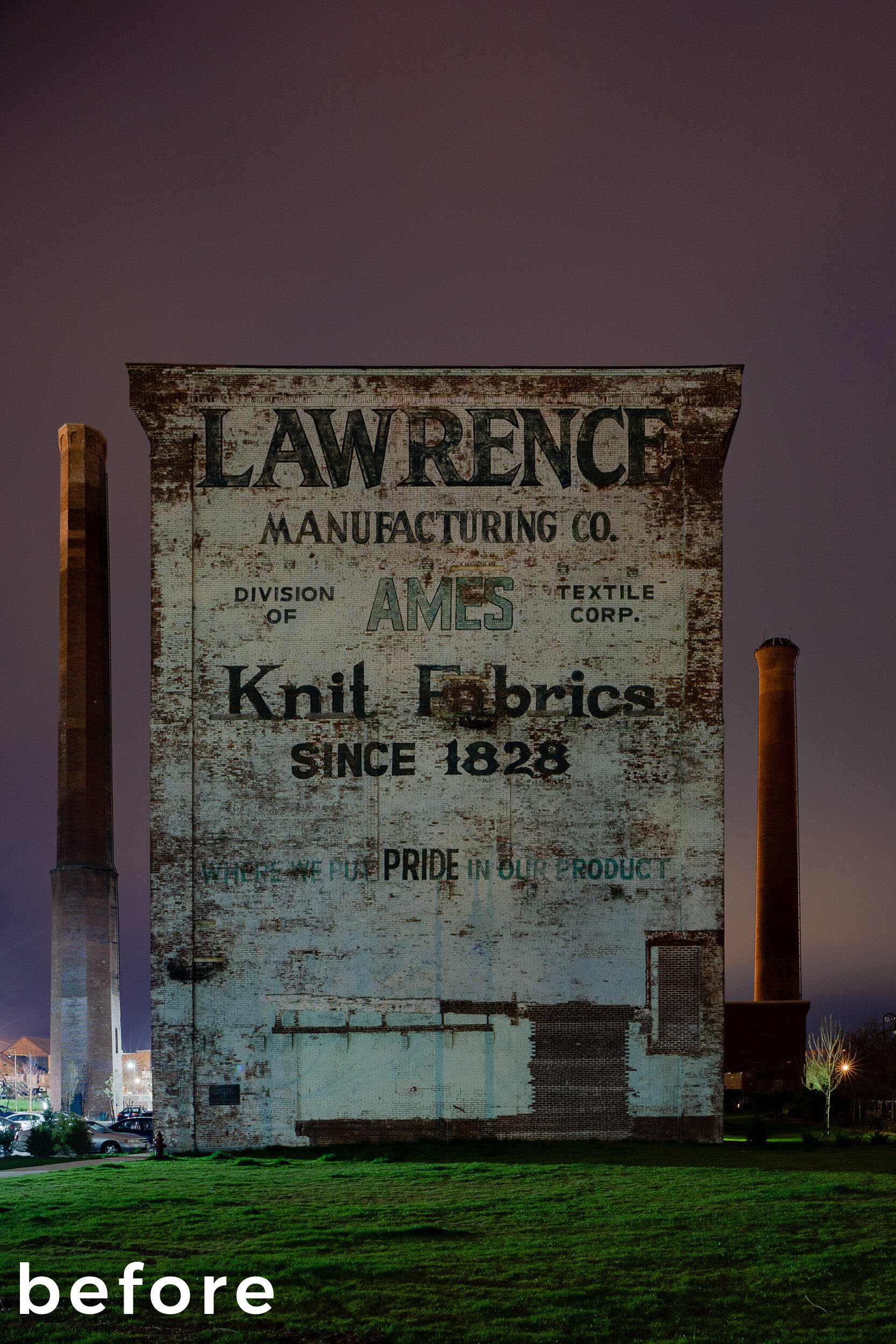
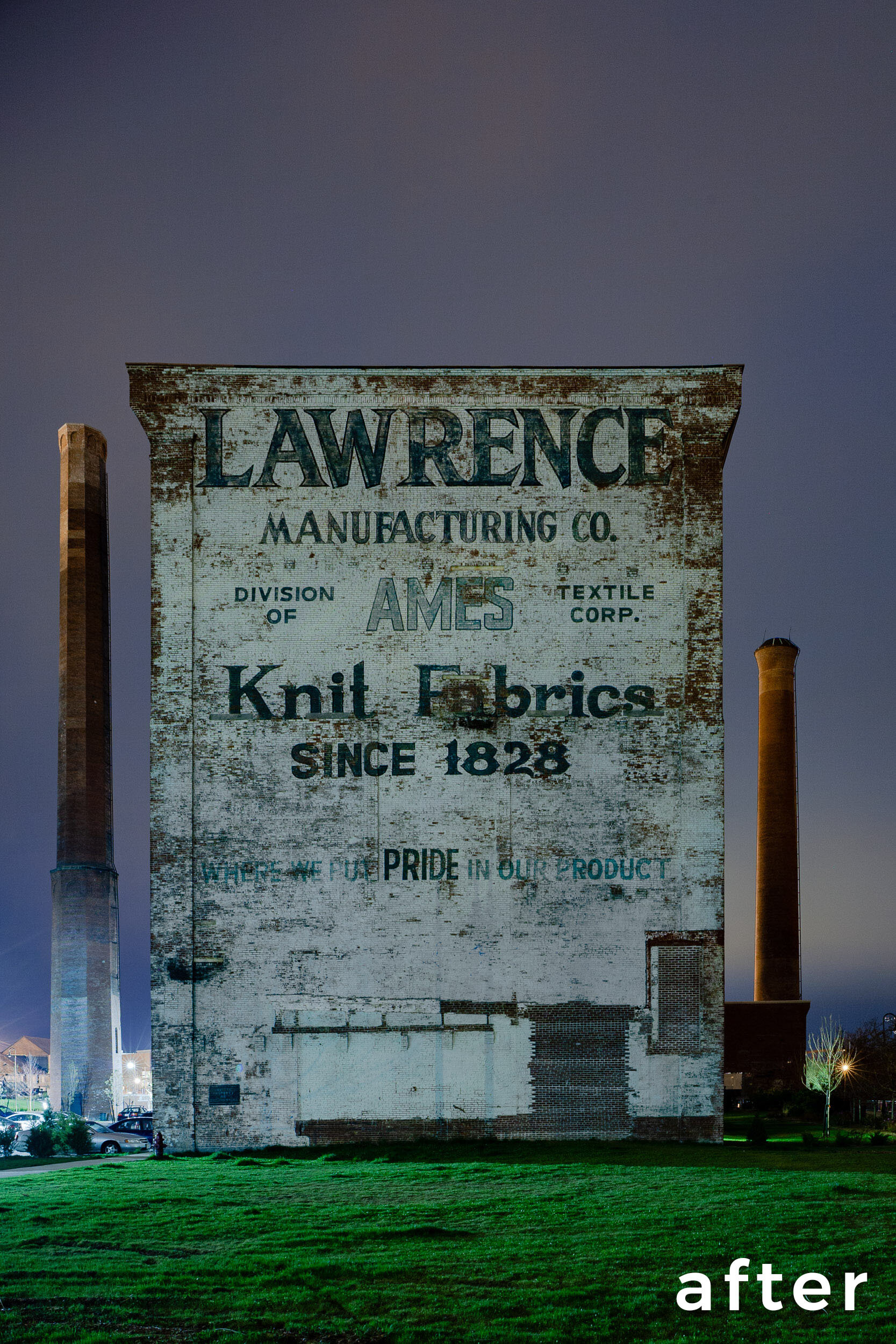
The new Lightroom selection and masking tools enable night photographers to make nuanced local adjustments more easily, more quickly and more effectively than before.

Even better is that these are now joined by the powerful new Select Subject and Select Sky tools, which are driven by artificial intelligence. We also now have the ability to select by color and brightness with the Color Range and Luminance Range selection tools. Moreover, we can add to and subtract from selections with ease, as well as invert and intersect them.

This update is an awesome upgrade for the night photographer and Lightroom user!

For the past ten days we’ve been delving into all these new and improved tools to see how they help night photographers in particular, and now we’re here to report back on our findings in a new video on our YouTube channel.

In This Video

In the video below, I illustrate several tips, including:

  • an introduction to the new Masks tool

  • working with your legacy local adjustments

  • creating masks using the new Select Sky tool

  • creating masks using the new Color Range tool

  • creating masks using the new Luminance Range tool

Plus … a New Course!

I hope you find the video above useful for learning how to harness the power of the new Lightroom tools to create better night photography. But honestly, to fully apply these new tools in a practical way requires more than a 20-minute video can adequately portray.

So for those who want to delve deeper, or for those who learn better in a give-and-take, question-and-answer environment with live demos and teaching, we’ve put together a brand new online course: Lightroom Live: Selections and Masks.

If you’re interested in jumping right in with these new Lightroom features, join us later this month (click the link above for dates and times). The cost is $99, and we’re limiting the class size to 12 to ensure that everyone has time to ask questions and to get more personalized assistance.

Your Turn

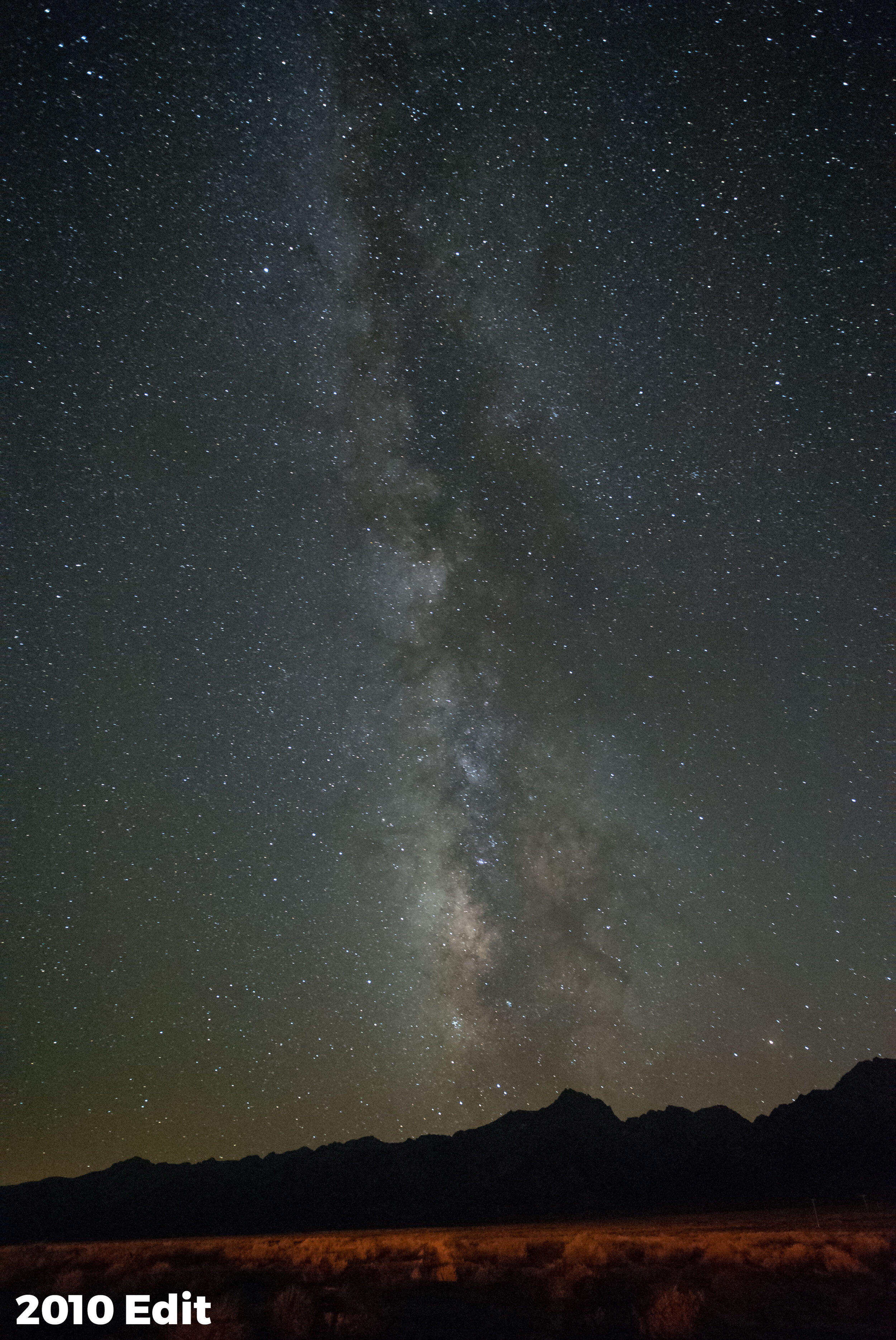
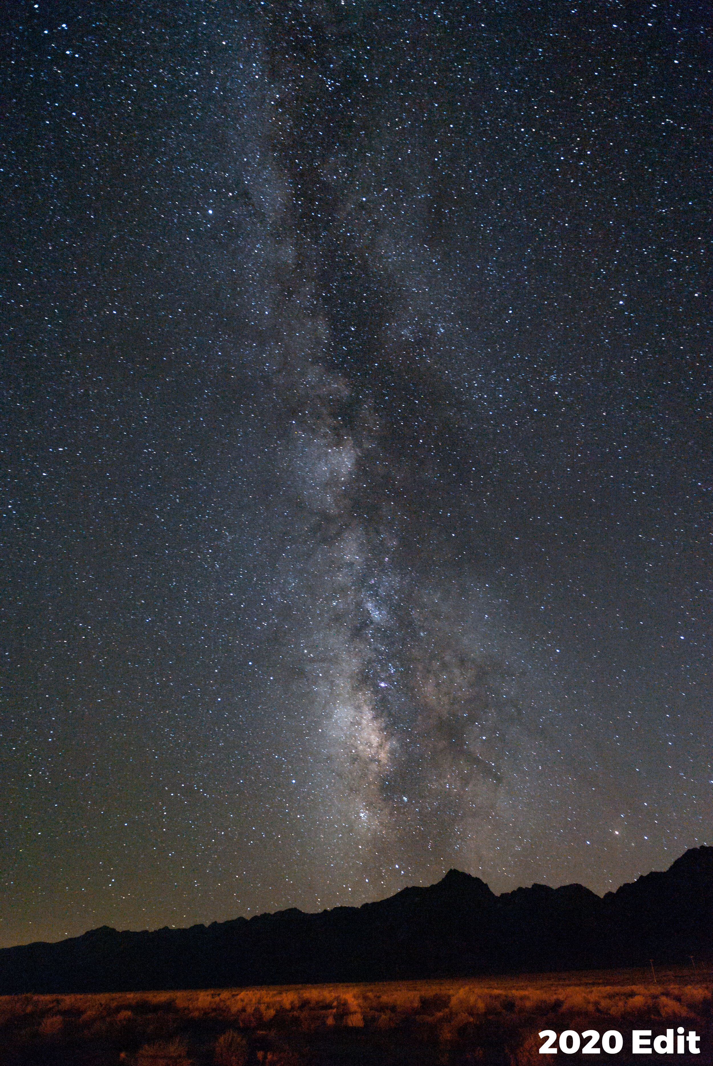
If you’re anything like us (and we know a lot of you are), then you’ve already been playing with these new masking tools, and you’ll be revisiting some old images to edit those even better. We’d love to see how you’re applying these new skills! Feel free to share an image in the comments, on our Facebook page or on Instagram (tag us @nationalparksatnight and/or hashtag us #nationalparksatnight).

Tim Cooper is a partner and workshop leader with National Parks at Night. Learn more techniques from his book The Magic of Light Painting, available from Peachpit.

UPCOMING WORKSHOPS FROM NATIONAL PARKS AT NIGHT

Size Matters: Understanding Image Resolution, and Why and When to Boost It

This week we’re showcasing post-processing. Want to learn even more about developing your digital photographs? Join Tim Cooper and Chris Nicholson on the Seattle waterfront this July for a weeklong Post-Processing Intensive workshop, including night shooting along the city shores of Puget Sound.


As we discussed in a recent blog post (“Supersize Me: Adobe Brings Us High-Quality Quadruple Enlargements”), Adobe’s new Super Resolution is a fantastic new tool to enlarge images for print. But how do you know when it’s needed? For a full understanding of image enlargement, we need to take a deep dive into file size, resolution and image resizing.

File Size and Resolution

The size of a file is talked about in several different ways. You could talk about the megapixels, megabytes or even file dimensions (width x length). For example, a photo from my Nikon Z 6 can be said to be a 25-megepixel file, or a 45-megabyte file, or a 6048 x 4024 file. In Figure 1 you can see how the Metadata panel in Lightroom shows a Z 6 image as having a file size of 44.93 megabytes and dimensions of 6048 x 4024.

Figure 1. Metadata panel in Lightroom.

If any of this seems unintuitive, then think of a piece of 4x8 plywood. It measures 4 feet wide and 8 feet long. Its area is 32 square feet. In addition, it has a certain weight.

Likewise, my Z 6 file is 6048 x 4024. It measures 6,048 pixels wide and 4,024 pixels high. Its area is 25 megapixels (6,048 pixels x 4,024 pixels = 24,337,152 pixels = 24.34 megapixels). Its “weight” is 44.93 megabytes.

Figure 2. 6048 x 4024 = 24.34 megapixels.

“Resolution” is the number of pixels in an image, expressed either as a total number or as dimensions (width x height). My Z 6 creates an image with a resolution of 25 million pixels (25 megapixels). But while megapixels is a great term for advertising camera models, as photographers we’re better served thinking in file dimensions.

Image Sizing

Screens and printers create images in very different ways. Screens are measured in pixels per inch (ppi) while printers are measured ­in dots per inch (dpi). Regrettably, these terms are often seen as interchangeable, even though they are not.

Screen Resolution

For example, my BenQ SW270C is a 27-inch monitor. Its resolution is 3840 x 2160. This means that the screen has 3840 pixels across its length and 2160 pixels from top to bottom.

Figure 3. Pixel dimensions of a BenQ SW270C photo monitor.

When you enlarge your image in Lightroom or Photoshop to 100 percent, you see only a portion of the photograph. This is because images from modern cameras have a higher resolution, or a higher pixel count, than the monitors they are displayed on.

At 100 percent magnification, one pixel on the monitor represents one pixel of the image. For this reason, 100 percent is sometimes called “actual pixels.” Figure 4 shows what is really happening behind the scenes: The image is much larger than the screen resolution can show at 1-to-1, so we see only the portion of the pixels that fit onto the screen.

Figure 4. The actual image size compared to the resolution of the monitor.

When you are viewing at 100 percent you are getting a very accurate view of the quality of your image. This is why it’s important to perform certain tasks such as noise reduction, sharpening and spot removal at this magnification.

These days tablets and phones are also used to view imagery. These devices have even less resolution than your computer monitor. Because modern cameras have such high resolutions, and because screens have comparably smaller resolutions, it’s very rare that you would need to enlarge or use Super Resolution on your photos just to view them on computer monitors or mobile devices.

Print Resolution

Printing, however, is a different story. Printers need a bigger file to create a quality image. To understand why, let’s look at the printer’s resolution. All printers (even the professional ones at labs) have a resolution of 300 dpi, with the sole exception being Epson printers, which print at 360 ppi.

The easiest way to understand the relationship between ppi and dpi is to look at the image in Photoshop’s Image Size dialog (Figure 5). To get there:

  1. In Lightroom select your image and choose Photo > Edit In > Edit in Adobe Photoshop.

  2. Once your image opens in Photoshop, choose Image > Image Size.

Figure 5. The Image Size dialog in Photoshop.

Notice the familiar pixel dimensions of 6048 x 4024. To see how large a print you can make from this file (without enlarging), simply change Pixels to Inches, and enter the ppi of your printer in the Resolution field. In this case (Figure 6), I can see that I could make a print of 13x20 inches on a 300 dpi printer without having to enlarge the image. (Or, as we see in Figure 7, I could make an 11x17 print on a 360 dpi Epson.)

Figure 6. This file could be printed at 13x20 on most printers.

Figure 7. The same file could be printed at 11x17 on an Epson printer.

Resizing Your Photographs

Changing the size of your images is completely normal. It actually happens often without you even realizing it. If you send a full-size JPG to Bay Photo and ask them to make a 30x45 print, they resize it. Every time you upload an image to Instagram, unless you specifically pre-size your image to 1080 pixels square, then it’s resized for you. Images you see on any website have all been resized.

Simply put, resizing is either throwing out or adding pixels to an image to make it fit its eventual use.

For example: Instagram currently displays images at a resolution of 1080 x 1080. To display my Z 6 image of 6048 x 4024 pixels on Instagram, it needs to be downsized (throwing out pixels). Conversely, to make a 30x45 print on a 300 dpi printer, my native resolution (as we saw in Figure 6) of 13x20 is not enough. I’d need to upsize it (adding pixels).

The act of upsizing or downsizing is also called “resampling.” Resampling can be done to an image in Photoshop or when exporting from Lightroom.

Resizing in Photoshop

When you want to resize an image using Photoshop, open the Image Size dialog seen in the above examples. If the Resample box is checked, then changing the pixels or inches will add or remove pixels from the image. Figure 8 shows that with the Resample box checked, changing the pixels to 1080 in width downsizes the image from 139.3 megabytes to a mere 4.44 megabytes.

Figure 8. The Image Size data shows how changing the width to 1,080 pixels downsizes the file from 139.3 megabytes to 4.4 megabytes.

Likewise, if you were making a print, you would open the Image Size dialog, change Pixels to Inches, and type in the desired width or height. Figure 9 shows that changing the height of this image to 30 inches will enlarge the file (adding pixels) from its original size of 139.3 megabytes to 696.6 megabytes.

Figure 9. The Image Size data shows how changing the height to 30 inches upsizes the file from 139.3 megabytes to 696.6 megabytes.

Notice that the aspect ratio in both cases has stayed the same. This image (as with most digital cameras) has an aspect ratio of 2x3. As long as the chain icon (circled in red in Figure 10) stays locked, then changing either the height or width will also change the other proportionally.

Figure 10. The chain icon on the left is locked, which keeps the aspect ratio constant. On the right the chain is unlocked, meaning you could disproportionately squeeze or stretch your image while resizing.

Resizing in Lightroom

If you want to resize with Lightroom instead, then you need to export the image (Figure 11):

  1. Select your image and choose File > Export, or click the Export button at the bottom left of the screen.

  2. In the Image Sizing section, check the Resize to Fit box and type your desired pixel length.

Figure 11. Exporting and resizing an image using Lightroom.

You have many choices within the Image Sizing box (Figure 12). If you want to size an image to use it on a screen (such as a monitor, website, Instagram, etc.), then all you care about is the number of pixels—the Resolution section, or pixels per inch, is irrelevant. Whether that’s set at 72 or 300 will have zero impact on your file and how it appears on a screen.

Figure 12. Options for resizing within the Image Sizing box.

However, if you want to size that file for print, then the Resolution section of this dialog becomes very important. Here’s the process:

  1. Select your image and choose File > Export, or click the Export button at the bottom left of the screen.

  2. In the Image Sizing section (Figure 13), check the Resize to Fit box and change “pixels” to “in” (i.e., inches).

  3. Type your desired length.

  4. Choose either 300 or 360 for Resolution (to match the dpi of the printer).

Figure 13. The proper settings for enlarging a file to make a 30x45 print for a 300 dpi printer.

As we saw earlier, if I wanted to use a file from my Z 6 to make a print larger than 13x20 on a 300 dpi printer, or 11x17 on an Epson printer, then I would need to upsize that file. Of course, if I crop the file, then I might need to upsize even for smaller print sizes. Figure 14 shows the same file that has been cropped. Now I could make only a 10x15 print—for anything larger, I would need to add pixels by resampling.

Figure 14. Our example image has been cropped. Now the maximum print size would be 10x15 at 300 dpi. If I wanted to print larger, I would need to upsize the cropped photograph.

Super Resolution

The problem with all of this is that from the beginning of digital photography, enlarging, or resampling, has been an obstacle. No one has yet found a way to add pixels to the resolution of an image that results in the same quality as the original, smaller file.

But programmers have always been chasing that goal. In the late 90s, third-party solutions such as Genuine Fractals were the answer. Then Photoshop caught up, and could produce the same quality with its upsizing algorithm. Then Adobe made that even better with the Preserve Details tool. All of these options (and more) were better than the previous best options, and that improvement continues with Super Resolution.

In short, Super Resolution is a superior way to enlarge your images, in the cases where you need to do so—which, as you’ve seen above, is only when you are making large prints.

A trip to Photoshop’s Image Size dialog will give you all of the information that you need to make the decision to upsize or not. If the answer is yes, then, for the best results, refer to my previous post on using Super Resolution.

And then what comes next? Keep an eye out for another upcoming post on this topic, wherein we’ll further explore image upsizing and demonstrate how to properly sharpen your upsized images for printing.

Tim Cooper is a partner and workshop leader with National Parks at Night. Learn more techniques from his book The Magic of Light Painting, available from Peachpit.

UPCOMING WORKSHOPS FROM NATIONAL PARKS AT NIGHT

Supersize Me: Adobe Brings Us High-Quality Quadruple Enlargements

This week we’re showcasing an exciting new feature from Adobe. Want to learn even more about developing your digital photographs? Join Tim Cooper and Chris Nicholson on the Seattle waterfront this July for a weeklong Post-Processing Intensive workshop, including night shooting along the city shores of Puget Sound.


The folks at Adobe have done it again. They’ve taken a good process and made it even better. This time they have made use of advance machine learning to drastically increase the quality of enlarged images in a new process called Super Resolution.

If you’ve been paying attention to news in the photography world this past week, then you already know all of that. But what we wanted to know is this: How well does Super Resolution work with night photos?

Let’s have a look …

What is Super Resolution?

Super resolution is a new process that enlarges your image files while maintaining (creating!?) an extremely high level of detail. (For more info, see Adobe’s explanation.)

Over the years, Adobe has done a great job of tweaking and creating new algorithms for enlarging image files, but this time they have outdone themselves. A direct side-by-side comparison of enlarged photographs shows the superiority of this new process, even in finicky long-exposure and high ISO images. You can see the difference between the newer Super Resolution files and the same files upsized with Adobe’s previous enlargement algorithm, Preserve Details (enlargement), in Figures 1 through 3. (These are best viewed on a larger display to more clearly differentiate the results.)

Figure 1: Lighting painting, ISO 200. This shows an upsized image at 100 percent (actual pixels), enlarged with both the old method and with Super Resolution. (Click to enlarge.)

Figure 2. Milky Way, ISO 6400. The traditionally upsized version appears a slight bit sharper, but the Super Resolution version shows much better grain structure. It’s always easier to add a bit of sharpening as opposed to trying to reduce noise, so again Super Resolution wins. (Click to enlarge.)

Figure 3. Moonlit landscape, ISO 6400. In this comparison the Super Resolution version shows better sharpness and a smoother sky.

As you can see in the above examples, overall the new process produces better detail and smoother gradients in the areas with less detail. Super Resolution does seem to add a bit more color noise in the shadows, but that’s easily remedied.

Who Needs Super Resolution?

While this is an awesome new feature, you may not have to use it all that often. You typically need to enlarge images only when making prints. Even the resolution of older cameras exceeds what’s needed for posting on websites and social media. So when you’re Instagramming, you don’t need this. But if you are making large prints from your files, you might want to use Super Resolution to upsize the file before you send it out or send it over to your home printer.

Another possible use would be upsizing images that have been dramatically cropped. I’m not talking about trimming a bit around the edges or cropping your image into a square, but rather a severe crop (you know, the kind of crop that you feel guilty about). Super Resolution can get those files back up to a more usable size.

How to Use Super Resolution

At the time of this writing, Super Resolution is available only through Adobe Camera Raw (ACR), but will soon be available in Lightroom as well. (We’ll keep you up to date. Be sure to watch our Facebook channel for the announcement.)

1. Launch Photoshop and choose File > Open.

2. Navigate to the desired RAW file and choose Open. This will open the image into the ACR editor (Figure 4).

Figure 4. Resulting ACR dialog after opening your RAW image in Photoshop.

3. Control-click (Mac) or right-click (PC) on the image and choose Enhance (Figure 5).

Figure 5.

4. In the resulting dialog, choose Super Resolution and then click Enhance in the lower right corner (Figure 6).

Figure 6. The Enhance Preview dialog.

5. Photoshop will create a new image from the original RAW file that is twice as tall and twice as wide as the original. Click on the resulting image to highlight it, then click Open in the lower right corner (Figure 7) to open the image into Photoshop.

Figure 7.

At this point you are back in Photoshop with an image that has four times as many pixels as the original, and is ready to be edited or printed.

Now What?

If you are ready to print through Photoshop, you are all set. File > Print will bring up all of the necessary dialogs for you to make a print on your home printer.

If you want to send out this file to a professional print house such as Bay Photo Lab, simply choose File > Save. A dialog will offer options of file type and location. I suggest saving the file in Photoshop format (i.e., PSD, for future use) and as a JPG to send to the lab. To keep things organized, save the file back into to its original folder.

At this point, Lightroom may not be aware that a new photo has been created from the original. If you would like to be able to access the image via Lightroom, open your catalog and navigate to the folder with the newly created file. In the Library module, Control-click (Mac) or right-click (PC) on the folder in the Folders panel and choose Synchronize Folder. Lightroom will see your new image and make it accessible.

If you want to just make a print, you can simply navigate (outside of Lightroom) to the folder with the new file, select the image and upload it to the printer of your choice.

The Long and Short of Super Resolution

Super Resolution is awesome—for making large prints. It is not a tool that is needed on a day-to-day basis. If you want to upsize an image to make a large print (say, 20x30 inches or larger), this should be your go-to tool. Likewise, if you have an image that has been severely cropped, Super Resolution can be a good way to regain the resolution needed to display the image as you envisioned.

Note: This blog post is a quick reference on how to use Photoshop’s new Super Resolution upsizing algorithm. It begs a lot of related questions, such as, “When is your current resolution not enough?” or even “What is upsizing?” For a deeper dive into understanding resolution and upsizing, keep an eye on our blog.

Tim Cooper is a partner and workshop leader with National Parks at Night. Learn more techniques from his book The Magic of Light Painting, available from Peachpit.

UPCOMING WORKSHOPS FROM NATIONAL PARKS AT NIGHT

How to Deal With Light Pollution, Part II: Post-Production

Note: This is the second in a three-part series about one of the most common questions we get: How do you deal with light pollution? We have three answers: with filters, with post-processing, with creativity. In this week’s blog post, Lance Keimig discusses the second of those solutions: processing in Lightroom.


Last week, Matt wrote about his experiences testing a couple of light pollution filters, and he showed how they can be useful for neutralizing color casts in clouds from artificial lights, in reducing atmospheric haze, and especially for taming the beasts known as sodium vapor lights.

He showed that the two filters he tested work primarily by filtering out a narrow band of intensely orange light that is particular to sodium vapor lights. Before the widespread adoption of LED street lighting, high pressure sodium vapor was the most common form of street lighting used worldwide. These lights are still quite common, and until they are eliminated altogether, light pollution filters will probably be the first line of defense against the color shifts they cause in photographs.

The image above is a good example of the types of artificial light sources that cause light pollution. The intensely yellow lights are low pressure sodium vapor, and the others in the scene are high pressure sodium vapor. Canon EOS 6D with a Nikon 28 mm f/3.5 PC lens. 6 seconds, f/8, ISO 200.

When we consider the problem of light pollution in night photography, there are two conundrums:

  1. unwanted color casts in the clouds and in the sky

  2. stray light that obscures the stars in our images

Light pollution filters can address both of those issues, providing that the bulk of the light pollution is from sodium vapor lights.

However, if you don’t use a light pollution filter, post-processing offers an alternative method to correcting unwanted color casts from light pollution in night photographs. In this post and the accompanying video (you can jump to it here), I’ll show you examples of how you can employ post-processing techniques to minimize unwanted color casts from light pollution. All of these examples utilize Lightroom Classic’s White Balance, Hue, Saturation and Luminance (HSL) and local adjustment tools to achieve the desired effects.

The first example (Figure 1) is one that I made last year during our Shi Shi Beach adventure in Olympic National Park. In this case, the lights from Victoria on Vancouver Island reflected off the low cloud cover and turned the sky yellow. A simple white balance adjustment took care of the yellow, and then a little HSL work with the targeted adjustment tool helped with the red and magenta from the beacon on the hill. I could not remove all of the red and still have the image look natural, so I just toned it down a bit.

Figure 1. Light Pollution over Vancouver Island. Nikon Z 6 with a Nikon Z 24-70mm f/4 lens. 693 seconds, f/5, ISO 800.

I made the next image (Figure 2) at the Owens Valley Radio Observatory in California. Light pollution on the horizon to the south shows a yellow glow from sodium vapor lights. HSL adjustments took care of removing the unwanted yellow from the image.

Figure 2. ORVO and Milky Way. Canon EOS 6D with a Nikon 20 mm f/3.5 AIS lens. 20 seconds, f/4, ISO 6400.

The image from Lassen Volcanic National Park (Figure 3) also had yellow light pollution at the horizon, but also a fair amount of yellow and orange in the soil at the foreground, so an HSL adjustment would have affected more of the image than needed. In this case, I used a local adjustment brush and desaturation to solve the problem.

Figure 3. Cinder Cone, Milky Way, Jupiter, Saturn and Mars. Nikon D750 with an Irix 15mm f/2.4 lens. 25 seconds, f/3.2, ISO 6400.

Dealing with light pollution in urban environments tends to be a bit more involved, and also subject to taste in how the image is presented. Below are two examples from Lowell, Massachusetts, an environment primarily lit by sodium vapor with a host of other light sources thrown in for good measure. For this first one (Figure 4), I used a gradient on the sky to remove the color cast without affecting the foreground.

Figure 4. Lawrence Mills, Lowell, Massachusetts. Canon EOS 5D with a Nikon 28mm f/3.5 PC lens. 74 seconds, f/8, ISO 100.

In this last example (Figure 5), setting the white balance by using the eyedropper on the clouds eliminated the color cast from the ambient sodium vapor lights, but exaggerated the cyan from the metal halide lights on the structure. A selection with the local adjustment brush enabled me to desaturate the cyan on the building without affecting the rest of the image.

Figure 5. Lawrence Mills, Lowell, Massachusetts. Canon EOS 5D with a Nikon 28mm f/3.5 PC lens. 73 seconds, f/8, ISO 100.

Video Tutorial

In the video below, I offer more detail on how I accomplished the edits I mentioned above, walking you through all the steps for achieving the same results in your own photos affected by light pollution.

Wrapping Up

As you can see, if you don’t have a light pollution filter, or even if you do, post-processing techniques offer another option for dealing with light pollution in nocturnal images. The techniques are most effective at minimizing color casts from gas discharge lights such as sodium or mercury vapor, or metal halide lights.

However, be aware: If the stars are obscured by scattered light in the atmosphere and are thus not recorded by the sensor, no amount of post-processing can bring them back. However, judicious use of the Dehaze slider will help bring out the stars that are present, and can also compensate for the loss of contrast from light reflected off of particulates in the low atmosphere that are the source of the problem.

In Part 3 next week, Chris will write about learning to live with light pollution in night images, and how to turn a hindrance into an unexpected bonus. Stay tuned, as the more tools you have at your disposal, the better your chances of a successful image regardless of the light conditions!

Lance Keimig is a partner and workshop leader with National Parks at Night. He has been photographing at night for 35 years, and is the author of Night Photography and Light Painting: Finding Your Way in the Dark (Focal Press, 2015). Learn more about his images and workshops at www.thenightskye.com.

UPCOMING WORKSHOPS FROM NATIONAL PARKS AT NIGHT

Keeping Our Galaxy Real: How Not To Overprocess the Milky Way

Note: This post concludes with a video of Gabe walking through how to process a realistic-looking Milky Way. Want to jump straight to that? Click here.


Do you remember the first time you saw the Milky Way?

So few of us have access to starry skies that the wow factor was undoubtedly very high. What you saw on the back of your camera and then on your monitor was even more exciting, and in this excitement you probably pushed your post-processing to bring out the stars just a bit more … and just a bit more … and just a bit more … and. …

This is a very normal and common experience. However, taken too far, it also detracts from reality—many of the night images we see online simply do not reflect what the Milky Way actually looks like.

In this post, I aim to help you process your Milky Way shots in a more natural and realistic way.

Milky Way panorama. Nikon D750 with a Nikon 14-24mm f/2.8 lens at 14mm. Seven stitched frames shot at 30 seconds, f/4, ISO 6400.

Star Witnesses

If you search the 3 million images tagged #milkyway on Instagram, you’ll notice that over 80 percent of them are overprocessed.

What do I mean by that? In those images, the Milky Way looks very unrealistic—too contrasty, over-sharpened and full of colors that jump out at you. In short, it looks like no Milky Way we have ever seen in the actual sky.

Yet the likes and positive comments pile on! Why is this?

The general public is still unfamiliar with what the Milky Way really looks like. Their only experience with it is what they see online. The Milky Way still has a high wow factor, and as technology and post-processing techniques become more powerful, photographers can eke out all sorts of additional detail. The problem is that so many eke out every detail.

We want to bring a realistic vision back to the Milky Way. The Milky Way should be the chorus to your song, but all good songs have a gradual build: highs and lows that build to that chorus. A good photograph should guide us throughout the whole image with a similar tempo.

Below is an example of a Milky Way image that is processed naturally versus one overprocessed in a way that’s commonly seen on the web. Note that in the overprocessed version the tonal range is not as smooth, the colors are too punchy, and there is very little separation between the Milky Way and the stars that surround it.

The left version might look "wow," but the right is closer to what the Milky Way actually looks like. Nikon Z 6 with a Nikon 14-24mm f/2.8 lens at 14mm. 15 seconds, f/2.8, ISO 12,800.

Avoiding Overprocessing

Most overprocessing pitfalls can be rectified by fewer global adjustments and more local adjustments. I know the global tools in Lightroom’s Basic module are right there and ready to use. But the astro-landscape photo is made of two different elements of exposure: the sky and the landscape. They often require different considerations on how to process them.

Globally applying Dehaze because it will successfully enhance your sky could very well have an adverse effect on the colors and shadows of your foreground. Unless your foreground is a silhouette, it’s best to think of your Milky Way image as two images and process them accordingly with local brushes and gradients.

If you are working under dark skies with little to no moonlight, you might even consider shooting two images: one correctly exposed for the stars and another longer exposure that reveals detail in the foreground. (I covered this type of blending of two images in my previous blog and video about Starry Landscape Stacker.)

An example of a blended image. First I shot a lower-ISO long exposure during civil twilight for the foreground, then a higher-ISO sharp-star exposure for the background, and layered the two in post-production. Being able to process the foreground and background separately allowed me to maintain a more realistic Milky Way. Hasselblad X1D with a Hasselblad 30mm f/3.5 lens. Foreground: 6 minutes, f/4, ISO 800; background: 23 seconds, f/4, ISO 6400.

Presence Sliders in Lightroom

Texture, Clarity and Dehaze are very attractive tools, as they can increase local contrast in a scene and really make an image pop. However, overusing them can lead to crushed shadows and unwanted shifts in color (as seen in the blog post linked above).

Think of these three adjustments as coming with great responsibility. To understand what they do, crank them to 100 percent, then slowly bring them back, and toggle between your full view and 100 percent to see how they fundamentally affect your image. Then when processing, use them judiciously.

presence.jpg
  • Texture

The newest filter in Lightroom (and the one I am most enamored by) increases sharpness without amplified grain or saturation. However, when overused, every star is sharpened and jumps out in the sky. This can compete too much with the Milky Way as well as falsely make every star look as bright as the next.

Depending on the scene, I like to add 3 to 8 points of Texture to my Milky Way by using a brush to add the effect locally. If I go above 10 on Texture, I really need to examine the effect at 100 percent zoom to make sure I’m not overdoing it. (However, that threshold applies only to the sky. If I have a well-lit rocky landscape, Texture is just what the doctor ordered to enhance the granularity of those rocks—for that I might use anywhere between 20 and 60 points.)

  • Clarity

I often use Clarity in lieu of the Contrast slider. I’ll adjust my white and black points first. Then, if the Milky Way needs more punch, I’ll slide Clarity to anywhere from 5 to 25. However, I always keep an eye on the top corners of my image, as Clarity quickly heightens any vignetting and can make smooth graduations in the sky seem choppy.

  • Dehaze

Brings contrast and saturation to an image. The former is great for boosting the low contrast that is often found in night skies. But keep an eye on that saturation—that’s where blues get wonky real quick. I never apply Dehaze globally; I typically apply it only via the Graduated Filter tool. My Dehaze adjustments can vary depending on the scene, but they usually range between 10 and 30.

It is also very important when you are combining global and local adjustments to remember that they build on top of each other. If you’re not precise in your workflow, you might get stuck fighting back and forth between how your global and local adjustments overlap and affect each other, sending you down the road of overprocessing. To avoid this, hone your global adjustments first, and only then start with the local changes to your Milky Way.

Another important thing to keep in mind is that our editing tools grow and change over time. I love Texture, but just a few years ago that tool wasn’t even in my imagination. It didn’t exist until about this time last year! Be sure to always keep a lookout for innovations in Lightroom that you can use to make your images better and better.

For example, I recently revisited the very first successful Milky Way image I’d ever shot. I hadn’t overprocessed then, but I had processed it with Lightroom 3 (below, left). That was a great program for its time, but it had some limitations compared to what’s on my computer today. Now, using Lightroom Classic 2020 (below, right), I get some finer detail out of the file.

Shot in 2010 with a Nikon D700 with a Zeiss 21mm f/2.8 lens at 30 seconds, f/4, ISO 6400. Left: Processed in Lightroom 3 with +12 Clarity, +11 Vibrance and +20 Luminance Noise Reduction. Right: Processed in Lightroom Classic 2020 with more subtle local adjustments, less noise reduction and more magenta.

Putting it All Together

I made this video that walks through my considerations for processing the Milky Way in a more natural way. I point out the sliders that we might slip too far on, and I share my Milky Way brush technique for subtly bringing out the finer details.

Now, if you’re one of the overprocessing culprits … First, know that you have a lot of company. But second, know there’s a better way, and we’re happy to help.

Stop processing the Milky Way with a hammer and a bucket of paint, and then share your images with us below in the comments. Or, better yet, share them online on Facebook or Instagram! Tag @nationalparksatnight and let’s educate the world on what the natural Milky Way really looks like!

Gabriel Biderman is a partner and workshop leader with National Parks at Night. He is a Brooklyn-based fine art and travel photographer, and author of Night Photography: From Snapshots to Great Shots (Peachpit, 2014). During the daytime hours you'll often find Gabe at one of many photo events around the world working for B&H Photo’s road marketing team. See his portfolio and workshop lineup at www.ruinism.com.

UPCOMING WORKSHOPS FROM NATIONAL PARKS AT NIGHT