Night Photography Blog — National Parks at Night

Adobe Lightroom

Live, in Front of an Online Audience: National Parks at Night!

In early March, Gabriel Biderman and I jetted over the Atlantic to run our first international trip of the year, to the Lofoten Islands of Norway. Two weeks later we returned to a very different life.

For the past two and a half months we haven’t been traveling for workshops—neither Gabe nor I, nor our business partners Matt Hill, Tim Cooper and Lance Keimig. We miss being in the outdoors at night, so much that we made a video about it. We also immediately missed interacting directly with the community of night photographers, both inside and outside the ranks of our workshop alums.

In an effort to reach out, and as part of the global collective effort to give us all something to do in the confines of our homes, we launched a series of weekly livestreams, as well as an online post-production course. Since March 23, we’ve been online at least three times per week, either on YouTube or Instagram, chatting with workshop alums and other night photographers, engaging in public Q&A’s with industry experts, teaching Lightroom and helping folks with their images, and more.

We’ve shared notices of these endeavors on our Facebook, Instagram and YouTube accounts, but have yet to mention anything in our blog. Today, that changes. Below you can see a rundown of all the online programs we’ve been offering this spring, along with our plans for the immediate future.

#BlogChat

Our #BlogChat livestream on YouTube is something that had been in the works for a while. Every week for more than five years we’ve published a post in this blog. But there is always so much more to say than can be fit into a thousand or two thousand words. So now we chat about it online, too, and we field questions from the live comments. Yay for more words!

On Tuesday nights, Matt sits down in his studio in Catskill, New York, and leads a conversation with whoever wrote that week’s blog post. We started with a week of five straight #BlogChats centered on posts from our archive, and since then have conducted a weekly online discussion of that week’s topic. We intend for this is be a consistent program, even when we’re back on the road.

Some topics we’ve covered so far:

You can see all our #BlogChat videos here:

To receive a notification from YouTube whenever we go live, be sure to subscribe to our channel!

(Yes, I am, right this minute, writing a blog post about a video program about our blog posts. It does not escape me that this is very meta. Is it possible that this week’s #BlogChat will be a video about our blog post about videos about our blog posts? We’ll see!)

Ask NPAN Anything / Conversations

Instagram is the social media service designed for photographers, so of course we have always dedicated a lot of time to our profile and image grid there. What we hadn’t done was engage via the platform’s live capability. Two months ago, that changed.

At the beginning of April we launched Ask NPAN Anything, a weekly Wednesday-night exchange between Gabe and one other instructor, and whoever was watching on Instagram could chime in with questions about … well, about anything. We’re always open books, happy to discuss all topics related to night photography, national parks and dark skies. We’ve been doing that for half a decade in our “Five Questions” blog series, and Instagram is the perfect alternative format for doing that live.

Each week featured a theme. One time Gabe chatted with me about national parks, another time he chatted with Matt about night portraits, another time he chatted with Tim about post-processing—and all of these were open to questions from anyone watching.

Then Gabe had an idea: What if we invite one of our friends to join us for a conversation? He reached out to JC Carey of Nikon, who was happy to come online and talk about Nikon cameras and lenses, his amazing work with strobes and his adventures photographing at night.

The next guest was Art Suwansang of BenQ, and everyone was able to ask great questions about monitors, calibration, etc. Then photographer Susan Magnano joined us to chat about being “stuck” living in an RV in the wilderness of Moab for two months during the COVID19 lockdown. This past week Ralph Lee Hopkins, a National Geographic photographer and the director of photography expeditions for Lindblad Expeditions, joined for a groupwide conversation about his amazing travels.

Because format and “the feel” of this livestream has changed a bit, we are announcing a new name for it: NPAN Conversations. Gabe will still host this every Wednesday night at 8 p.m. ET, and other NPAN instructors will still often be guests. Here’s a peek at what we’re planning for the next few weeks:

  • June 3: Rafael Pons of PhotoPills

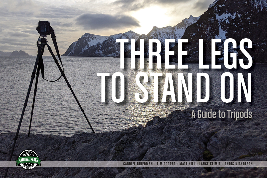
  • June 10: To be announced, talking about tripods

  • June 17: Lance Keimig, talking about night photography books

  • June 24: Sandra Ramos, aka National Park Patch Lady, talking about getting to know the smaller units of the National Park Service

We also have long-term plans for guests that include a national park ranger, an astronomer and a street photographer, as well as industry experts in the fields of lighting, printing, lenses and more.

For all of these sessions, the floor will be open for questions, so be sure to join us on Wednesday nights on Instagram (@nationalparksatnight) or npan.co/instagram.

The Night Crew Image Review

One of the most important activities on many of our workshops is the Image Review. We gather during daytime to go over the photographs we’ve been making at night. It gives the group a chance to celebrate its successes and to learn from its challenges.

Now we have brought that experience online with The Night Crew Image Review. Each week we’ve put out a call for images, and then we’ve met with participants on Zoom to go over their submissions. We’ve seen some great work, and we’ve offered suggestions on everything from initial capture to cropping to post-production.

Moreover, we have simulcast the meetings live on our YouTube channel so that other photographers can hopefully learn from the experience and join in the chat discussion. You can see all the Night Crew Image Review sessions we’ve done here:

As of June, we’re changing the schedule for this program to once per month, on dates to be announced. You can still submit images at any time by visiting npan.co/imagereview. We’ll reach out when it’s your turn for the livestream group review so that you can join us on Zoom, and we’ll announce the simulcast on our social media channels.

If you need more immediate feedback, that’s actually a service we offer! We run one-on-one sessions with photographers on a regular basis, on topics as varied as:

  • Catalog Clutter and Image Organization

  • Gear Consultation, Camera Settings

  • Image Review

  • Lightroom and Photoshop

  • Mentoring and Artistic Development

  • Monitor Calibration

  • Night Photography Techniques

  • Pre-Workshop Education

  • Travel Prep

This is a service we offer online as well as in-person when possible. For more information, visit our Tutoring page.
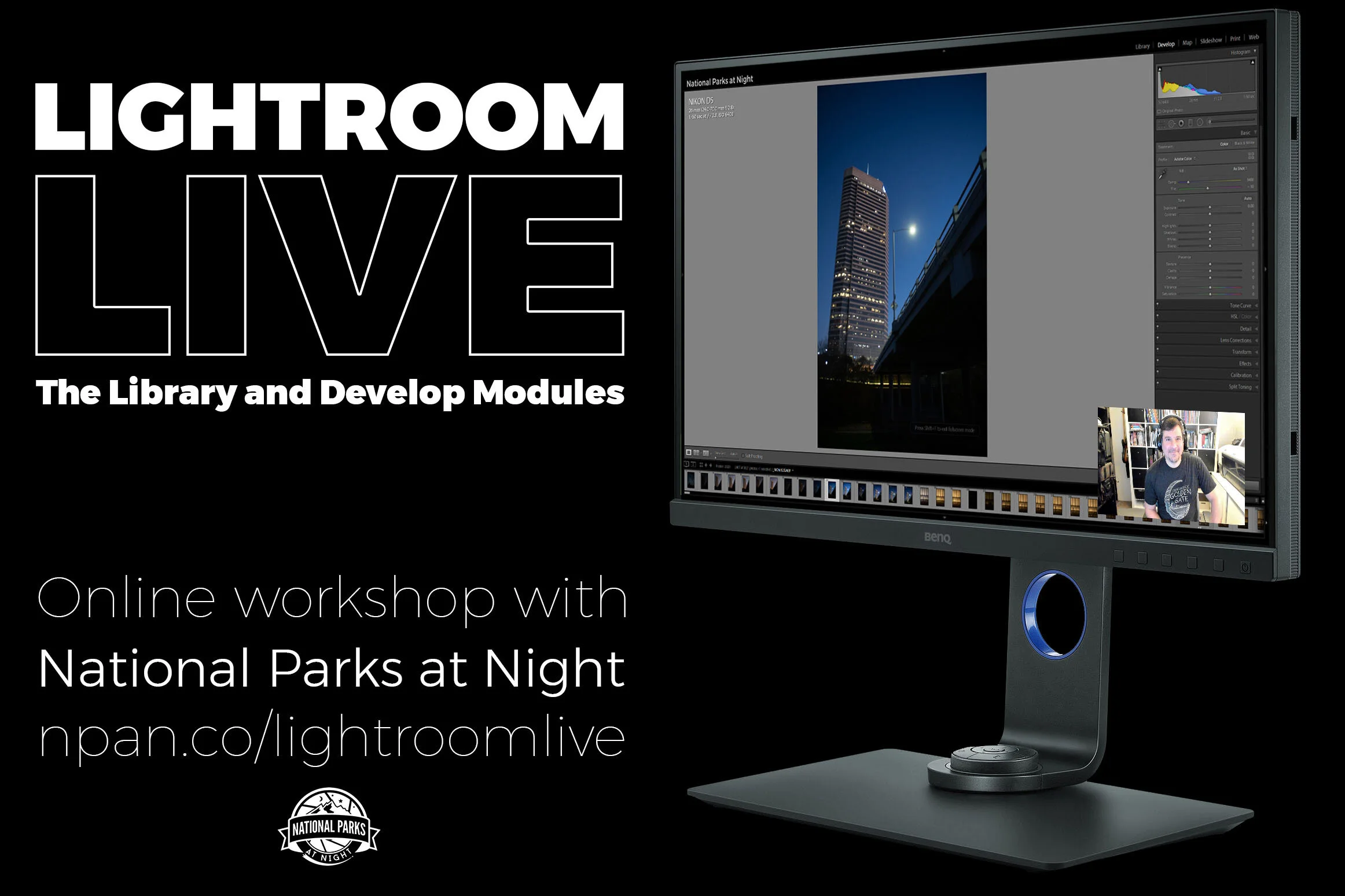
Lightroom Live

This is another idea we’d contemplated for a while, and this was the perfect time to launch it: an online course designed to teach Lightroom, the most important piece of software for photographers, focused on the two most important modules, Library and Develop.

You can see more about our Lightroom Live online course in this video:

We’ve run two sessions of Lightroom Live already, each with a full cohort of 12 participants who attended four two-hour classes. (We’re keeping these classes small to maximize the time that participants get with the instructors.) We recently announced two more sessions, each in June, each on weekends, each with seats available:

  • Session 3: June 5, 6, 12, 13

  • Session 4: June 20, 21, 27, 28

The course also comes with bonuses! When you register you’ll receive a download of our new video Lightroom: Correcting Your Catalog Chaos (which will be on sale to the public soon—stay tuned!), and at the end of the course you’ll receive an hour of one-on-one time with the instructor of your choice.

See our Lightroom Live online course page for more information and to register today.

Other Endeavors

During all this non-travel time, we’ve been busy with other projects as well. Of course, we’ve still been writing blog posts, on topics ranging from the new Nikon D780 to a new intervalometer to ideas for long exposures at home and more.

We also recognized that five years of blog posts, over 200 in total, are a little unwieldy to look through when they’re organized only by date. So we created a brand new page on our website where you can see all our posts organized by topic. That’s about 300,000 words of free night photography education. We hope you enjoy!

We’ve also been busy on the publishing front. In April we released an e-book titled Great Balls of Fire: A Guide to Photographing Meteor Showers. It covers everything you’d want to know about the subject:

  • which meteor events to target

  • dream locations to photograph meteor showers

  • how to scout, shoot and edit a meteor shower

  • a gear guide for being perfectly equipped in the field

You can get more info and download the e-book here.

(Psst, psst! Want to know a secret? We’re also in the final stages of publishing our second e-book of the spring. Want a sneak peek?)

Wrapping Up

Of course, we have some more plans too. We’ll let you know as soon as they’re ready.

In the meantime, we’re excited to see you online! For more information and to stay updated about all of our livestream programs, visit npan.co/live.

Chris Nicholson is a partner and workshop leader with National Parks at Night, and author of Photographing National Parks (Sidelight Books, 2015). Learn more about national parks as photography destinations, subscribe to Chris' free e-newsletter, and more at www.PhotographingNationalParks.com.

UPCOMING WORKSHOPS FROM NATIONAL PARKS AT NIGHT

Cleaning the Clutter: How to Get Your Lightroom Catalog in Tiptop Shape

Clean and organized. Some people are and some people are, well, less so. When it comes to Adobe Lightroom however, we all benefit from a clean, well-organized catalog. In fact, cleaning up Lightroom is one of the most common topics we’re asked about on our workshops and in our one-on-one Tutoring sessions.

In this post, I will share three tips on decluttering this very important part of our digital lives.

Tip 1: Use Reject Flags to Remove Unwanted Images

Get rid of those files you’ll never use and do it quickly with Reject flags. Lightroom has the capacity to keep track of thousands and thousands of images. In fact, I’ve not heard of an upper usable limit, but I have noticed that when my catalog neared 50,000 images it started to slow down a bit. Cleaning out the dead weight couldn’t hurt, right?

Here’s a method that will help you sail through your images and quickly mark them for deletion:

  1. Open Lightroom and enter the Library Module.

  2. From the menu choose Photo > Auto Advance (Auto Advance is engaged when there is a check mark next to it). You can also do this by engaging your Caps Lock key.

  3. Find a folder that contains images you would like to cull. Click on the first image and then press your space bar to magnify the image to fill the screen (this puts you into Loupe view).

  4. Now, if you want to keep this image, simply hit the right arrow on the keyboard to advance to the next image. To mark the image as rejected, you can go up to the Menu and choose Photo >  Set Flag > Rejected (Figure 1), or press X. This will set the flag on the image as rejected, and because you have Auto Advance enabled, Lightroom will automatically advance to the next image!

Figure 1. Rejecting an image.

Once you are finished working through that folder, it’s time to actually delete the images:

  1. Return to the Grid mode by pressing G.

  2. The keyboard combination to Delete Rejected Photos on a Mac is Command + Delete, and on a PC is Control + Backspace. Click whichever is pertinent.

  3. Lightroom will ask you to confirm (Figure 2). Click Delete from Disc to permanently delete the images from your computer as well to remove them from your Lightroom Catalog.

Figure 2. Deleting flagged images from the catalog and disk.

Deleting images one at a time takes a lot of time. By using Reject flags and then the Delete Rejected Photos feature, you’ll save a ton of time, thus freeing up more time for you to sift through more images.

Further Tips

  • You can do this whole process of adding Reject flags to the images while working in the Grid view as well.

  • If you accidentally flag an image as rejected, simply click on the image again and press U to unflag it.

  • Conversely, pressing P will flag an image as simply “flagged.” Many of us think of this as a Pick flag. This can be an additional marker on your image along with stars and color labels.

Tip 2: Optimize Your Catalog

Your Lightroom catalog is a database. Databases, like your teeth, need maintenance and occasional care. If uncared for, like your teeth, they will no longer perform the job we ask of them without being painful to use.

Begin by backing up your catalog on a regular basis. This could be once per week or once every two weeks or so. Remember this backs up only your Lightroom Catalog (the database of the location of your images and all the metadata and edits you’ve performed on them). This does not back up your actual photographs. To ensure your images are backed up, you must take the separate step of backing up the drive(s) where your images are stored.

Here are the steps to determine when your catalog will be automatically backed up:

  1. From the menu on a Mac, choose Lightroom Classic > Catalog Settings, or on a PC choose Edit > Catalog Settings.

  2. Click on the General tab.

  3. In the Backup section, choose your frequency preference in the dropdown menu (Figure 3). I choose “Every time Lightroom exits.” This setting gives me the option to back up or skip each time I close the program.

Figure 3. Setting backup preferences.

When I quit Lightroom, I see the dialog in Figure 4, which tells me the backup preference that I set earlier. Then it’s time to make some additional choices. Notice that I check both boxes outlined in red. Test Integrity will ensure my catalog is healthy, and Optimize Catalog will keep my catalog lean. This way, by taking the time to back up my catalog, I’m simultaneously repairing it and making it run more efficiently.

Figure 4. Backup options.

Further Tips

  • Both the Test Integrity and the Optimize options are sticky, which means once you check the boxes they will still be checked every time you back up, until you uncheck them. (And vice versa.) So if you check the boxes today and then back up, next week when you go to back up again, the boxes will already be checked for you. Awesome, right?

  • There is no need to have a zillion backups of your catalog. I recommend periodically going to the Backups folder and deleting older backups. I typically keep one or two. The Backups folder can be found by navigating to the General tab of Catalog Settings (directions above) and clicking the Show button (Figure 5). This will take you to the folder on your hard drive where your backups are stored. Enter the folder and delete any subfolders for older backups that you no longer want to keep.

Figure 5. Navigating to the location of your backups.

Tip 3: Organize by Using Smart Collections

I know, I know, the topic of organizing your Lightroom catalog could easily fill a small book. (Or it could even fill a 5.5-hour video dedicated to the Library and Develop modules 😎). For now, I’d like to show you just one of the myriad tools you can use to ensure that your images are always easy to find. That tool is Smart Collections.

The more information you put into an image, the easier it is to find. For example, all imported image files already contain EXIF data from your camera that lists aperture, shutter speed, focal length, ISO, lens model, etc. This embedded information makes it easy to search for, say, all images shot with a Nikon Z 6 set at ISO 6400. You could further narrow the results by searching for all images shot with a Nikon Z 6 set at ISO 6400 using a focal length of 14mm.

That is incredibly powerful. But EXIF is only one part of an image’s metadata. The color labels, stars and flags we add to help us organize our catalogs are also metadata. Develop settings we apply—such as Exposure, White Balance and Dehaze—are also recorded as metadata. The keywords we apply to images? Metadata.

So we start off with searchable metadata in the form of EXIF data from our camera. But we can also apply metadata after the images have been imported.

Again: The more information (data) we apply to an image, the easier it is to find. How so? Smart collections.

Think of a smart collection as a really smart, saved search. In the above example we wanted to search for all images shot with a Nikon Z 6 set at ISO 6400 using a focal length of 14mm. Great. We could do that with Library Filter. But if you did this through a smart collection, Lightroom would immediately find those images and gather them up in one location for you to view at any time. It doesn’t move your images. It just creates another “location” to view the images that meet those criteria, no matter how many different folders the images live in.

The smart collection doesn’t stop there, though. It continually monitors your whole catalog and updates the collection whenever a new image meets those same criteria (Nikon Z 6, ISO 6400, 14mm focal length). You don’t need to anything. The next time you import an image you shot with a Z 6 at ISO 6400 and 14mm, that image will automatically appear in that smart collection.

Creating a Smart Collection

The Collections panel sits just below your Folders panel in Lightroom’s Library module (Figure 6).

Figure 6. Creating a smart collection.

Here’s how to create a smart collection:

  1. Click on the plus sign in the upper right corner of the Smart Collection panel to reveal the actions shown in Figure 7.

  2. Choose Create Smart Collection. You will see the dialog that allows you to set the criteria the smart collection will search for (Figure 8).

  3. Start at the top by giving your new smart collection a name. (Ignore the Inside a Collection Set option for now.)

  4. Keep Match set to “all.”

  5. The large area on the bottom of the dialog contains the rules you will set up for the smart collection. Notice that by default the first rule is sets Rating as “is greater than or equal to.” Clicking on one of the dots to the right sets the star rating it will search for. So if you click the fourth dot, this smart collection will collect all of the images in your Library that are marked 4 stars or above.

  6. Click Create and you’ve just made your first smart collection!

Figure 7. Collection panel actions.

Figure 8. Creating a smart collection.

Putting Smart Collections to Practical Use

Now let’s make a smart collection that will help keep your catalog organized.

  1. Click the plus sign to create a new smart collection.

  2. Name this collection “Without Keywords.”

  3. Click the arrows next to Rating and instead choose Other Metadata > Keywords (Figure 9).

  4. Click the arrows next to “is greater or equal” and instead choose “are empty” (Figure 10).

  5. Click create.

Figure 9. Choosing a criterion for a smart collection.

Figure 10. Refining the options for a criterion.

Now you have a smart collection that shows every image that needs to have keywords applied. Click on any image, apply a keyword, and that image will automatically disappear from the smart collection. Why? Because now that the image has a keyword, it no longer fits the criterion.

Creating this particular smart collection is a great way to begin organizing your entire Library, because it can be very difficult to find images that lack keywords!

Smart collections are extremely powerful. As you can see from the screenshot in Figure 9 above, there are an enormous amount of criteria you can use to build your smart collections. And you are not limited to just one choice. By clicking on the plus sign to the right of your first rule, you can continue to add additional rules. As long Match is set to “all,” an image would need to meet all of the criteria to show up in the smart collection. Figure 11 shows a screenshot of the smart collection we talked about earlier (Nikon Z 6, ISO 6400, 14mm focal length).

Figure 11. A smart collection that collates all images shot with a Nikon Z 6 at ISO 6400 with a focal length of 14mm.

Spend some time thinking about how you want to find and organize your Library. Poke around in the choices for ideas for new collections. Before you know it you’ll be creating smart collections that will keep your Library perfectly organized!

Some Sample Smart Collections

Here are a few ideas to get you started:

Make a collection of your favorite photos that are marked with 5 stars.

Make a collection of your favorite photos that are marked with 5 stars.

Make a collection that shows all of your images that don’t have stars.

How about one to show your favorite family photos?

Or your favorite vacation photos?

Further Tips

  • Organize your smart collections by creating collection sets. Think of these as folders to store your individual collections in.

  • In the Collections panel, collections appear in alphanumeric order from top to bottom with the collection sets coming first. If you want to have something appear at the top, use a space or underscore before the title to force Lightroom to move it up there.

  • You can edit a smart collection anytime by double-clicking on the gear icon that appears on your smart collection icon.

Wrapping Up

There you go, three tips to help you clean your Lightroom catalog! It might take some time and dedication to get this done, but the investment will pay off later when you’ll be running a lean, efficient database of images.

Do you have any of your own tips for how you like to clean up your Lightroom catalog? Share them in the comments below or on our Facebook page!

Want some help getting your Lightroom catalog organized? National Parks at Night offers one-on-one tutoring, so we can work with you remotely! See our Tutoring page for more information.

Tim Cooper is a partner and workshop leader with National Parks at Night. Learn more techniques from his book The Magic of Light Painting, available from Peachpit.

UPCOMING WORKSHOPS FROM NATIONAL PARKS AT NIGHT

Five Ways That Lightroom’s New Update Eases the Processing of Night Photos

As has been true since the beginning of photography, field work is equally important as what comes after: post-production. Consequently, we always monitor the advancement of both in-field and on-desk tools, and this week there was some good news in the latter category.

On Tuesday, Adobe released an update to Lightroom that contained several interesting changes, including five that will make life easier for night photographers. So below we explore each new feature and setting, looking specifically at how it applies to working with night images.

(Note that these points pertain to Lightroom Classic, which is the version we use—and recommend using—for serious photo editing.)

1. Large-File Support

If you’re into blending exposures, stitching complex panoramas or stacking images—whether for stars, lighthouse beams, light painting or whatever else—then you’ve probably had to deal with the 2 GB size limitation for a PSD, Photoshop’s default file format (Figure 1).

Figure 1. Until now, Photoshop files over 2 GB posed a problem for Lightroom users.

If your image exceeded that limit, you were faced with five primary options, all of which had downsides:

  1. Downsize the resolution (which meant throwing away pixels).

  2. Flatten the layers (thereby limiting the ability to edit the image in the future).

  3. Save as a TIFF (which has a 4 GB limit).

  4. Save as a large-format PSB file (which Lightroom couldn’t see, edit or catalog).

  5. Convert the layers to a Smart Object and save them as a new linked file, then save the whole thing as a TIFF (which is an inelegant, unintuitive process).

Now, with this update, these options are obsolete and the downsides are no longer obstacles. Lightroom now recognizes PSBs, allowing you to import, catalog and edit these files of theoretically unlimited size. (“Theoretically” because there are limitations, but ones that most photographers will never encounter—i.e., 65,000 pixels wide or tall, or 512 total megapixels.)

2. Simpler Visual Matching

Last winter Tim Cooper wrote a blog post titled “How to Make Your Lightroom Rendering Look Like Your Camera Preview.” One of the key points was ensuring that the profile you use in Lightroom’s Develop module matches the profile you use in your camera (i.e., the “Picture Controls” setting for Nikon, “Picture Styles” for Canon, “Picture Profile” for Sony, “Film Simulation” for Fuji, etc.)

For example, I always set my Nikon D5 (or any other Nikon camera I might be using) to “Standard,” so I want to use “Camera Standard” as my Lightroom profile. That used to be a manual step (or semi-manual, depending on how presets were used), but now Lightroom can do it for me by default.

To automate that process, select Edit > Preferences on a PC or Lightroom Classic > Preferences on a Mac, then select the Presets tab, and you’ll find the option at the top under Raw Defaults. Click on the Master drop down to reveal its options (Figure 2):

  1. “Adobe Default,” which is the behavior you’re accustomed to—Lightroom just applying its own Adobe Color profile to the RAW conversion

  2. “Camera Settings,” which uses the same profile/style you indicated in-camera

  3. “Preset,” which uses any Adobe- or user-created Develop preset, which you select in the fly-out menu

Figure 2. Lightroom’s new Raw Defaults let you specify which demosaicing profile is automatically applied when importing images.

For the purpose mentioned above, you want the second option, “Camera Settings” (and be sure to check “Use defaults specific to camera model” for the most precise results). You don’t even need to tell Lightroom which profile to use—it reads the camera setting from the metadata and chooses the appropriate profile for you.

Consistent Black and White Workflow

This feature also comes into play when shooting in black and white with a digital camera, which is an effective strategy for dealing with night scenes that contain too many variations of color temperatures to reign them all in to one exposure (e.g, LED and sodium vapor lights in the same scene)—or for if you just like to work in monochrome.

When using a digital camera to shoot black and white images, we always recommend changing your camera’s picture style to a monochrome setting. This provides an LCD preview in black and white, which helps you visualize how the final image will look more effectively than if you were looking at a color preview.

The problem with this strategy was that Lightroom would still import the RAW file as a color image. You would then need to remember which files you intended to be black-and-white photographs and then change the settings accordingly.

However, now with this new Raw Defaults management, if you set the preference to “Camera Settings,” then images you shoot with an in-camera monochrome picture style will appear as monochrome in Lightroom (Figure 3).

Figure 3. By setting the new Raw Defaults option to “Camera Settings,” images shot in-camera as black and white will now automatically have the corresponding monochrome profile applied on import.

3. Overriding Manufacturer Adjustments

This isn’t new functionality so much as a new interface. It’s also really the second part of the previous feature, but we have a completely separate use for it, so it gets its own heading.

In that same Presets tab in Preferences, below the Master setting, you’ll find the option to apply a specific profile based on which camera you’re importing image files from. Most photographers who use this feature do so because they have specific adjustments they like to make to files from specific types of cameras—for instance, always applying a little extra Vibrance to images from an old backup digital body.

But there’s another, similar use: Overriding the built-in processing adjustments that some manufacturers apply to files from some cameras.

For example: We love the Nikon Z 6, but one challenge is that the files come packaged with baked-in noise reduction settings for Lightroom that we find to be way too aggressive. (Figure 4. You can read more about this in our blog post “The Z 6 is the Best Camera for Night Photography.”)

Figure 4. The aggressive default noise reduction settings packaged in the metadata of Nikon Z 6 files..

The good news is that Lightroom now allows you to more easily take control of this on import, by indicating a specific profile or preset from the same Preferences tab (Figure 5). Simply select the camera model, then select from the same options listed above. Now that profile/preset will be applied to any imported files originating from that type of camera. (You can also apply this setting to specific cameras by serial number, if you need to. For the record, most photographers don’t need to.)

Figure 5. By applying a custom preset in this new interface, we can fix perceived problems with baked-in adjustments from camera manufacturers.

So, using this feature, we can tell Lightroom not to use Nikon’s baked-in noise reduction settings for Z 6 files, but rather to apply a custom preset with the noise reduction approach we deem more appropriate. Gabe likes his Z 6 noise reduction set between 10 and 30 for luminance and color noise, so he could perhaps create a preset for 10 each, apply that to all Z 6 images on import, then tweak each of those settings manually in the Detail panel of the Develop module.

4. Camera Support

Nearly every Lightroom update includes support for new cameras and lenses, and this month’s is no different. One notable addition has us pretty excited.

Figure 6. The Nikon D780.

A few weeks ago we got our hands on a brand new Nikon D780 so we could test it for night photography. (Thank you to B&H Photo! See our review in the coming weeks.) Lance was working with the camera before and during our workshop in Death Valley National Park, but he couldn’t open the files in Lightroom. That was a big obstacle to testing, not to mention that it was an unfortunate fact for any early adopter of the camera.

Now? No problem. The new version of Lightroom (as well as Camera Raw) will open D780 files. (For the record, other companies make cameras too, and Lightroom does support them. Also new to Lightroom are the Canon EOS-1Dx Mark III and the Olympus OM-D E-M1 Mark III, among others.)

5. Auto Sync is Less Dangerous

The Auto Sync feature is very powerful, as it was the easiest way to sync adjustments to multiple photos—such as when applying Dehaze to a few dozen starry-sky images before stacking them. But Auto Sync is also dangerous, because it’s easy to create havoc with. Why? Because it was easy to leave on by accident, leaving you unaware that you could be applying a series of changes to dozens, hundreds or thousands of images—or even, as I did once, to the whole catalog. The danger of this was so palpable that I’ve always hesitated to teach the feature on workshops.

Now Adobe has mitigated the risk with three simple tweaks to Lightroom’s interface:

  1. When you activateAuto Sync, the button now changes appearance to a bright light gray that’s easy to see at the bottom of the Develop module.

  2. When you hover the pointer over the Auto Sync button, a tool tip warns what will happen if you click it.

  3. When you make an auto-synced adjustment, Lightroom now advises that you did so with a message such as “Contrast updated for 190,817 images.” (That’s not a joke. See Figure 7.)

Figure 7. Auto Sync can be dangerous, but powerful. New features mitigate the former.

The software also gives you the ability to disable these new warnings in Preferences. Don’t disable them. Ever.

Wrapping Up

There you have it—five ways to work easier when post-processing night photos, courtesy of Adobe.

Which of these features are you most happy to see implemented? And what features and improvements do you hope to see next? Tell us what you think in the comments section below or on our Facebook page.

Note: Do you want to learn more about post-processing? Sign up for the waitlist for our Post-Processing Intensive workshop in San Francisco, or check out our tutoring services!

Chris Nicholson is a partner and workshop leader with National Parks at Night, and author of Photographing National Parks (Sidelight Books, 2015). Learn more about national parks as photography destinations, subscribe to Chris' free e-newsletter, and more at www.PhotographingNationalParks.com.

UPCOMING WORKSHOPS FROM NATIONAL PARKS AT NIGHT

Five Questions: Flashlight Filters, Night Photography with Film, Adobe Bridge and More

We like getting questions. Sometimes they challenge us, sometimes they fascinate us, and sometimes they allow us to fill in the gaps of the things we teach on workshops and in our blog.

This installment of our “Five Questions” series features inquiries about making custom filters for color-correcting flashlights, Pentax’s built-in equatorial tracking, film photography at night, Viltrox lenses and using Adobe Bridge with Lightroom.

If you have any questions you would like to throw our way, please contact us anytime. Questions could be about gear, national parks or other photo locations, post-processing techniques, field etiquette, or anything else related to night photography. #SeizeTheNight!


1. Making Custom Color-Correction Filters

Coast Portland LF100 flashlight filters.

Q: Thanks for your recent post on color temperature. Can you describe how you physically make a filter for the flashlight? Tons of gaffer tape? — Will

A: You could use gaffer tape, or you could just wrap the gel around the end of the flashlight and hold it there with your hand or a rubber band. But there’s a more elegant way. In Part I of that series, Tim told how he attaches the gel to the flashlight. Personally, I like to use double-sided tape to adhere the gel to the clear filter, which gives me a nice, clean piece of gear to work with.

However, the first time I did this, I used standard-size clear tape. It didn’t fit across the whole filter, so I needed to use three pieces side-by-side, which created shadow lines in my flashlight beam. Not a huge problem, but it wasn’t polished enough for me. Moreover, one of the reasons I love using a Coast HP7R to light paint is because the illumination is even across the whole beam. So, shadows from my filter wouldn’t do.

Because of that, I instead started using clear mounting sheets. They come in 8.5x11 sheets, from which I can cut a piece that covers the whole filter. I cut a square piece large enough to cover the clear plastic disc, then use sharp scissors to trim the edges to align with the circle. Then I peel off the backing, adhere a square of filter gel, and finish by trimming that as well. If I need two gels, I repeat the process on the other side of the disc.

Then I can pop my custom filter in the holder, and light paint with precise color with no fuss. — Chris

2. Equatorial Tracking with Pentax

Q: I rarely see anything about the use of equatorial mounts in general, or more specifically what Pentax claims to have with their K1 being able to simulate an equatorial mount for up to 3 minutes. I purchased the K1 thinking that this was the way to go, but as I am just starting in astro-landscape photography, I would be interested in your thoughts on these approaches to letting the shutter stay open a little while longer. — Ray B.

A: None of us have shot with a Pentax K1, but I have a couple of friends who have, and the AstroTracer feature does indeed perform as advertised. Since you already have the camera, I definitely recommend that you give it a go. Just bear in mind that you will still have to do a separate shot for the landscape or foreground, as it will be blurred in the tracer image. (The AstroTracer tracks the sky, so the camera will not be synchronous with the earth!)

For general astro-landscape photography, typical exposures are 20 seconds, f/2.8, ISO 6400. With the AstroTracer, you should be able to get 2 or 3 minutes at f/2.8 to f/3.5 and ISO 1600, depending on your lens.

We would love to see your results. Please send us a couple of images, or better yet, share on our Facebook page. — Lance

3. Film Photography at Night

Q: Greetings from Portugal! I make landscape photos with long exposures, including night photography. I shoot in black and white with digital, but also with film (Tri-X), and recently I got some Acros. What are your views about these two options? — Verissimo

Figure 1. Click to englarge.

A: Thank you for reaching out, all the way from Portugal! I’ve used film for night photography for over 20 years—less and less over the last 2 or 3, but lately I’ve been resurging. (Keep your eye out for a post about that soon!)

Figure 1 is an excerpt from my book Night Photography: From Snapshots to Great Shots, with a chart that compares the film reciprocity of Tri-X and Acros.

As you can see, Tri-X is not a good film for night photography, unless you want to be pushed to very long exposures very quickly. A 15-minute exposure for digital would need to be doubled for Acros (30 minutes), but quadrupled for Tri-X. That’s 1 hour, and anything over 15 minutes is not recommended for Tri-X. This means that with Tri-X at night, you can shoot only under full moon or in brightly lit urban conditions.

Last summer there was some very good news for film night photographers, as Fujifilm brought back Acros after a yearlong hiatus. One of our most beloved black-and-white films, Acros has very low reciprocity failure and can be used successfully under a variety of low-light conditions.

Another thing to consider is that when shooting film at night you are technically overexposing the lights to get a better burn into the silver. To compensate, I advise that you reduce your development times by 10 percent or so to get the best results. Use my chart and -10 percent as a starting point to cook up solutions that best fit your style and the chemicals you use. — Gabe

4. Viltrox 20mm

Q: In your recent blog post “How to Plan, Shoot and Edit a Milky Way Arch Panorama,” I have to say I am a bit confused by this statement: “Lately I’ve fallen in love with the Viltrox 20mm f/1.8, because it comes in a Nikon Z-mount and is crazy-easy to focus manually.” I am unable to find this lens in a non-Z-mount. Maybe you can point me in the right direction? Also, do you know how the Viltrox compares to the Nikon F-mount 20mm f/1.8G combined with the FTZ Adapter? — Eunice

The Viltrox 20mm f/1.8 Z-mount lens.

A: Viltrox is a relative newcomer to the lens market. They presently make the 20mm f/1.8 lens only in a Sony E-mount and a Nikon Z-mount. The latter is not yet available through U.S. retailers, but you can order one directly through Viltrox on Amazon. The Viltrox website is not so up-to-date, but here is some information about the two focal lengths they make (20mm and 85mm). For most of what they manufacture that is available in the U.S., check out B&H Photo.

As for your other question, I have not compared those two lenses directly, so I cannot comment about the optics. But I can comment on the physical attributes.

The Nikon 20mm f/1.8G is substantially lighter, but then you do need to factor in the FTZ Adapter, which adds a little weight. The 20mm is very sharp, though it does suffer from more coma than the Nikon 14-24mm f/2.8, which is why the latter is legendary among night photographers.

Here’s the breakdown:

  • Viltrox: heavier, manual focus only, has coma until stopped down to at least f/2.8, all metal lens barrel, comes with adapter to use screw-on filters 

  • Nikon: lighter, requires adapter, auto and manual focus, also has coma until stopped down to at least f/2.8, plastic lens housing, can use screw-on filters natively

Matt

5. Bridge to Lightroom?

Adobe Bridge—meant for using with Photoshop, not generally with Lightroom.

Q: At a recent workshop you said not to use Adobe Bridge to edit photos before importing them into Lightroom, but rather use just Lightroom. If you import from Bridge, that changes the equation somewhat? Most folks in my camera club swear by Bridge. — Brien R.

A: If someone is not using Lightroom, then by all means they should be using Bridge. But there just isn’t any good reason I can think of to use Bridge before Lightroom. Everything that Bridge does is something that’s built into Lightroom, so using Bridge beforehand is just adding extra steps to accomplish the same tasks.

I’m not claiming that there’s not some truly efficacious reason out there to use Bridge first, but it would be a major exception to the rule, something that would fit a very specific, out-of-the-ordinary need. As an indication of how unusual that need would be, know that between Lance, Tim and I, we don’t know any professional photographer who uses Bridge before Lightroom. — Chris

Chris Nicholson is a partner and workshop leader with National Parks at Night, and author of Photographing National Parks (Sidelight Books, 2015). Learn more about national parks as photography destinations, subscribe to Chris' free e-newsletter, and more at www.PhotographingNationalParks.com.

UPCOMING WORKSHOPS FROM NATIONAL PARKS AT NIGHT

How to Make Your Lightroom Rendering Look Like Your Camera Preview

Have you ever imported an image into Lightroom and felt that it looked different than what you remember from the back of your camera? If you have, you are probably not imagining it.

There are two reasons this disparity can occur. The first is a function of our vision. The second derives from the way your camera and Lightroom handle RAW files.

Night-Adjusted Vision

Our eyes are fabulous instruments. Their ability to adjust to a wide range of light is astonishing. Stand outside on a bright sunny day and you’re able to take in all of the information from your surroundings. Enter a dark room and your eyes adjust to the low level of luminance, allowing you to make out shapes and details. Stand on a street illuminated with city lights and you can discern every detail from the highlights of bright buildings to the shadows beside them.

However, adjusting to extreme darkness takes time. As your surroundings get darker, your pupils dilate to allow more light to enter—just like opening your lens aperture from f/8 to f/2.8. This condition is called “night-adjusted vision.”

When your eyes are dilated in this state, the images on your camera’s rear LCD will be perceived as much brighter than they actually are—because your eyes have adjusted to the darkness of the world, and not to the brightness of your camera. The problem this causes is that when you view your images in Lightroom, they look much darker than you remember from in the field.

The solution

Turn down the brightness on your camera’s LCD.

Most cameras’ default setting for brightness is Auto. This means when it’s bright outside, the screen brightens; when dark, the screen dims.

While the Auto setting is fine for most types of photography, the night photographer needs to take manual control over the brightness of the LCD. By lowering it to the lowest setting possible (or second lowest), you will get a much more accurate preview at night. This will also help achieve a better match when you review your images back in Lightroom. (Figure 1 shows the LCD brightness settings on Nikon and Canon cameras.)

Figure 1. The LCD Brightness settings in Nikon (left) and Canon menus.

How the Camera Previews

Even though you have set your camera to shoot RAW, the image you see on the rear LCD is not the RAW image, but rather a JPG generated from that RAW data. For many photographers this discrepancy is irrelevant. But for those wanting to ensure a close match from camera to Lightroom, a better understanding of this function is important.

There is a setting in your camera that allows you to create different “flavors” in your photos. Each manufacturer has different names for this setting, but in essence they all alter the color and contrast of the resulting image. For example, by using Portrait mode, the skin tones of your subjects will seem more natural. Using Neutral will lower the overall contrast and saturation. Standard provides a more traditional rendering.

Figure 2. The Nikon Picture Control menu.

Figure 2. The Nikon Picture Control menu.

For detailed explanations and a complete list of your options, consult your camera manual. Nikon calls their setting Picture Controls (Figure 2). Canon is Picture Styles. Sony is Picture Profile. Fuji is Film Simulation.

These settings are applied differently to RAW and JPG images. When you shoot in RAW, the image is captured and then passed on to an in-camera processor. Here the RAW image is “tagged” with the Picture Control. But that interpretation—those settings—are not permanently baked into the file. Think of it like a note that’s added to the file that says, “Make the image look this way when it’s opened.”

When your camera displays the image on its LCD, it first creates a JPG made from the RAW file with the Pictures Control “notes” taken into account. So what you’re seeing on the LCD is not the RAW file, but a JPG that your camera’s internal computer has rendered just for that immediate use. It has no impact on how the image will look later in Lightroom.

This is in stark contrast to how things work if you’re shooting straight to JPG, rather than shooting RAW files. When you shoot in JPG, the Picture Style is actually baked in. So if you shot on the Landscape setting, the extra contrast and saturation is a permanent addition to the file. When it comes to shooting JPG versus RAW, there are many photographic disciplines out there and each has its own version of best practices. For the night photographer, we want as much flexibility within our files as possible, so we shoot in RAW.

My personal preference is to shoot my night images in RAW on the Neutral picture style. This style is the lowest in contrast and saturation. This means when I preview my image on the camera’s LCD I am seeing a more accurate view of all the image data that the camera captured. Using something like Landscape or Vivid may fool me into thinking there is less detail in the file, which in turn may cause me to make different choices in the field.

Lightroom and RAW Files

Provided you have calibrated your monitor (something every photographer should do!), JPGs from your camera should look pretty similar in Lightroom as they did on your camera’s LCD. This is because the Picture Style from the camera has been baked in!

However, remember that RAW files are only “tagged” with this information. That note attached to the image file that says “make the image look this way when it’s opened” is not available to Lightroom because the camera manufacturers consider it proprietary information—they don’t tell Adobe how to decipher it. This means the only thing Lightroom can do is create its own version of what the image should like. What we see in Lightroom is Adobe’s interpretation of the 0s and 1s in our RAW file.

Moreover, Adobe has many interpretations that you can select from. Adobe Color is the default interpretation (or Profile) that Lightroom uses. You can see the Profile dropdown in the Develop Module at the top of the Basic Panel (Figure 3).

The Problem

And that right here is where the mismatch between the LCD and Lightroom often happens.

Let’s say you shoot a RAW image with the Picture Control of Landscape. On the camera’s LCD it will look more contrasty and more saturated—because, again, you’re seeing a JPG with that Landscape “preset” applied. But when you import that RAW file into Lightroom, you’re seeing Adobe’s interpretation of this file based on assigning the Adobe Color profile. That’s a completely different algorithm. So this will almost always look different from what you saw on the back of your camera, because the settings being applied are coming from two different recipes.

Figure 3. This image is set to the default Adobe Color profile.

Figure 4.

The Solution

Choose a profile in Lightroom that better matches your memory.

How? In Lightroom, click on the double arrow next to Profile. You will see a list of alternative profiles that Adobe offers (Figure 4). From this menu you could choose, for example, Adobe Landscape to try to approximate what you remember from the field.

(These profiles are not just for matching, however. You can choose any profile to create the look that you want. Be creative. You don’t have to match what you saw in the field—you can also match the possibilities that you see in your artist eye.)

The difference in the profiles can be seen best when looking at contrast and saturation. Adobe Vivid and Adobe Landscape are the most contrasty and saturated. Next comes Adobe Color, Standard and Portrait with varying degrees of moderate contrast and saturation. Adobe Neutral is the least contrasty and saturated. Figures 5 shows one image with several profiles applied.

Figure 5.

But there are even more options beyond those! By clicking on Browse in the list, you can access all of Adobe’s profiles. The ones with the stars appear in the Favorites list, which is the dropdown we saw in Figure 4. In Figure 6 below, you can see that all of Adobe’s standard profiles are starred.

Hovering your cursor over these profiles produces a temporary preview in the image window. I recommend previewing the different profiles to gauge their affects.

Matching to Camera

In addition to Adobe’s Standard profile, you can also access their Camera Matching profiles. These profiles attempt to match your camera’s Picture Control settings as closely as possible. While not exact, they can be accurate enough to, in golf terms, “get you on the green”—and on the blue and the red, so to speak.

And there you go. That’s the secret!

That feature right there—the Camera Matching profiles—can be one of the best tricks to get your Lightroom rendering to most closely align with what you see on the LCD. You simply pick the profile that aligns with the Picture Control you used in-camera. For example, if you shoot in Camera Neutral and then apply Lightroom’s Camera Neutral profile, that should get you a relatively accurate match.

There’s a good chance that you will use this strategy so often that you’ll want to speed up the process. If you find yourself using one or more of the Camera Matching profiles repeatedly, you can add it to the favorites list to access it more quickly. Do this by clicking on the star to the right of the Camera Matching profile. Now that profile will appear on the profile dropdown list. And if you find yourself always using the same profile, you can include it in an import preset.

Figure 6.

Figure 7. The dropdown list after I added Camera Landscape and Camera Neutral as favorites.

Figure 8.

Final Takeaways

As we’ve seen, there are a two main reasons why our images in Lightroom may not match what we saw in-field on our camera’s LCD:

  1. Our night-adjusted vision perceived the image on the LCD as brighter than it actually was. The solution here is simply to lower your camera’s LCD brightness while shooting at night.

  2. Lightroom doesn’t have the ability to the read the Picture Control (Style, Profile, Film Simulation) in our RAW files. Again the solution is simple: A quick trip to the Profile section of the Basic Panel in the Develop Module will allow you to choose a profile that better matches your memory of the image. It’s also a great way to experiment and learn!

Tim Cooper is a partner and workshop leader with National Parks at Night. Learn more techniques from his book The Magic of Light Painting, available from Peachpit.

UPCOMING WORKSHOPS FROM NATIONAL PARKS AT NIGHT