Night Photography Blog — National Parks at Night

Lightroom

Five Questions: Holiday Lights, Metal Prints, a Southern National Park and More

‘Tis the season of giving. You’ve given us questions, and we’re giving you answers. Unwrap below.

This special holiday installment of our “Five Questions” series features inquiries about photographing Christmas lights, choosing a surface for metal prints, Congaree National Park, Irix and Sony lenses, and how Lightroom affects raw data.

If you have any questions you would like to throw our way, please contact us anytime. Questions could be about gear, national parks and other photo locations, post-processing techniques, field etiquette, or anything else related to night photography. #SeizeTheNight!

1. Dashing Through the Holiday Lights

Question:

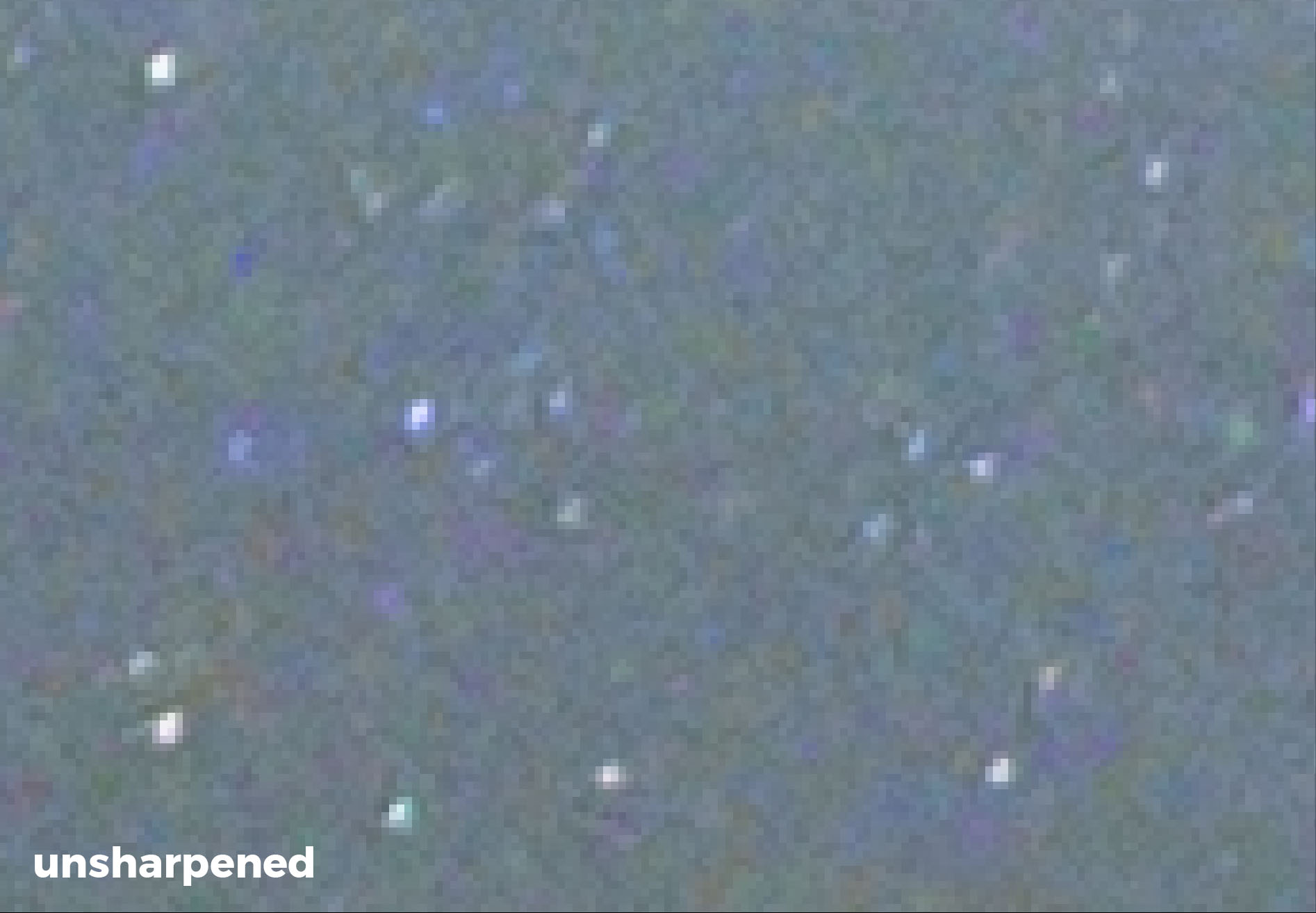
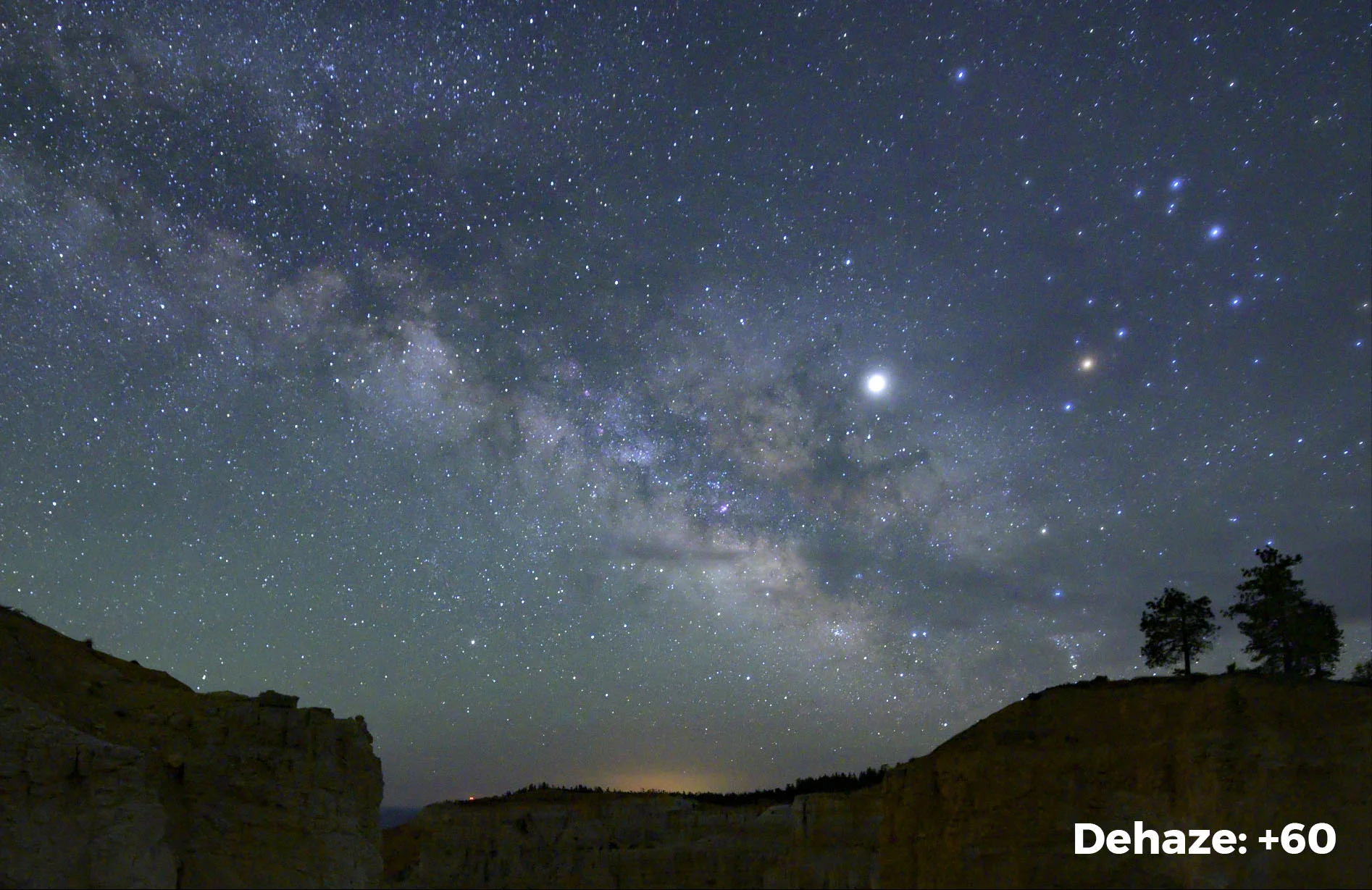
I’m hoping you can solve a mystery for me and my photography students. When they created a zoom-blur photo of holiday lights, some streaks were solid and some were dotted. None of the lights appeared to be blinking. So does this have to do with the cycling of new LED lights? The exposure times were 1 second or longer, which I would think would be long enough to compensate for flicker. What’s the solution to get solid lines, if we can? — Kathy E.

This is one of the photos Kathy E. is asking about. Click on the image to view the photo larger and see full the effect. © 2022 James Steele. Nikon D7500 with a Nikon 70-300mm f/4.5-6.3 lens. 1 second, f/11, ISO 200.

Answer:

The intensity of LED lights is controlled by increasing or decreasing the frequency of their flicker. What you’re seeing is a result of that.

We almost never see this effect with photo/video lights because the manufacturers know about shutter speeds and they keep the frequency much faster than any shutter speed that photographers would conceivably use. However, with cheap light sources, like Christmas lights, the manufacturers don’t care; the lower refresh rate of the LED pulsing will be captured by the camera.

So, in short, the lights were blinking—faster than the eye could see, but not the camera’s eye. If you see that some lines are dotted and some aren’t, that means that the lights were cycling at different rates—some fast enough for the shutter speed, and others too slow.

To keep the lines from becoming dotted during a zoom-blur, I would try zooming more slowly during a longer exposure. (Stop down everything, and maybe even add a neutral density filter.) That way the light will have more time to burn into the pixels while they’re pulsing during your zoom. — Matt

Note: For more about how to photograph holiday lights, see Gabriel Biderman’s post “Seize the Season.”

2. Metal Mettle

Question:

What finish do you recommend for metal prints of astro photos from Bay Photo Lab? — Alan A.

When hanging a metal print opposite a window, consider avoiding a high-gloss surface, as the window light will cause glare. High-gloss prints are best hung at a 90-degree angle from a window.

Answer:

This is a very subjective question with answers that depend on two main factors:

1.       What is your personal taste?

2.       Where will the print hang?

I feel that most of my night images benefit from being printed on a more luminous surface. For metal, I tend to print on high-gloss surfaces. Lance prefers the mid-gloss option. My wife prefers my work printed with a satin finish because glare really annoys her. So as you can tell, personal taste can vary from person to person!

However, understanding what each finish can bring to your space—and how it’s affected by your space—is also key. If you are going to hang a print directly across from a window, then satin might be your best option as you’ll want to have minimal glare. I tend to hang most of my prints at a 90-degree angle to the windows, where even high gloss shows little to no glare.

Bay Photo recently announced their Performance EXT coated metal surfaces, which have additional coatings to extend print life in direct sunlight or outdoors. This addresses another important factor: Most of my images are in a bright room, and my oldest Bay Photo metal prints are 5 years old and show no signs of fading. I recently replaced some metal prints from another printer—those were around the same age but were starting to fade. I have not used Bay’s EXT coating yet, but I advise considering it if your prints get direct sunlight.

If you are new to the metal game, I suggest getting a sample pack made in a smaller size before committing to a surface you are unfamiliar with. Bay offers sample packs in 4x6, 5x7 and 8x12 inches with either standard coating or EXT.

Finally, if you are new to using Bay Photo, be advised that they offer a 25 percent discount on your first order. — Gabe

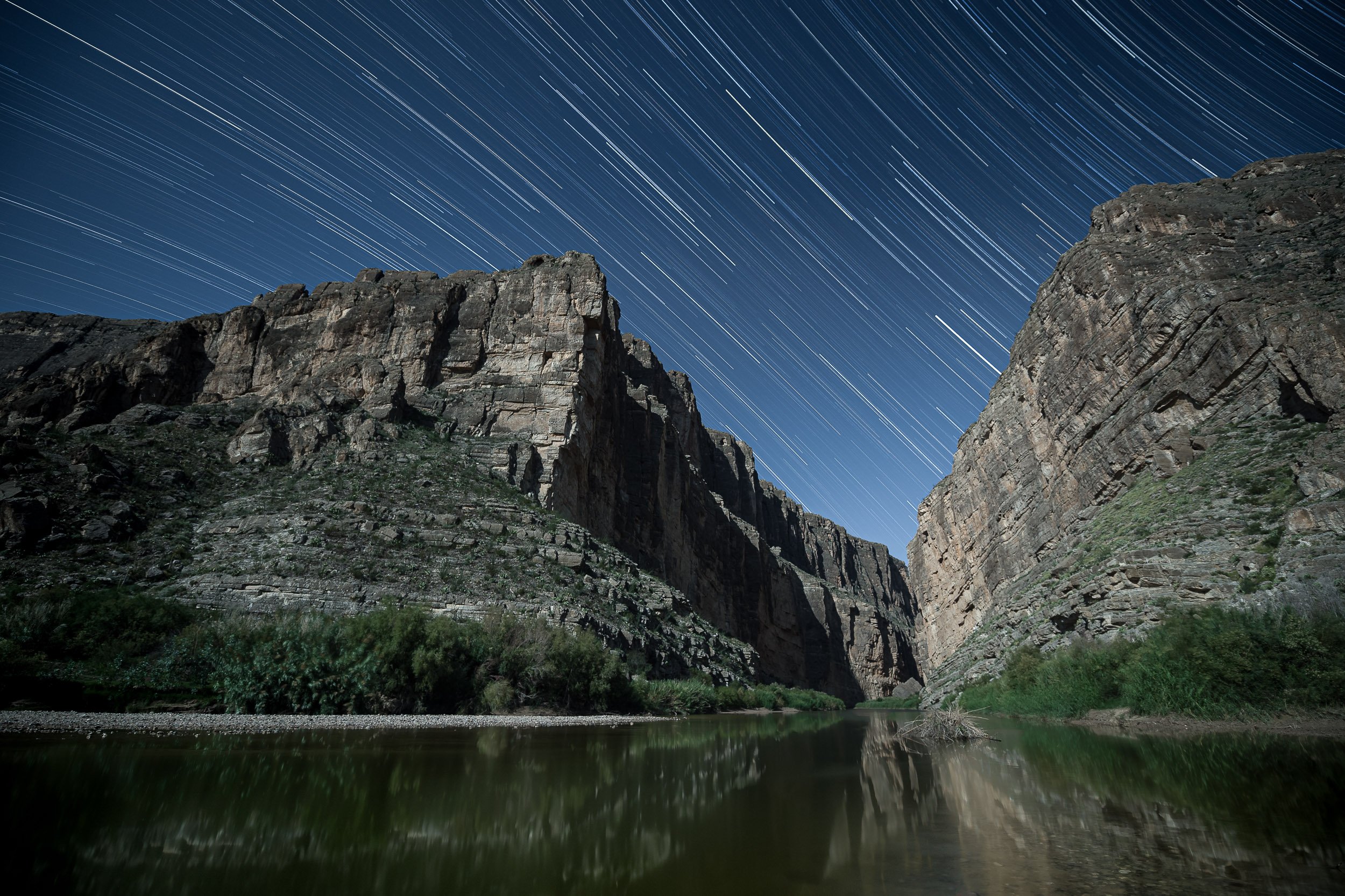
3. Photographing Congaree

Question:

Have you ever photographed in Congaree National Park in South Carolina? It is only a few hours’ drive from my house and I’ve been thinking about going there, but I’m not sure if the park offers many good landscape opportunities. — Arnie

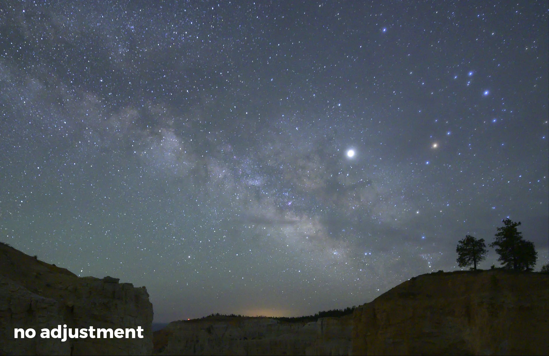
Congaree National Park boardwalk loop trail. © 2016 Chris Nicholson. Nikon D3s with a Nikon 24-70mm f/2.8 lens. 1 second, f/11, ISO 800.

Answer:

I’ve been to Congaree several times. It’s a very pretty park, but it’s primarily forest. (Floodplain forest, in particular. More on that in a bit.) As you may already know, forest photography is challenging because it’s very much about making compositional order out of natural chaos. So if you’re into that type of challenge, then Congaree can be amazing. (It’s also good for spider and snake photography.)

There are some other compositional elements to work with, but most take some effort to get to: the Congaree River (which needs to be hiked to), several ponds (which need to be hiked to) and Cedar Creek (which should really be paddled). The one exception is the 2.4-mile boardwalk trail that starts (and ends) behind the visitor center; that trail is an easy way to get around that section of park, and is an attractive subject as well.

My personal feeling is that aside from the annual show of synchronous fireflies, Congaree is better for daytime photography than nighttime, and it’s better still in overcast light or fog.

The park is probably at its aesthetic best when it floods, which happens about 10 times per year—the caveat being that those conditions drastically minimize how much of the park you can access. But even with the restricted access, the reflections of the forest in the floodwater can be ample fodder for photography. — Chris

4. Sony vs. Irix Lenses

Question:

In one of Lance’s presentations he recommended the Irix 15mm T2.6 Cine lens as the best for capturing the Milky Way. I am now using a Sony a7R IV camera body with two different lenses for night shooting: the Sony 16-35mm f/2.8 GM and the Sony 20mm f/1.8 G. What is the possible improvement I might achieve with the Irix lens? — Ed H.

Answer:

I’ve looked at your photos, and you do not seem to have a problem focusing, which could have been one reason to switch.

Of the lenses you mentioned you already own, both have some noticeable coma, but neither to a catastrophic level. Stopping down the 20mm to f/2.5 should clear it up nicely. Coma on the 16-35mm will vary across the focal lengths, and with it being an f/2.8 lens, you’d likely need to stop down to f/4 or more to get rid of it.

If you need something wider, or if further testing of the 16-35mm tells you that you need to stop down to f/4 or smaller at 16mm, then the Irix 15mm will probably be a little bit better. Other advantages of the Irix are that it’s a touch wider, and it’s easier to focus and to keep in focus. I like to stop down the Irix to f/3.2 to get rid of its minimal coma.

If those advantages don’t resonate with you, then stick with your two Sony lenses. What you have seems to be working. — Lance

5. Raw Permanence

Question:

When importing, does Lightroom add edits or adjustments? If so, is there a way to import raw files as shot in camera? I was told by another photographer that Lightroom always applies filters or edits on import, so instead of importing directly into Lightroom, she moves images from a card to an external drive, and then imports to Lightroom from the external drive, thus preserving her original in-camera files. — Christie

Answer:

Your friend is partly right and partly wrong.

Yes, Lightroom applies some standard edits. These are the same types of edits that Canon software would apply when importing Canon raw files or Nikon software would apply when importing Nikon raw files. Most of them are under-the-hood stuff, such as sharpness, noise reduction, etc. These are basically the same types of edits that are applied to a JPG when it’s produced in-camera. They don’t really change the look of the image so much as refine it to compensate for imperfections in how the image data was captured.

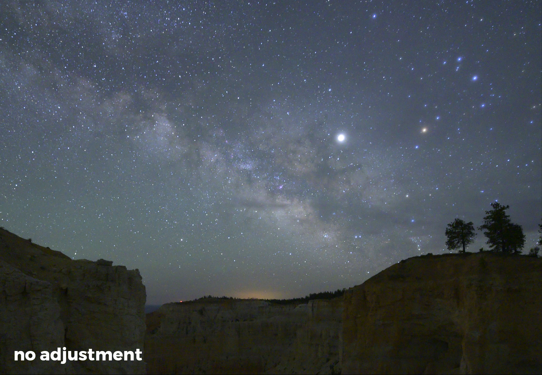
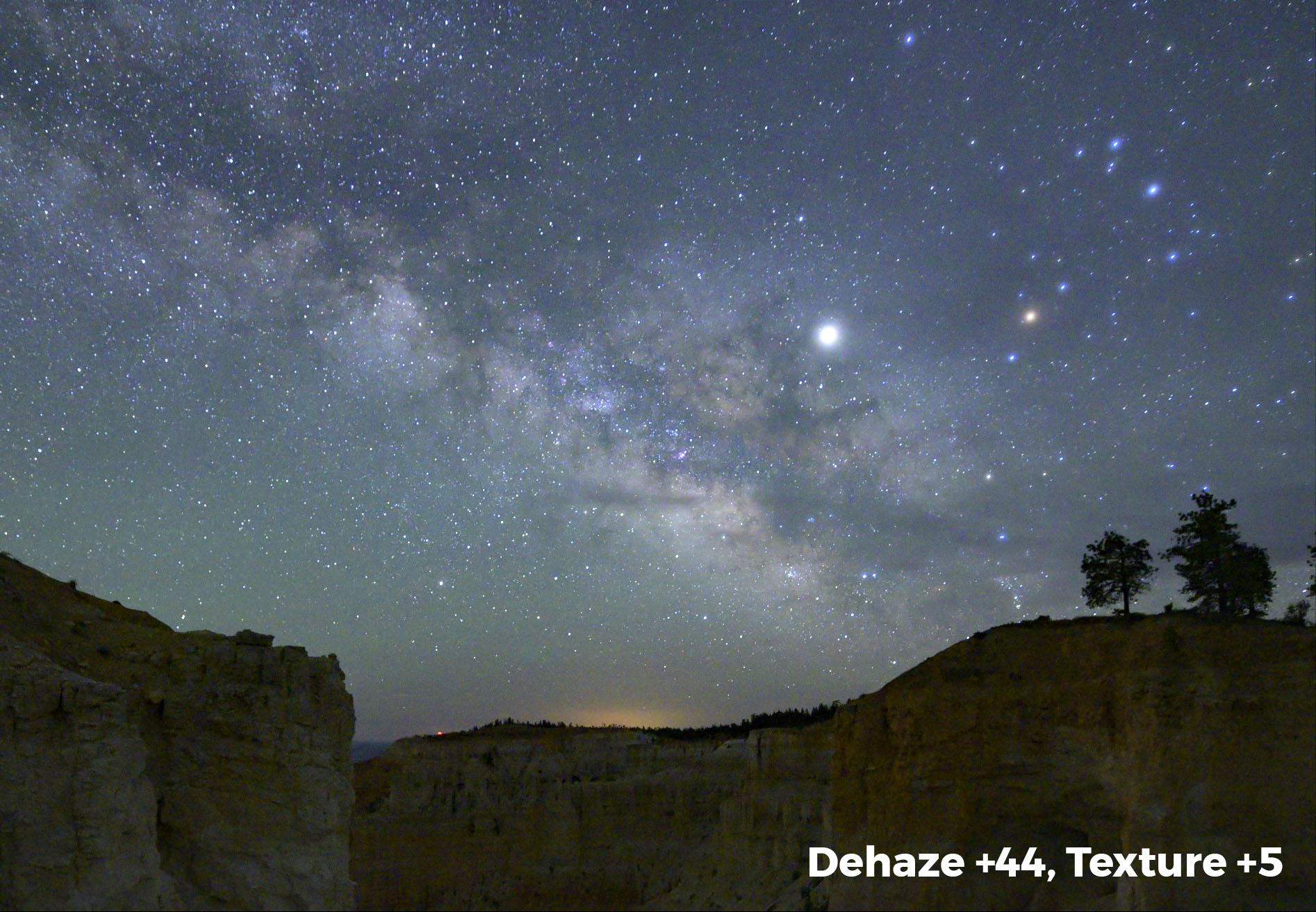
If there is a change in how the photo looks after importing, the likely cause is that the profile Lightroom is applying in the Develop module doesn’t match the in-camera profile you used when shooting. Immediately upon import you see the camera-generated JPG preview, and then very quickly Adobe updates this preview with their interpretation of that file based on the Lightroom profile that’s being applied. In some cases, this can drastically change the look of your photo. (You can read more about this, and how to fix it, in our post “How to Make Your Lightroom Rendering Look Like Your Camera Preview.”)

Not to worry, though. These settings are not permanent.

In fact, none of the edits that Lightroom applies are permanent. They are simply a recorded set of instructions that tell Lightroom how to render the raw data when you view it on screen or export it later. Those instructions are stored in the catalog database and/or a sidecar file, not in the image file. The actual raw file never changes—only the instructions on how it should be previewed, copied or printed. And those instructions can be reset, altered, updated and reset again, all while never making any change to the raw file.

You can prove this by making drastic changes to a photo in Lightroom and then opening the raw file in another program. When you open it in, say, Nikon Capture NX-D, you won’t see any of the Lightroom edits—because, again, those edits are not stored in the raw file.

Therefore, having another copy of raw files in their “original state” is completely unnecessary—it’s a waste of hard drive space. Of course, we do highly recommend backing up your photo files, but that’s a whole other blog post. (Stay tuned.) — Tim

Chris Nicholson is a partner and director of content with National Parks at Night, and author of Photographing National Parks (Sidelight Books, 2015) and Photographing Lighthouses (Sidelight Books, 2023). Learn more about national parks as photography destinations, subscribe to Chris' free e-newsletter, and more at www.PhotographingNationalParks.com.

 UPCOMING WORKSHOPS FROM NATIONAL PARKS AT NIGHT

Five Questions: Barns, Filters with Auroras, Star Trail Settings and More

The night photography world is full of questions, and we’re happy to help with answers.

This installment of our “Five Questions” series features inquiries about photographing barns on the Blue Ridge Parkway, coma with Nikon Z lenses, moving a Lightroom catalog on a Mac, using filters when shooting auroras and settings for star trails.

If you have any questions you would like to throw our way, please contact us anytime. Questions could be about gear, national parks and other photo locations, post-processing techniques, field etiquette, or anything else related to night photography. #SeizeTheNight!


1. Clapboard on the Blue Ridge Parkway

Question:

I am thinking about traveling to the Blue Ridge Parkway to do some star photography and would love to do some light painting of old barns or structures. I am wondering if you have any locations you can recommend. — Michael S.

Mabry Mill, Blue Ridge Parkway. © 2021 Chris Nicholson. Nikon D5 with a Nikon 24-70mm f/2.8 lens, lit with four Luxli Fiddle LED panels. 30 seconds, f/2.8, ISO 6400.

Answer:

The Blue Ridge Parkway is a great place to find barns! But many are on privately owned or leased farms along the parkway; you could still shoot those, but would want to ask permission of course, especially if photographing them at night, and absolutely if you’re going to light paint them.

Sticking to barns that are not privately owned, here are some tips:

Stay north of Asheville. The section of the parkway south of Asheville (and even for a bit north) is mostly mountainous. The northern two-thirds of the parkway—perhaps safely stated as “north of the Linn Cove Viaduct”—is more rural and agricultural.

If you’re open to just historic clapboard structures that aren’t barns, you can’t drive more than a few miles without seeing some. These come to mind immediately: Mabry Mill, Puckett Cabin, Brinegar Cabin. Lots of others scattered about.

For barns in particular, off the top of my head: the Johnson Farm at Peaks of Otter (you’ll need to hike to it), Explore Park (though you’ll want to ask about access after 8 p.m., as it’s managed by the city of Roanoke) and the farm at Humpback Rocks Visitor Center. — Chris

2. Non-Coma Z Lenses

Question:

I just switched to the Nikon Z 6II and am looking for a recommendation for a lens without coma distortion. I have tried and returned two Rokinon 14mm f/2.4 lenses with severe coma. My preference would be a lens in the 14-24mm range. — Edmund

Answer:

You are going to love the Z 6II! The FTZ adapter works well, so it gives you lots of options, but both the Nikon Z 14-24mm f/2.8 and Nikon Z 24-70mm f/2.8 are among the very best lenses Nikon has ever produced. Pricey, but worth it. Another option (assuming you have the FTZ adapter) is the Nikon’s F-mount 14-24mm. There is nothing better than those three lenses at this time. — Lance

3. Moving Lightroom on a Mac

Question:

Is there a simple way to migrate Lightroom files on a Mac? I will soon have to bring in a new and larger external hard drive. — Julie P.

Answer:

Yes, and the process is actually pretty simple.

  1. With Lightroom closed, plug in the old drive and the new drive.

  2. Copy all of the information from the old drive to the new drive.

  3. Unplug your old drive and launch Lightroom. You will see question marks next to your folders, because Lightroom can no longer find your old hard drive.

  4. You need to locate the parent folder for your images. In Lightroom, navigate to the topmost folder in your Folders hierarchy. That may well be the parent folder, but it’s possible that the true parent folder is hiding above it. By right-clicking on that topmost folder, you will see an option to Show Parent Folder. This command will show the folder containing that topmost folder, if there is one.

  5. Right-click on your parent folder and choose Find Missing Folder. Lightroom will open your system’s Finder.

  6. Navigate to the new drive, then choose the matching parent folder and click Choose.

The parent folder and all of its subfolders (all on the new hard drive) will now be linked back with Lightroom. — Tim

4. Light Pollution Filters and Auroras

Question:

I just read your article on light pollution filters. Will these filters also be usable when shooting Northern Lights? — Claron K.

Answer:

Yes, I believe they would be useful for shooting Northern (or Southern) Lights when near inhabited areas. As auroras tend to be green, pink, purple and sometimes blue, the orange/yellow blocking ability would have a complementary effect. However, you could be lose up to 1 stop of light, so keep that in mind. — Matt

5. Star Trail Settings

Question:

I just reviewed your “How I Got the Shot: Lake McDonald” blog post about star trails. Phenomenal image! I have done a ton of research on how to do this kind of photo, but was hoping for a simple recommendation for settings and timing. I’ll be shooting with either a Nikon D850 or a Nikon Z 6 with a 14-24mm lens. — Darlene

Star Circles Over Lake McDonald. © 2015 Gabriel Biderman. Fujifilm X-T1 with a Fujifilm 10-24mm f/4 lens. 41 stacked frames, each shot at 2 minutes, f/4, ISO 3200.

Answer:

There is no simple formula for star trails. You need to find the balance between a proper base exposure, how long you want to go, and image quality.

You can capture trails with either one long exposure or with multiple shorter exposures that you later stack in Photoshop. Single exposures are often best for up to 15-minute shots, but when you want longer trails you’ll most likely want to shoot multiple frames to stack.

Do a high ISO test shot to figure out the proper exposure. Then you want to get to a more optimal image quality setting. Lower your ISO to something you’re comfortable with in terms of noise (for example, maybe ISO 800), and then adjust your shutter speed accordingly to compensate.

Also consider apertures, in this regard: The wider the aperture, the higher number of stars will appear. While that might sound like a good thing, too many star trails could look too chaotic and distract from the rest of the scene. For example, on a dark night f/2.8 will show an overwhelming number of trails, while f/8 would create a more subtle effect. Under a full moon this isn’t so critical, as not as many stars are visible anyway. Either way, just be careful that you don’t stop down so much that you have to crank up your ISO and sacrifice image quality.

Another consideration is how long your camera’s shutter can be open without generating long-exposure noise (speckled red, blue and green confetti-like specks in your image). This noise is produced when a camera processor overheats during long exposures, but higher outdoor temperatures and lower humidity also play a factor. You have to learn what your camera can tolerate by running some tests in different conditions. For example, if the ambient temperature is 60 to 65 F or less then you can usually get away with 4- to 6-minute exposures, but if the temperatures are 80 F or higher then you might be limited to 30 seconds or 1 minute.

To counteract that effect, you might wonder about using long-exposure noise reduction (LENR). You can use that quite effectively if you’re shooting one long exposure for star trails, but it would be countereffective for stacking. The reason is that for most cameras, LENR disables the shutter after each exposure (for the same amount of time as the shutter speed), which would create breaks in your star trails.

The final decision is how long you want your star trails to be. When facing north for circumpolar trails, you want to shoot for at least 1 hour, and the longer the better. If you are facing east, west or south, you can get away with shorter total exposures—8 to 30 minutes might be sufficient. — Gabe

Chris Nicholson is a partner and workshop leader with National Parks at Night, and author of Photographing National Parks (Sidelight Books, 2015). Learn more about national parks as photography destinations, subscribe to Chris' free e-newsletter, and more at www.PhotographingNationalParks.com.

UPCOMING WORKSHOPS FROM NATIONAL PARKS AT NIGHT

How to Plan, Shoot and Edit a Milky Way Arch Panorama (Part II)

Note: This is the second in a two-part series about creating a Milky Way panorama. Part I covered planning and shooting. Below we go over how to put it all together in post.


In last week’s blog post, Matt demonstrated how to create the raw materials for a Milky Way panorama arch. I really enjoyed the post and was glad that he asked me to follow up with a tutorial on processing the frames he captured to stitch the final image.

Computer Software

To create a panorama from multiple images, you’ll need some type of software for your computer. When it comes to software, I like to keep it simple—until I can’t. For me, keeping it simple means working with software I already own and understand. In this case, that means working with Adobe Lightroom Classic and Photoshop. While there are other stitching programs out there, I have always been satisfied with the Adobe products. I already own them, so again, I keep it simple.

In general, both Lightroom and Photoshop are seriously robust and each have their own advantages and disadvantages. When it comes to processing panoramas, both programs work well. Lightroom is the more convenient of the two, and Photoshop offers more options and tends to create more realistic results when you have less-than-perfect captures.

What are less-than-perfect captures? In short, images that the software finds difficult to stitch together. This could be frames taken without a nodal rail or frames that don’t overlap enough, etc. In last week’s article, Matt showed how to create perfect captures that will be easy enough for either program to stitch.

Pre-Stitch Processing

Once you download your images, it’s time to start processing them. If you are planning to stitch (or “merge”) the images together using Lightroom, there’s very little processing that’s necessary beforehand. The reason is that the result of Lightroom’s Merge function is a panorama that is still a RAW file. This means you can do all your processing to the final pano after it’s created, rather than to each individual file before stiching.

Figure 1.

However, there is one exception to that, and that exception is Lens Correction. Why? Because correcting lens quirks will help the rest of the process go better, particularly in regard to vignetting. Removing vignettes will help the exposure look consistent across the whole panorama.

The Lens Correction panel (Figure 1) lives in the Develop module, and it’s the one place you must visit before merging your images into a panorama. Here you can see I’ve checked the Remove Chromatic Aberration box as well as the Enable Profile Corrections box.

Checking both of these boxes tells Lightroom to correct any aberrations associated with that particular lens. At this point Lightroom will typically recognize which lens you’re using and apply the correct profile corrections automatically. However, if you are using a very old lens, or if you’re using a lens brand that’s different than your camera brand, you may need to manually input the type of lens you used. In the example in Figure 1, I had to choose Zeiss from the Make drop-down menu for before Lightroom recognized the lens as the Zeiss Milvus 2.8/15 ZE.

Once you have set the Lens Correction panel on one image, it’s time to sync that change across all the images of that set. From the thumbnails at the bottom of the page, first click on the image with the Lens Corrections. Next, hold down the shift key and click on the last image in that set. This will highlight (select) all of the images in the series. Notice in Figure 2, the cell for the first image I clicked on (the one with the changes) is white, while the remainder of the selected cells are light gray. This means that all the images are selected, but the white image is the “active” image. When we sync, the active image is the one that shares all of its settings with the others.

(If the image with the Lens Corrections is not white, simply click on the correct image. All images will remain selected—you will have just changed the active image.)

Figure 2.

With all of the images selected, click the Sync button (circled in red in Figure 3). (If the Sync button is not available, that means you have only one image selected. Return to the Filmstrip at the bottom and reselect the images.)

Figure 3.

Now, click the Sync button to open the Synchronize Settings dialog (Figure 4).

Figure 4.

Click the Check All button and then finish by clicking the Synchronize button. This will close the box and copy all of the settings from the active image to the selected images.

Figure 5.

Merging Using Lightroom

With all of your images selected and synchronized, it’s time to merge them into a panorama. From the Lightroom menu, choose Photo > Photo Merge > Panorama (Figure 5).

The next thing you’ll see is the Panorama Merge Preview box (Figure 6). The choices here are quite minimal. Projection (Spherical, Cylindrical and Perspective) is what determines the overall shape and look of your image. Simply choose the one that best represents your original vision. Because Matt used a nodal rail when shooting, the difference between Spherical and Cylindrical is nearly impossible to discern. This may not always be the case. Again, just choose the setting that produces a result you like.

Figure 6.

With this image, when I choose Perspective, I get the error “Unable to merge the photos(Figure 7). If you get this error, simply choose another projection. It may or may not work. As I mentioned earlier, while Lightroom’s Merge to Panorama is convenient, it may not work in all circumstances.

Figure 7.

The remaining options are really just that—options. My preferred settings (which appear in Figure 6) are:

  • I keep the Boundary Warp at 0 and I check the Auto Crop box. This keeps Lightroom from stretching the image to fill in blank spaces around the edges, and instead crops out those stray spaces.

  • I keep the Auto Settings box unchecked. This keeps Lightroom from auto-tuning the basic adjustments in the final pano. I prefer to make my own adjustments.

  • I check Create Stack so that the panorama file is stacked with all of its source images in the Library module. This just helps keep things organized.

Click the Merge button at the bottom right of the Panorama Merge Preview dialog to create your panorama. Lightroom will begin merging your images, and you can track its progress in the taskbar in the upper left portion of your screen (Figure 8).

Figure 8.

Once finished, your image will appear back in Lightroom (as a RAW file), all ready for you to apply your favorite Milky Way edits!

Comparing Lenses

As you may remember from last week, Matt shot the raw materials with three lenses—the Zeiss 15mm Distagon f/2.8, Viltrox 20mm f/1.8 and Sigma 35mm f/1.4 Art. Here are those three panos created with Projection set to Spherical.

Figure 9. Nikon Z 6 with a Sigma 35mm f/1.4 Art lens. Multiple stitched frames shot at 8 seconds, f/2.8, ISO 6400.

Figure 10. Nikon Z 6 with a Viltrox 20mm f/1.8 lens. Multiple stitched frames shot at 14 seconds, f/2.8, ISO 6400.

Figure 11. Nikon Z 6 with a Zeiss 15mm Distagon f/2.8 lens. Multiple stitched frames shot at 16 seconds, f/2.8, ISO 6400.

The first thing you might notice is that the panos shot with longer lenses are darker, with fewer stars appearing in the sky. That’s because Matt needed shorter exposure times for the longer lenses, in order keep the stars sharp.

The next thing you’ll notice is that the images from the widest-angle lens—the 15mm (Figure 11)—do not merge well. The sky on the left side of the image appears uneven. Lightroom may sometimes have problems merging panoramas made with superwide-angle lenses.

Merging Using Photoshop

When using a very wide lens, or if you didn’t use a nodal rail—or if Lightroom is having trouble with the pano for any reason, discernible or not—you may have to take your images into Photoshop to do the stitch. The steps are very similar to merging in Lightroom. In fact, the first three steps are exactly the same:

  1. Select first image in the series and go to the Develop module.

  2. Go to the Lens Corrections panel and check Remove Chromatic Aberration and Enable Profile Corrections.

  3. From the thumbnails at the bottom of the page, click on the image with the Lens Corrections (this should already be selected if you were just working on it), hold the shift key and click on the last image in the pano series. With all of the images selected, click the Sync button.

Now we start to detour from the Lightroom pano workflow. Before exporting to Photoshop, you can edit your images before merging. Stick with the big overall changes in the Basic panel, such as White Balance, Color Profile and the fundamental tonal adjustments. Remember you’ll be syncing these changes across all of your images in the set, so don’t make a change that might adversely affect one of the other images.

Once that first frame is suitably adjusted, sync the settings across the whole set in the same way as described above. Then look at each image to ensure that the settings work well with each frame. If they don’t, return to the settings and adjust as needed. Then synchronize them again.

Once all the frames in the set look right, select the whole series by clicking the first and shift-clicking the last. Then, from Lightroom’s menu, choose Photo > Edit In > Merge to Panorama in Photoshop (Figure 12).

Figure 12.

Next you’ll see the Photomerge dialog in Photoshop. Choose Auto from the Layout panel on the left and check Blend Images Together (Figure 13). You don’t need to check Vignette Removal or Geometric Distortion Correction, because you already fixed those issues in Lightroom; you don’t need to check Content Aware Fill Transparent Areas because we’ll tackle that manually later.

Figure 13.

Click OK. Photoshop will now start to create the panorama. This could take a minute or so. For our example, Figure 14 shows the final image that Photoshop creates.

Figure 14.

Next, from the Photoshop menu, choose Layer > Flatten Image.

For the simplest way to wrap up, choose File > Save and then File > Close and your image will return to Lightroom ready for your magic touch in the Develop module. However, if you are even somewhat Photoshop literate, there are some advantages to keeping the file open and continuing to work on it before sending it back to Lightroom. Read on. …

More Photoshop Edits

One of Photoshop’s more powerful features is Content Aware Fill, which is perfect for filling in gaps at pano edges that you would otherwise need to chop off with the Crop tool. In this example I wanted to keep a bit of sky over the Milky Way arch, so I left the blank corners, as seen in Figure 15. Content Aware Fill will help us quickly and intelligently fill in those blanks.

Figure 15.

After I crop the image (as seen above), I choose Layer > Duplicate Layer from the Photoshop menu. This keeps all of my edits on a separate layer and protects my original pano as a background layer.

Next I select the Lasso tool and draw a circle around the area that I want to fill (Figure 16). I don’t want to include too much excess area, but I also don’t want to cut it too close.

Figure 16.

After making the selection, I select Edit > Content Aware Fill, which is where a lot of magic can happen. In the Content Aware Fill dialog, everything masked with green is where Photoshop will look to sample data to fill in the blank area (Figure 17).

Figure 17.

By default, the Subtract paint brush is selected. Simply paint away any areas of green that you feel don’t need to be included in the sample; likewise, you can add to the sample by holding Alt (Windows) or Option (Mac) and painting to add green. Figure 18 shows how I painted away areas not similar to the area I want to fill. For example, I don’t want Photoshop to sample a starry sky when trying to fill foreground rocks. The Preview box on the right foretells the final effect.

Figure 18.

When finished, click OK, which will apply the fill and close the dialog. Figure 19 shows the result. Photoshop has literally made up information (based on the green-masked sample) and filled the blank area.

To continue filling in the corners, I return to the pano copy layer by clicking on it (Figure 19). Again I make a selection and proceed as above until all of the corners are filled. (Remember to return to the Layer 0 Copy layer between edits.)

Figure 19.

Once you are finished, you can flatten the image (Layer > Flatten Image), choose File > Save and then File > Close, and your panorama will return to Lightroom ready for final edits.

In Summary

Both Lightroom and Photoshop can create seamless panoramas of the night sky. Lightroom excels at being simple and convenient when using source images that are easy to merge. Photoshop can be used when images are less than perfect. This includes images made from superwide-angle lenses or frames that don’t overlap as much.

Regardless of which tools you use, making the time investment to learn how to create Milky Way panoramas will open up a whole new area for creativity in night photography.

Whether you’ve been making Milky Way panos for years or will start after reading this post, we’d love to see your images! Please share in the Comments section below or on our Facebook page.

Tim Cooper is a partner and workshop leader with National Parks at Night. Learn more techniques from his book The Magic of Light Painting, available from Peachpit.

UPCOMING WORKSHOPS FROM NATIONAL PARKS AT NIGHT

Five Questions: Very Large Files, Pollution Filters, Fuji lenses and More

This installment of our “Five Questions” series features inquiries about large image files, light pollution filters, lenses for Fuji, organizing files in Lightroom and old Canon cameras..

If you have any questions you would like to throw our way, please contact us anytime. Questions could be about gear, national parks or other photo locations, post-processing techniques, field etiquette, or anything else related to night photography. #SeizeTheNight!


1. Giant Files Missing from Lightroom

A 4 GB, 38-layer PSB file from Matt. Files this big don’t show up in the Lightroom catalog.

Q: I have run into an issue with large file sizes when image stacking. In Lightroom, after I choose Open as Layers in Photoshop, the final layered file is greater than 2 GB. I saved it in PSB large document format. The file was saved to the disk, but is not showing up in my Lightroom catalog like PSD files do, nor does it show up in the Import window in Lightroom. It looks like Lightroom cannot see the file at all. So I tried flattening the file, but then I got a moiré pattern in the image. Have you seen this before? What is your process for saving and working with very large Photoshop files? — Craig

A: That is correct—for some reason, Adobe hasn’t allowed Lightroom to see PSB files. So your options are to either work with that file only in Photoshop, or to flatten it so it saves as a smaller PSD file.

But yes, flattening can occasionally create its own challenges. We have seen that moiré issue with stacked photos before. It happens sometimes, but not others, and we haven’t been able to identify a pattern of when or why. We’ve asked others who are Adobe-knowledgeable, and haven’t found an answer—but we’ll keep trying! What I can tell you is that the moiré seems to happen more often when working with images from higher-resolution cameras, and that sizing down the image a little before flattening seems to help. — Chris

2. Filtering Light Pollution

Light pollution from Miami over Everglades National Park. Nikon D3s, Nikon 17-24mm f/2.8. 20 seconds, f/2.8, ISO 6400. © 2013 Chris Nicholson.

Q: Do you use light pollution filters of any kind? I don’t remember any of you mentioning them, and I don’t see them in your gear list. Are they just a scam? It seems like such a filter would help when you can’t get to a dark sky area. — Brien

A: Night sky filters mostly help with color shifts from light pollution, and can increase contrast in the sky. We’ve tried a couple of them, but have not tested them scientifically––yet. There will be a blog post comparing them for effectiveness before too long.

That said, I think the general consensus is these filters they can improve skies somewhat, but probably don’t provide $250 to $300 worth of improvement, which is what they tend to cost. I wouldn’t call them scams, but I also probably wouldn’t call them a great investment if resources are limited.

If you decide to try one, please let us know what you think by sharing in the Comments section or on our Facebook page. — Lance

3. Night Lenses for Fuji

Q: I own a Fuji X-T2 and have a 14mm f/2.8 lens. I notice that at least one of you has posted photos using an X-T2 with their 10-24mm f/4 lens. These photos look great. I have been looking at that lens and/or the Fuji 16mm f/1.4 to get a stop or two of additional light, given that the tests I see appear to indicate the corners are much softer at f/1.4, better at f/2 and pretty good at f/2.8. My interest in the 10-24mm is the flexibility and range down to 10mm, but I am concerned about the stops of light I would give up. What is your experience with these lenses, and do you think I should instead look more deeply at a Samyang or Rokinon 12mm or 10mm? — Larry G.

fuji lenses.jpg

A: Several of us have been shooting with Fujifilm since the X system came out, and our two favorite lenses for the night are the Fuji 10-24mm f/4 and the 16mm f/1.4.

The 10-24mm gives an excellent zoom range that’s good for including lots of night sky. The f/4 does limit light, which makes it challenging for Milky Way shots, but if you were to shoot at ISO 6400 or 12,800 and use Starry Landscape Stacker, then you could get away with it. However, the 16mm f/1.4 would be our preferred Milky Way lens for Fuji—it’s an excellent focal length and you can shoot wide open or stop down to f/2 without a worry.

That being said, if I were to buy into the Fujifilm lens system now, I’d have to give their new 8-16mm f/2.8 lens some serious consideration. It’s wider, faster and heavier than the 10-24mm, but the f/2.8 aperture gives it the versatility to shoot in any day or night situation.

On the higher end of tried-and-tested night lenses, I’d also recommend:

For budget and manual focus lenses:

  • I’m not a fan of the Rokinon/Samyang lenses—I’ve had too many with soft, out-of-focus edges. (Though I might try Samyang’s new 10mm f/2.8.)

  • Matt and I both own the inexpensive 7Artisans lenses—the 12mm f/2.8 is pretty good and Matt really likes his 7.5mm f/2.8 fisheye.

Finally, with adapters, any lens can be at your disposal:

  • Our favorite night lens is the Irix 15mm f/2.4 that comes in Canon, Nikon and Pentax mounts. It’s manual focus with a click stop at true infinity, it has hyperfocus markings, and you can lock your focus. It comes in two versions: Firefly and Blackstone. Optically they’re the same, but the Firefly is polycarbonate and the Blackstone is magnesium alloy. The former is lighter, and is best for hikers and photographers who are otherwise weight-conscious; the latter is more rugged, made for extreme situations, and has engraved fluorescent markings that are easy to read at night. — Gabriel

4. Organizing Photos in Lightroom

Q: I really want to move into Lightroom, but I do not organize my images by date. It just won’t work for me because I really want to group photos by place and such so I can look at a “place” together with all times I’ve been there. I know that’s what collections are for, but I cannot even begin to fathom reorganizing everything into dates and collections. Can I use Lightroom that way? — Therese I.

A: You’re in luck, because the Lightroom engineers designed the catalog to be pliable enough to use in whatever way feels comfortable to individual photographers. So when organizing photos, do whatever makes sense to you.

There are two strategies I see most often:

  • Organize into folders by date, and use keywords, collections, etc., to catalog and find them. This is what I do. That works very well for the way I think, because I have a very good memory for dates—show me an image of mine and I can tell you the month and year I shot it. A folder in my catalog might be “2016-05-20_Acadia.” So I do have location info in the folder name, but it’s only secondary. However, this approach doesn’t necessarily work so well for a fair number of other people whose brains don’t categorize information the same way mine does. Many other folks tend to …

  • Organize images into folders by region, country, city, etc. So there might be a folder structure of United States -> Southwest -> Arizona -> Grand Canyon. Using this strategy, you could still search by date, as that info is built into the metadata.

Really, it just comes down to which way your brain tracks these things better. Like I said, I’m in Group 1, as are Gabe, Matt and Lance. Tim is in Group 2. Lightroom is flexible enough to make your own system within the confines of the software. The important thing is to pick a strategy that is easy enough to implement while effective enough to be useful, and then to be diligent about sticking with the procedure you choose so that you can always find your images quickly and effortlessly. — Chris

5. Old Canon vs. New Anything

1561852319_1346734.jpg

Q: What is your thought on the Canon XSi for landscape and night photography? I was thinking of upgrading to a their DLSR cameras, but was wondering if a Nikon camera would be a better option. — Nichole P.

A: The Canon XSi is more or less an entry level camera from 2008, and, to put it mildly, would be a subpar choice for night photography. We recommend a current camera that is at least one notch up from entry level.

To an extent, it matters what kind of photography you’d like to do. If you want to photograph the Milky Way, then the above recommendation is a minimum, and we’d encourage you to step up to a full-frame camera like the Canon 6D Mark II, or even the original 6D (which you could get on eBay for about $500) if you are on a tight budget. Over at Nikon, the D750 is an outstanding value, or the D5500 or D5600 would be OK.

Most importantly, I recommend buying a current generation camera. Even with lower-priced models, current cameras are far superior to those that were made even just a few years ago. — Lance

Chris Nicholson is a partner and workshop leader with National Parks at Night, and author of Photographing National Parks (Sidelight Books, 2015). Learn more about national parks as photography destinations, subscribe to Chris' free e-newsletter, and more at www.PhotographingNationalParks.com.

UPCOMING WORKSHOPS FROM NATIONAL PARKS AT NIGHT

Sliding Into Sharper Skies: Lightroom Brings Texture to Night Photography

Lightroom’s new Texture slider.

Back in May, Adobe introduced a new slider to the Presence area within the Basic panel in Lightroom’s Develop module. This new tool was originally intended to be a “smoothing” slider that would soften skin texture somewhat more naturally than the Clarity slider does. But during development, the engineers found that while it was great at smoothing skin tones, it could also be used to add texture to our photographs.

Thus, the new Texture slider is aptly named. It really does enhance texture in our images! But as with all new photography tools, we wanted to push its limits and see what else it can do, particularly for night photography. As it turns out, when paired with the Dehaze slider, Texture can really enhance the look of our night photographs.

For those of you looking for a quick read, that about sums it up. By adding in a fair amount of Dehaze and a little Texture, your night skies will come alive! In the example below, Dehaze was set to +44 and Texture to +5. These are by no means default settings, as each camera produces different files and each scene requires its own approach. This does, however, give you starting point.

For those of you looking for a deeper understanding, read on.

A Deeper Understanding

The general effect of the Texture slider is somewhere between Clarity and Sharpening. To fully understand how this slider works, let’s take a look at all the sliders that enhance detail and contrast in our images: Sharpening, Texture, Clarity and Dehaze. We’ll begin with Sharpening.

Understanding Sharpening

Each of the aforementioned sliders, in essence, increases contrast. It’s the areas they increase contrast in that separates them from one another. Sharpening, on one end of the scale, adds contrast at the pixel level. Dehaze, at the other end, is much broader in its application of contrast. Let me show you what I mean.

Sharpening increases apparent sharpness by finding an edge, and then darkening one side and lightening the other. This increases contrast around that edge, making it appear sharper. The images below show an unsharpened enlargement (11:1) of a night sky, and the same section after adding Sharpening. Notice how the stars appear to have a dark ring around them? This is the contrast being added by the sharpening slider.

Also notice that even the pixels in the sky without stars have been sharpened. This look is what makes an over-sharpened image look “false.” Lowering the value of the Detail slider can correct this negative effect. The images below show the sky sharpened with Amount at 150 and Detail at 25, and the same image with the Detail slider lowered to 2.

Finally, let’s look at the real comparison. The images below are completely unsharpened and then sharpened with Amount at 150 and Detail at 3.

As you can see, the adjusted image has an increased apparent sharpness in the stars without appearing to be over-sharpened in the surrounding sky.

Of course, you would never want to sharpen your images at a magnification of 11:1. And the slider settings presented are not what I would necessarily suggest. These magnifications and settings were used to better help you understand the concept of sharpening. Sharpening should be done at magnifications of 1:1 or 1:2. Experiment with each magnification to suit your taste. Likewise, experiment with your sharpening sliders, keeping your Amount higher and Detail lower.

Note: The other sliders in the Sharpening box are Radius and Masking. The Radius slider controls how large the “halo” around the edge becomes. A higher Radius equals a thicker halo ring; a lower Radius setting creates a more natural look (a setting of 1.0 could be your benchmark). Adobe defines Masking as: “Controls an edge mask. With a setting of zero (0), everything in the image receives the same amount of sharpening. With a setting of 100, sharpening is mostly restricted to those areas near the strongest edges.” So increasing your Masking slider relegates the sharpening to only the areas with well-defined edges—which is typically the place we want the sharpening to effect.

Congratulations! You’ve made it through it a quick primer on Sharpening. The reason I dove a little deep here is that a basic understanding of Sharpening helps create a better understanding of the other contrast controls—Texture, Clarity and Dehaze.

Understanding Dehaze

Now, let’s jump to the other end of the spectrum with Dehaze. While Sharpening adds contrast on the pixel level, Dehaze increases contrast across your image on a much broader scale. The following images are at a 4:1 magnification. We see a comparison of no contrast controls applied, versus the Amount slider in Sharpening increased to the maximum of 150, versus Dehaze set to +100. (Again, these adjustments are not recommendations, but rather exaggerations to show the effect.)

Contrast added with Sharpening.

Contrast added with Dehaze.

Below, let’s look at those two contrast adjustments side by side—Sharpening at 150 and Dehaze increased to the maximum of +100.

The Dehaze slider is actually increasing contrast between the sky glow and foreground. Compared to Sharpening, notice how Dehaze makes the foreground darker and the sky glow brighter. This makes the foreground and sky more separate from one another (i.e., there’s more contrast between them).

You can also see how Sharpening actually brightens the foreground and adds texture throughout. It does not, however, significantly separate the sky glow from the foreground.

Below is another example, comparing the image straight from the camera with a version with Dehaze set to +60.

This really shows how Dehaze darkens the sky around the Milky Way. Again, this is a broader application of contrast as opposed to Sharpening’s more localized approach to separating individual stars from their surroundings. For our night skies, the Dehaze slider can be simply magic. (See more on this in my 2018 blog post “Dehaze: The Night Photographer's Secret Weapon.”)

Note: Along with an increase in contrast, the Dehaze slider also significantly increases contrast and somewhat darkens the whole image. After pumping up Dehaze, it’s not uncommon for me to decrease the blue saturation and increase Exposure.

So What About the Texture Slider?

The Texture and Clarity sliders fall between Sharpening and Dehaze. The breakdown of the different sliders looks like this:

  • Sharpening. Pixel-level addition to contrast around the edges. No real increase in saturation. Can increase grain and noise in the image.

  • Texture. Edge contrast added on a broader scale than Sharpening. Increases the apparent texture without the amplification of grain or noise that is sometimes accompanied with Sharpening. No noticeable saturation increase. The net effect is one of increased sharpness.

  • Clarity. Contrast added throughout the image on a broader scale than Texture. Looks more like an increase using the Dehaze slider but with slight sharping of the edges and no noticeable increase in saturation. The net effect is one of increased local contrast.

  • Dehaze. Adds contrast and saturation across a broader area of the image. Virtually no sharpening effect added. Separates especially well in brighter, low-contrast areas. This is why it works so well on our night skies.

  • Contrast. The broadest application of contrast. Also adds saturation. It does not take into account bright areas or dark areas, nor does it control edges. It’s the bludgeon of contrast controls with a very heavy-handed effect. Consider this to be an image-wide increase in contrast.

So the Texture slider is really like a less focused Sharpening slider. It creates edge sharpness without increasing noise and grain. You can see the effect here:

Used in combination with the Dehaze slider, Texture can produce night skies that are both crisp and colorful. However, like with the Sharpening slider, you should adjust with a soft hand. Kid gloves. A little goes a long way.

Putting it All Together

The following is a workflow that I used to process a recent image from our Bryce Canyon National Park workshop. Figure 1 shows the image captured with a Luxli Viola at camera left to illuminate the foreground. The Luxli output was balanced to complement the Milky Way in the background. The exposure was 15 seconds, f/2.8, ISO 6400.

Figure 1. Bryce Canyon National Park. Nikon Z 6, Nikon 14-24mm f/2.8 lens at 14mm, light painted with a Luxli Viola. 15 seconds, f/2.8, ISO 6400. Unprocessed.

Figure 2 shows the image after basic Lightroom adjustments—I decreased Blacks to -32 and increased Whites to +4.

Figure 2. Blacks -32, Whites +4.

Then, as we see in Figure 3, I added a local adjustment on the foreground using the Adjustment brush and increased the Texture to +45. This increased the sharpness and texture of the hoodoos in the foreground. (This is the type of application that Texture is actually designed for—adjusting actual texture in a surface.)

Figure 3. Local Adjustment of the foreground, Texture +45.

The last adjustment was to the sky only, increasing Dehaze to +30, Exposure to +35 and Texture to +3. Figure 4 shows the final image.

Figure 4. The final image with another local adjustment of the sky: Dehaze +30, Exposure +35,Texture +3.

Everyone will develop their own special recipe of slider settings for their night skies. And indeed these may even change from one scene to the next. The important thing to keep in mind is the effect of these settings. A better understanding of what each slider produces will arm you with the knowledge to craft a truly fine photograph.

Tim Cooper is a partner and workshop leader with National Parks at Night. Learn more techniques from his book The Magic of Light Painting, available from Peachpit.

UPCOMING WORKSHOPS FROM NATIONAL PARKS AT NIGHT